Dual Image Accordion – Click-to-Expand List with Two Synced Images
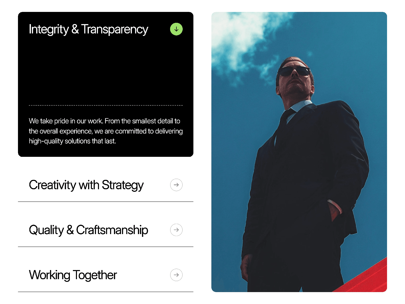
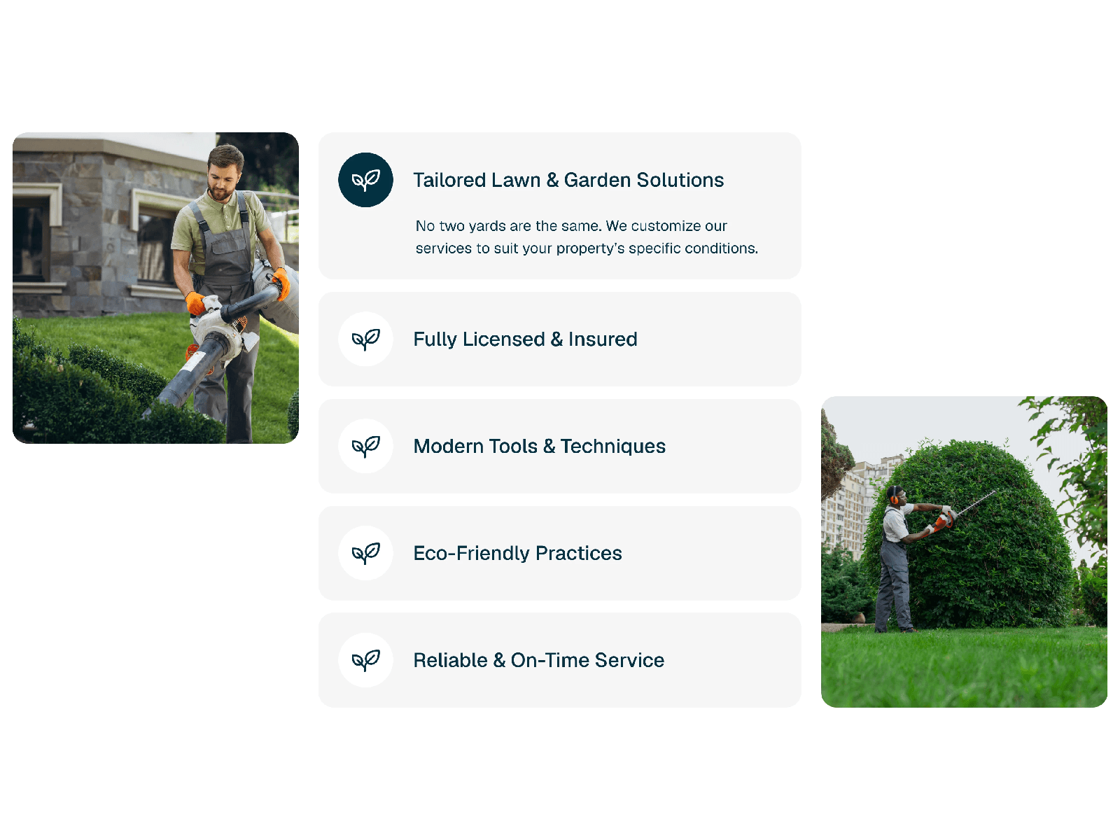
Dual Image Accordion is a modern, interactive Framer component that pairs a clean icon list with two synced side images. Instead of showing every detail at once, it displays a minimal list of icon-led titles by default, and expands the active item's description the moment a visitor clicks. Both side images update in sync with the active item, giving your "Why Us," services, or process section a premium, editorial feel with almost no setup required.
Click-to-Expand with Dual Synced Images
Expands to reveal a description beneath the clicked title.
Both left and right image panels update to match the active item.
Inactive items stay minimal and collapsed, keeping focus sharp.
Smooth height and fade transitions feel natural and intentional.
Only one item expands at a time, clean and distraction-free.
Fully responsive and optimized for modern GPU-accelerated performance.
Customizable Design Controls Dual Image Accordion includes full Framer property controls so you can instantly match it to your brand or layout.
Customize
Items – Add, remove, or reorder as many items as needed.
Icon – Assign a unique icon to each item.
Title & Description – Edit label and body text per item.
Tab Images – Assign two synced images (left and right) to each item.
Text Color – Set the color for titles and descriptions.
Icon Fill (Open & Closed) – Set separate icon colors for active and inactive states.
Background Color – Set the card background color.
Open & Closed Icon Colors – Fine-tune the expand/collapse icon per state.
How It Works Dual Image Accordion tracks click events across each list item. When a visitor clicks a title, the component smoothly animates its description open while both side image panels crossfade to the corresponding visuals.

Dual Image Accordion – Click-to-Expand List with Two Synced Images
Dual Image Accordion is a modern, interactive Framer component that pairs a clean icon list with two synced side images. Instead of showing every detail at once, it displays a minimal list of icon-led titles by default, and expands the active item's description the moment a visitor clicks. Both side images update in sync with the active item, giving your "Why Us," services, or process section a premium, editorial feel with almost no setup required.
Click-to-Expand with Dual Synced Images
Expands to reveal a description beneath the clicked title.
Both left and right image panels update to match the active item.
Inactive items stay minimal and collapsed, keeping focus sharp.
Smooth height and fade transitions feel natural and intentional.
Only one item expands at a time, clean and distraction-free.
Fully responsive and optimized for modern GPU-accelerated performance.
Customizable Design Controls Dual Image Accordion includes full Framer property controls so you can instantly match it to your brand or layout.
Customize
Items – Add, remove, or reorder as many items as needed.
Icon – Assign a unique icon to each item.
Title & Description – Edit label and body text per item.
Tab Images – Assign two synced images (left and right) to each item.
Text Color – Set the color for titles and descriptions.
Icon Fill (Open & Closed) – Set separate icon colors for active and inactive states.
Background Color – Set the card background color.
Open & Closed Icon Colors – Fine-tune the expand/collapse icon per state.
How It Works Dual Image Accordion tracks click events across each list item. When a visitor clicks a title, the component smoothly animates its description open while both side image panels crossfade to the corresponding visuals.