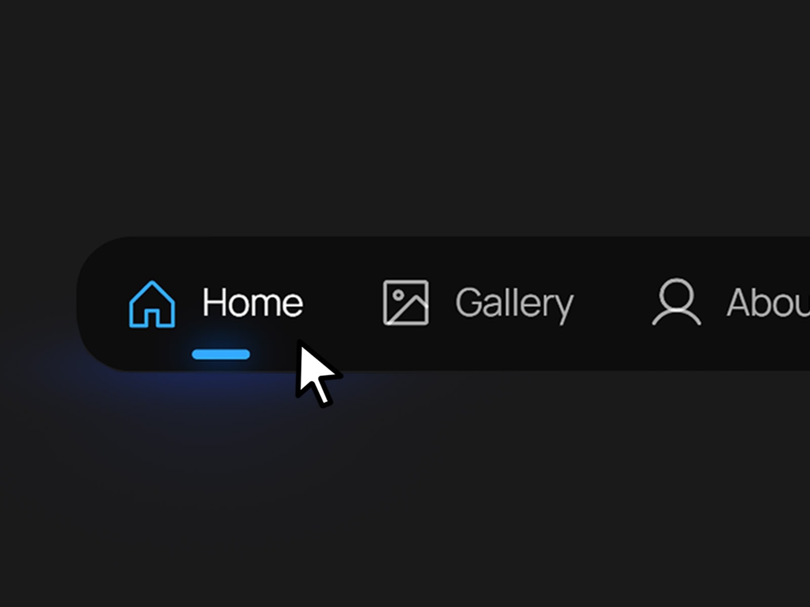
Island Navbar is a floating, app-inspired navigation component designed for creators and portfolio sites that want a distinctive, mobile-native feel. Inspired by the compact nav bars found in mobile apps, it condenses your site's navigation into a sleek floating capsule that can be placed at the top or bottom of the page. With toggleable icons and text, animated hover states, and a signature dashed border animation, it brings a tactile, polished touch to any creative site.
Flexible Display: Independently show or hide icons and text to match your site's style.
Animated Hover State: Links transition to a lighter accent color on hover, paired with an animated dashed border around the button.
Active State Indicator: A clear accent-colored icon and underline mark the current page or section.
Content
Number of Links: Choose how many nav items to display (up to 5).
Show Icon / Show Text: Toggle icon and text visibility independently.
Icon 1–5, Title 1–5, Link 1–5: Set the icon, label, and destination for each nav item.
Color Properties
BG Color: The background color of the navbar capsule.
Border Color: The color of the navbar's outer border.
Hover Color: The accent color links transition to on hover.
Inactive Text / Active Text: Colors for unselected and selected link text.
Accent Color: The color of the active link's icon and underline indicator.
Glow Accent: The glow color applied around the active link.
Best Practices
Balance Icons and Text: For minimal sites, try icons only; for clarity on larger screens, keep both enabled.
Match Your Palette: Adjust the Accent and Glow colors to align with your site's branding for a cohesive look.
Keep Titles Short: Concise labels (1–2 words) work best to preserve the compact, floating aesthetic.
Support & Assistance
If you have any questions, need help using the component, or encounter any issues, you can reach out to me at danielgrafix12@gmail.com. I'll get back to you as soon as possible.

Island Navbar is a floating, app-inspired navigation component designed for creators and portfolio sites that want a distinctive, mobile-native feel. Inspired by the compact nav bars found in mobile apps, it condenses your site's navigation into a sleek floating capsule that can be placed at the top or bottom of the page. With toggleable icons and text, animated hover states, and a signature dashed border animation, it brings a tactile, polished touch to any creative site.
Flexible Display: Independently show or hide icons and text to match your site's style.
Animated Hover State: Links transition to a lighter accent color on hover, paired with an animated dashed border around the button.
Active State Indicator: A clear accent-colored icon and underline mark the current page or section.
Content
Number of Links: Choose how many nav items to display (up to 5).
Show Icon / Show Text: Toggle icon and text visibility independently.
Icon 1–5, Title 1–5, Link 1–5: Set the icon, label, and destination for each nav item.
Color Properties
BG Color: The background color of the navbar capsule.
Border Color: The color of the navbar's outer border.
Hover Color: The accent color links transition to on hover.
Inactive Text / Active Text: Colors for unselected and selected link text.
Accent Color: The color of the active link's icon and underline indicator.
Glow Accent: The glow color applied around the active link.
Best Practices
Balance Icons and Text: For minimal sites, try icons only; for clarity on larger screens, keep both enabled.
Match Your Palette: Adjust the Accent and Glow colors to align with your site's branding for a cohesive look.
Keep Titles Short: Concise labels (1–2 words) work best to preserve the compact, floating aesthetic.
Support & Assistance
If you have any questions, need help using the component, or encounter any issues, you can reach out to me at danielgrafix12@gmail.com. I'll get back to you as soon as possible.


