This is a streamlined and minimalistic single-page portfolio design aimed exclusively at product designers, front-end developers, and creative studios. The template uses the Bento Grid layout to represent your professional experience and creative visuals in a clean, structured format for desktop, tablet, and mobile devices.
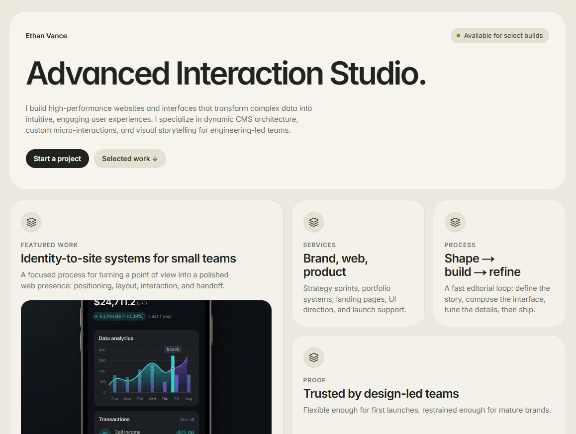
Modular Bento Grid Layout: High-contrast layout to present credentials, services, and visual proof in well-defined grid cards without any clutter.
Hero Section: Features the studio tagline, quick bio, image and two call-to-action buttons (Start a project / Selected work).
Selected Works Showcase: Styled to prominently highlight a dark mode app mockup.
Services & Process Cards: Structured cards presenting the studio’s core services and creative process ("Brand, web, product").
Social Proof & Principles: Separate cards with information about metrics, social links, and ethos of the brand ("Useful before loud").Fully Responsive Breakpoints: Perfectly stacked from multi-column layout on desktop to single column format on mobile devices.
Dark Mode Contrast Accent: Use of dark mode visuals on top of clean card styling.

This is a streamlined and minimalistic single-page portfolio design aimed exclusively at product designers, front-end developers, and creative studios. The template uses the Bento Grid layout to represent your professional experience and creative visuals in a clean, structured format for desktop, tablet, and mobile devices.
Modular Bento Grid Layout: High-contrast layout to present credentials, services, and visual proof in well-defined grid cards without any clutter.
Hero Section: Features the studio tagline, quick bio, image and two call-to-action buttons (Start a project / Selected work).
Selected Works Showcase: Styled to prominently highlight a dark mode app mockup.
Services & Process Cards: Structured cards presenting the studio’s core services and creative process ("Brand, web, product").
Social Proof & Principles: Separate cards with information about metrics, social links, and ethos of the brand ("Useful before loud").Fully Responsive Breakpoints: Perfectly stacked from multi-column layout on desktop to single column format on mobile devices.
Dark Mode Contrast Accent: Use of dark mode visuals on top of clean card styling.