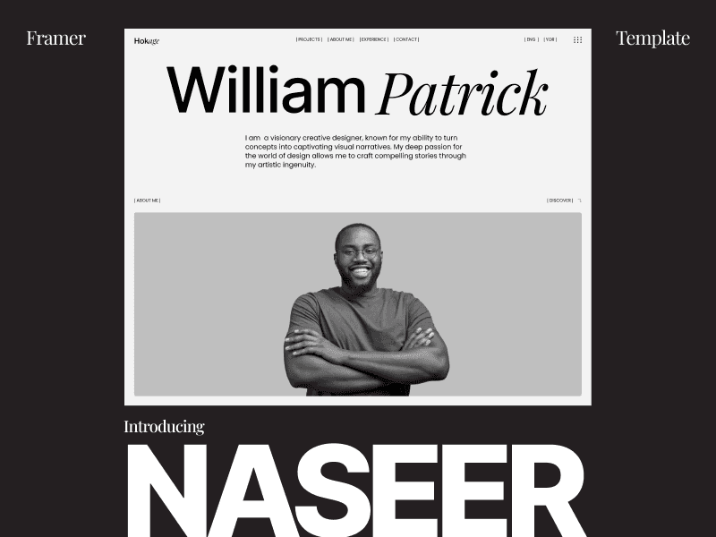
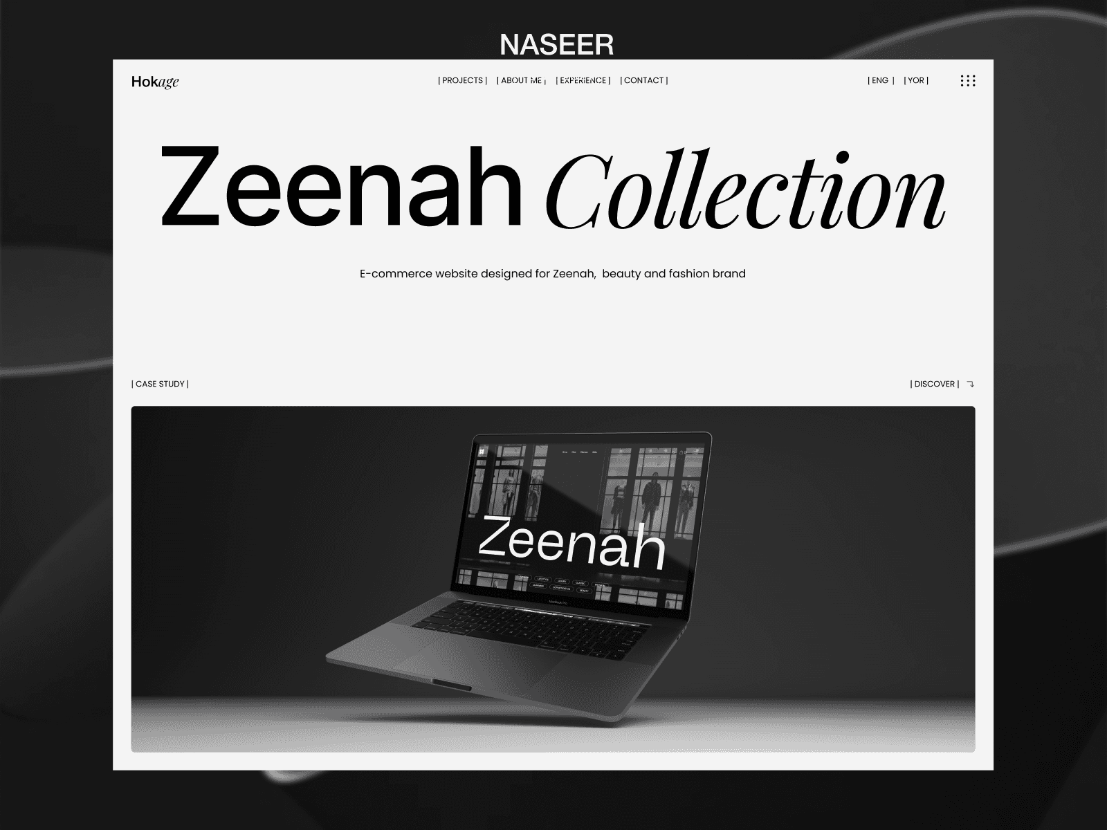
Field Theory


Field Theory is a Framer template inspired by high-end creative studios. It blends art direction, branding, and modern web design helping fashion brands craft luxurious, cinematic digital experiences with confidence and style.
Field Theory embodies a modern editorial aesthetic clean, spacious, and art-directed with precision. It draws inspiration from luxury fashion campaigns, independent design magazines, and contemporary branding studios.
The design merges minimalism with cinematic motion, focusing on typography, whitespace, and hierarchy rather than ornamentation. Every scroll and transition feels intentional, evoking the pacing of a fashion film or printed editorial spread.
It’s sophisticated yet restrained perfect for studios and brands that value detail, storytelling, and timeless visual direction.
Visual Elements
Typography: Tall, elegant serif paired with modern sans-serif for contrast.
Color Palette: Monochrome base (black, white, neutral gray) with subtle highlights or brand accent tones.
Layout: Grid-driven composition; strong alignment; generous negative space.
Imagery: Full-bleed visuals, photography-first presentation, cinematic framing.
Motion: Smooth, layered transitions; subtle parallax and fade interactions.
Tone: Refined, confident, editorial not loud or playful.