

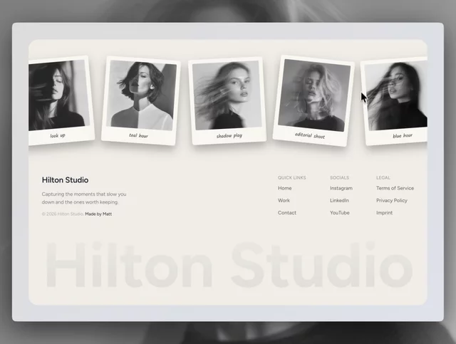
Your best work shouldn’t stop moving at the bottom of the page.
Polaroid Footer brings photos, captions, and polished interactions together in one distinctive experience.

Brookmere has sold more than everything else we have made put together.
Still not entirely sure why. Finance sites are boring and this one leans all the way into it.

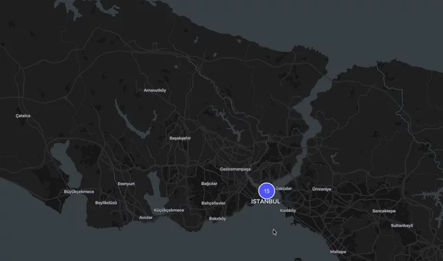
CMS powered interactive map in Framer is totally possible using Insert Frame's MapFrame plugin, (you can try it for free & 10% discount code is AKINGN , as for all Insert Frame products :)) Here's the tutorial with free starter file: https://www.youtube.com/watch?v=hsS3bJZ7QJo

Free to use. Made for you - https://framer.link/cKeJMRb
The dashboard in this template shows loads, drivers, and auto-dispatch rates.
Not "analytics." Not a chart with unlabelled axes. A logistics dispatch board.
That was a deliberate risk, and it is the thing I would defend hardest.
Generic AI templates all have the same hero mock - a purple gradient, three floating cards, numbers that mean nothing. It works for everyone, which means it convinces no one.
A visitor evaluating an AI product looks at the dashboard mock for about two seconds and asks one question: does this thing do work that resembles mine?
An abstract chart cannot answer that. A dispatch board can, and if the visitor runs a fleet, it just did.
→ Pick one vertical for the hero mock
→ Real column headers, real row labels
→ Make it swappable, but ship it specific
The counter argument is that specificity narrows the audience. In practice, vagueness narrows it more. Nobody has ever recognised themselves in a placeholder.
Specific is easier to change than convincing.
Grab it now - https://framer.link/9lYPgcF
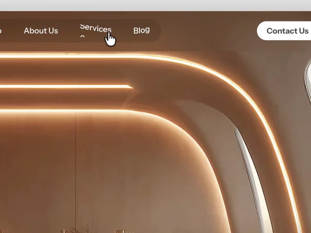
Interior designers do not sell rooms. They sell the confidence to spend forty thousand on one.
That changes what the website has to carry.
A photography grid proves taste. Everyone's portfolio looks good in this category. It does not answer the question the client is actually holding, which is what happens between the first call and the day I get my house back.
So the process section outranks the gallery.
Consultation. Planning. Design. Execution. Four words, but they do the thing images cannot -they give a nervous person a shape to hold onto.
→ Name the stages, not the deliverables
→ Say roughly how long each takes
→ Show where the client makes decisions
→ Give each service its own page, because a commercial fit-out buyer and a kitchen renovation buyer are not the same person
Beautiful work gets you the enquiry. Structure gets you the signature.
It’s still free to grab now - https://framer.link/CVlmpWG
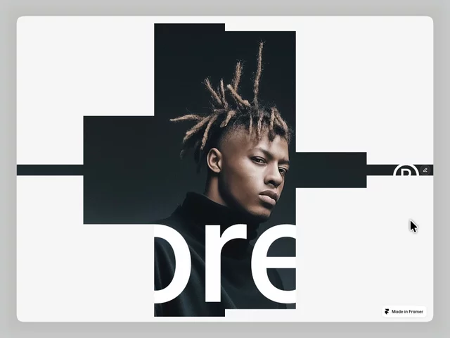
929 studios have used a template I nearly did not publish.
I sat on Norell for two weeks because I thought the typography was too plain next to what was ranking at the time. Everything on the front page was animated, layered, loud.
I published it plain anyway.
The plain one is the one that worked, and I still find that hard to internalise. Every time I start something new, the instinct is to add.
Restraint is not a style. It is a decision you have to keep making.
Rebuilt the demo video this week. A year later, the parts I fussed over have dated. The parts I left alone have not.
Grab it for free now - https://framer.link/u6F6seh
Plumbing Company Framer Template - Pipeo
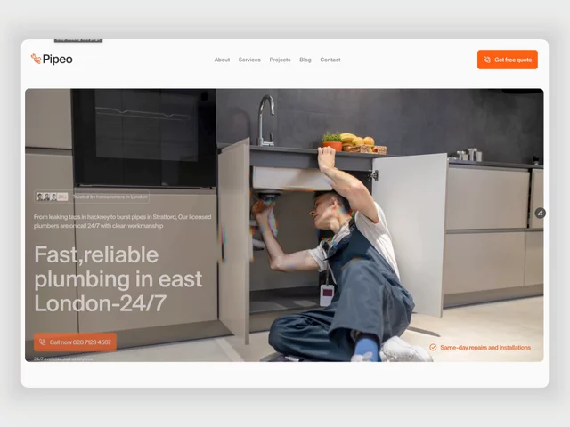

Take it. No purchase, no email, no catch - just duplicate it 👉 https://framer.link/flekKau
Six faces with names and job titles on a cleaning company website.
Not stock. The actual people who will be in your house on Tuesday.
Think about what is being bought here. A stranger gets a key to your home while you are at work. Nobody is comparing service lists at that point — they are deciding whether to be uncomfortable.
James Wilson, Office Cleaning Lead. Now there is a person, not a company.
When the service happens inside someone's home, the team page is the trust page.
Grab it for free now - https://framer.link/CVlmpWG
Six awards, no badges.
The standard is a row of gold laurel graphics. I built a table instead: award, issuing body, arrow.
Badges are unreadable at a glance. Tables get read, because reading is what tables are for.
And a wall of laurels says please notice we were recognised.
A quiet list just says we were.
Confidence is a design decision, not a personality trait.