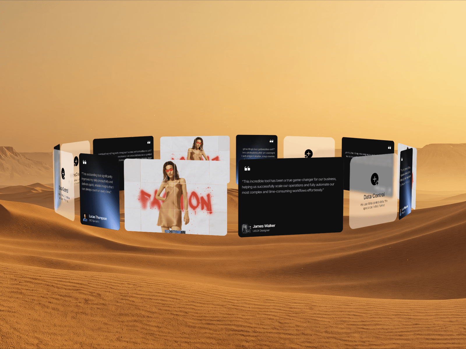
Add a premium 3D spatial rotating ring layout to your Framer projects with smart depth fading, physics-based swipe interactions, and responsive auto-fill spacing.
Real-time 3D spatial positioning and rotation
Smooth physics-based drag and swipe interactions
Smart auto-spacing with equal arc gap calculations
Dynamic depth fading and intelligent z-index sorting
Adjustable camera tilt and 3D perspective distortion
Highly optimized requestAnimationFrame performance
Auto-fill functionality for rapid dynamic content scaling
Clean integration with native Framer components
Works perfectly for galleries, portfolios, and spatial UI
Ring radius and distance
Camera tilt angle
3D perspective intensity
Auto-spin toggle and speed multiplier
Drag and swipe sensitivity
Depth fade visibility toggle
Front-safe fade start angle
Back-side fade limit angle
Total slot count for auto-fill
Fully customizable embedded child content
Drop the Circular UI Slider component onto your Framer canvas
Connect your native Framer cards, images, or frames as children
Adjust the ring radius and 3D perspective to fit your specific layout
Tune the drag sensitivity, camera tilt, and auto-spin speed
Set your depth fading angles for a realistic spatial effect
Publish to deliver a highly interactive 3D spatial gallery
Premium portfolio galleries
3D product showcases
Interactive testimonial sliders
Immersive app feature tours
Spatial team member directories
Modern SaaS landing pages
Dynamic pricing tier displays
Interactive partner logo clouds
Dark mode UI environments
Web3 and futuristic interfaces

Add a premium 3D spatial rotating ring layout to your Framer projects with smart depth fading, physics-based swipe interactions, and responsive auto-fill spacing.
Real-time 3D spatial positioning and rotation
Smooth physics-based drag and swipe interactions
Smart auto-spacing with equal arc gap calculations
Dynamic depth fading and intelligent z-index sorting
Adjustable camera tilt and 3D perspective distortion
Highly optimized requestAnimationFrame performance
Auto-fill functionality for rapid dynamic content scaling
Clean integration with native Framer components
Works perfectly for galleries, portfolios, and spatial UI
Ring radius and distance
Camera tilt angle
3D perspective intensity
Auto-spin toggle and speed multiplier
Drag and swipe sensitivity
Depth fade visibility toggle
Front-safe fade start angle
Back-side fade limit angle
Total slot count for auto-fill
Fully customizable embedded child content
Drop the Circular UI Slider component onto your Framer canvas
Connect your native Framer cards, images, or frames as children
Adjust the ring radius and 3D perspective to fit your specific layout
Tune the drag sensitivity, camera tilt, and auto-spin speed
Set your depth fading angles for a realistic spatial effect
Publish to deliver a highly interactive 3D spatial gallery
Premium portfolio galleries
3D product showcases
Interactive testimonial sliders
Immersive app feature tours
Spatial team member directories
Modern SaaS landing pages
Dynamic pricing tier displays
Interactive partner logo clouds
Dark mode UI environments
Web3 and futuristic interfaces


