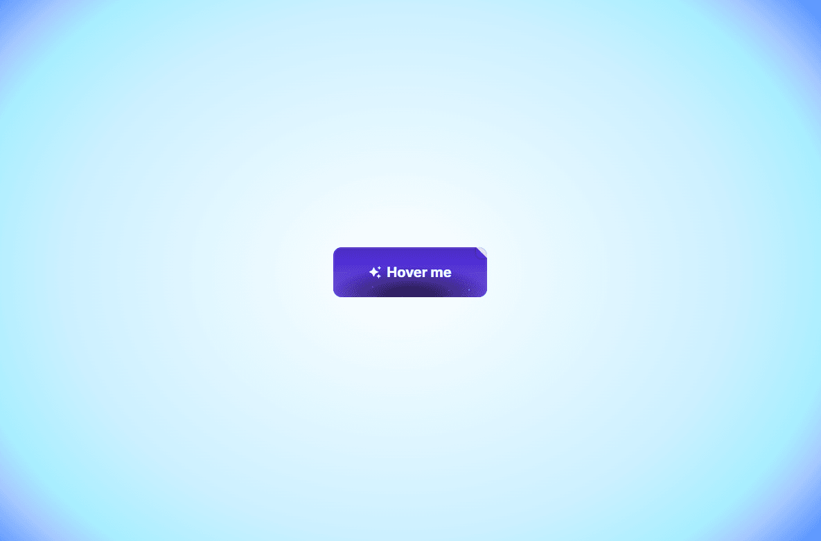
Join Button is an eye-catching call-to-action component featuring floating dust particles, a subtle corner paper-fold detail, and interactive icon animations. Designed to draw immediate visual attention, it brings an extra touch of polish to high-converting landing pages.
Floating Particle Effect: Subtle ambient light particles continuously float upward inside the button to create a lively background dynamic.
Playful Corner Fold: Features an animated top-right corner fold that shifts playfully on hover.
Animated Spark Icon: Includes an optional sparkle icon that scales and rotates smoothly when visitors hover over the button.
Click Micro-Interaction: Gently scales down on click (active state) to give visitors satisfying tactile feedback.
Full control directly from Framer’s right-hand property panel — no coding needed:
Text — Button label (e.g., "Join Now", "Get Started", "Claim Access")
Link — Destination page or URL (supports opening in a new tab)
Icon — Toggle the animated sparkle icon on or off
Font — Select any web or system typography family and weight
Font Size — Adjust text sizing in pixels (default: 14px)
Text Color — Choose the label and icon color (default: #FFFFFF)
Color Top & Bottom — Customize the primary background gradient shift
Radius — Control corner roundness (default: 12px)
Height — Set exact button height (default: 44px)
Padding H & V — Finely adjust horizontal and vertical internal spacing
Questions or suggestions? Reach out anytime at karimsaif010@gmail.com or on X @karimsaif0.

Join Button is an eye-catching call-to-action component featuring floating dust particles, a subtle corner paper-fold detail, and interactive icon animations. Designed to draw immediate visual attention, it brings an extra touch of polish to high-converting landing pages.
Floating Particle Effect: Subtle ambient light particles continuously float upward inside the button to create a lively background dynamic.
Playful Corner Fold: Features an animated top-right corner fold that shifts playfully on hover.
Animated Spark Icon: Includes an optional sparkle icon that scales and rotates smoothly when visitors hover over the button.
Click Micro-Interaction: Gently scales down on click (active state) to give visitors satisfying tactile feedback.
Full control directly from Framer’s right-hand property panel — no coding needed:
Text — Button label (e.g., "Join Now", "Get Started", "Claim Access")
Link — Destination page or URL (supports opening in a new tab)
Icon — Toggle the animated sparkle icon on or off
Font — Select any web or system typography family and weight
Font Size — Adjust text sizing in pixels (default: 14px)
Text Color — Choose the label and icon color (default: #FFFFFF)
Color Top & Bottom — Customize the primary background gradient shift
Radius — Control corner roundness (default: 12px)
Height — Set exact button height (default: 44px)
Padding H & V — Finely adjust horizontal and vertical internal spacing
Questions or suggestions? Reach out anytime at karimsaif010@gmail.com or on X @karimsaif0.