
Websites that move a number, not just look good. Design, custom code, animation, SEO & GEO - one person, accountable end to end.
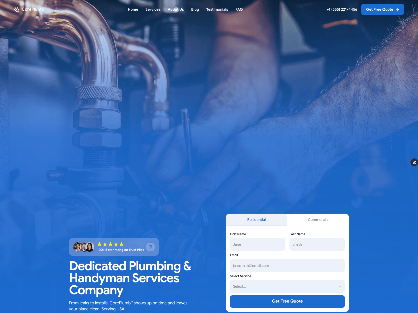
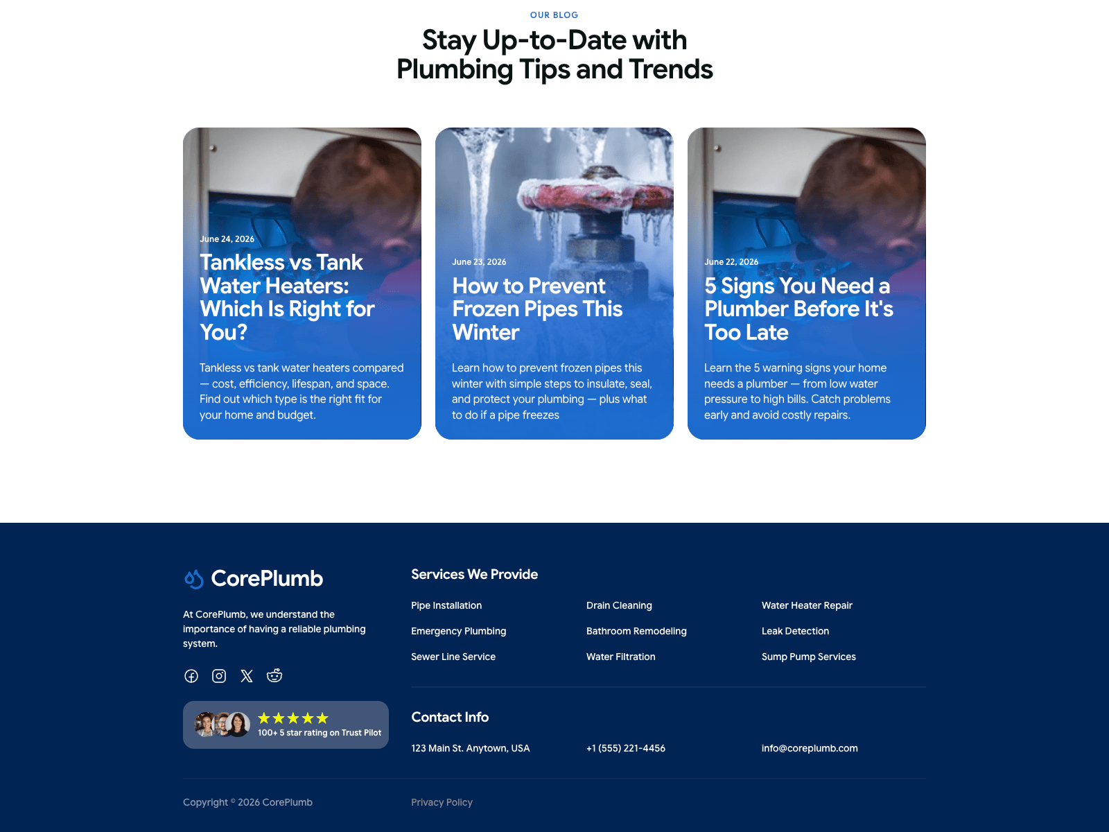
CorePlumb - my plumbing template - is out in the wild. Found it running live on planneretic.com.
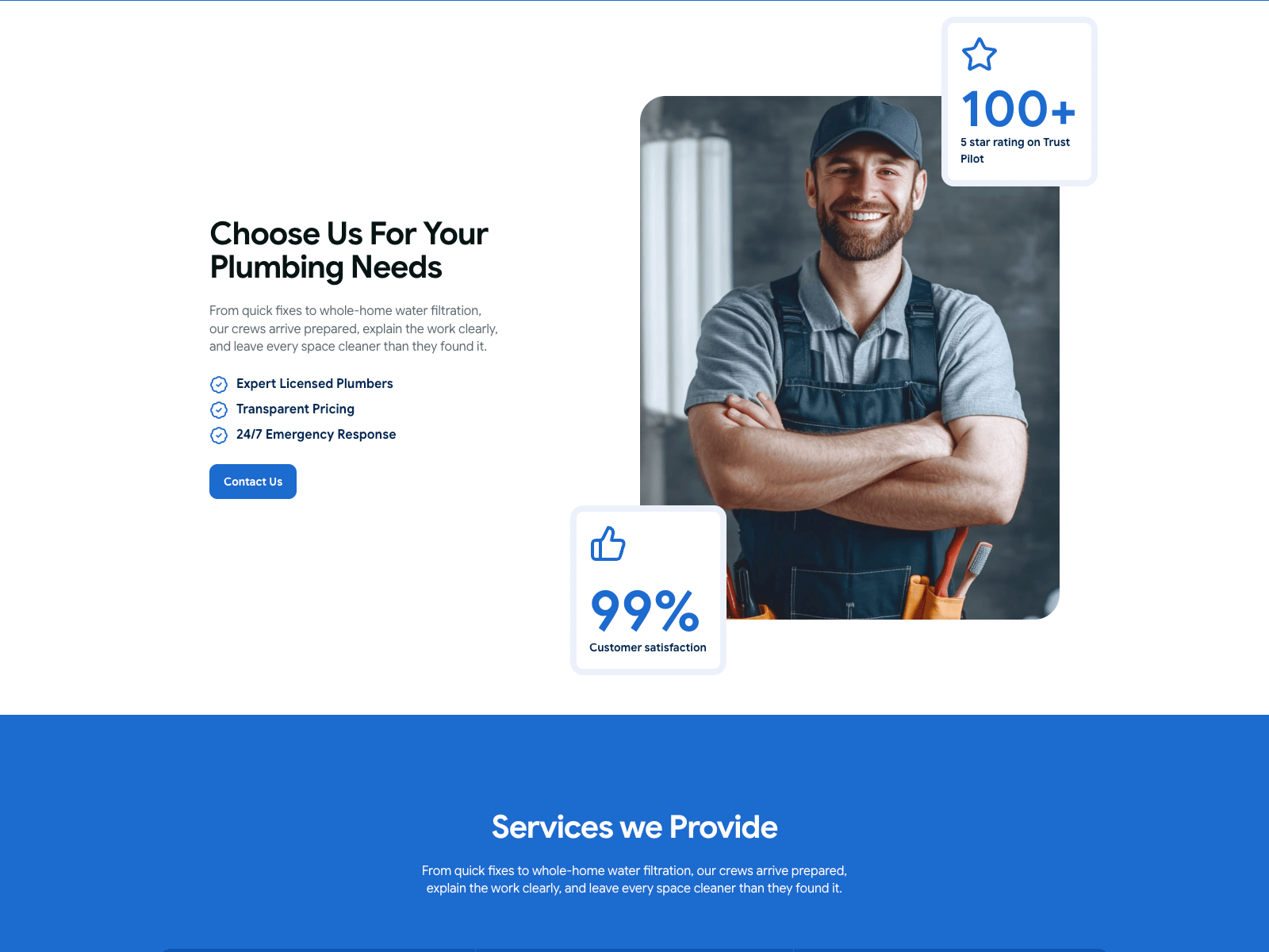
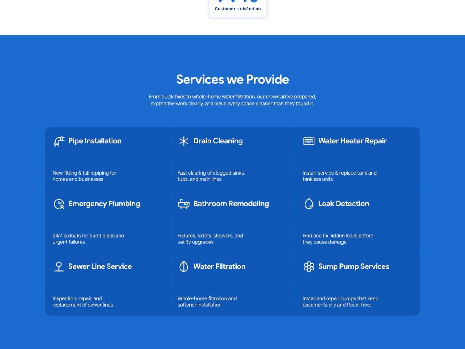
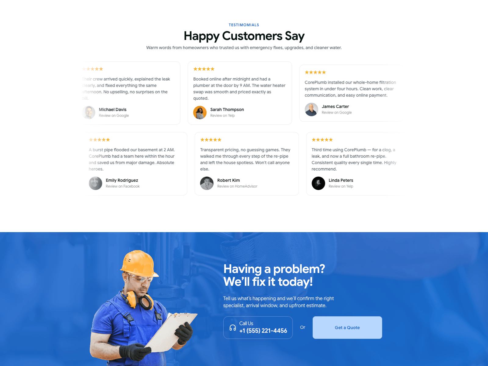
Odd feeling seeing something you built as a generic system turn into someone's actual business. Different logo, same architecture: nine CMS service pages, inline quote form, testimonial marquee, FAQ built around the objections homeowners actually raise.
Template's in the Framer Marketplace if it's useful to anyone.
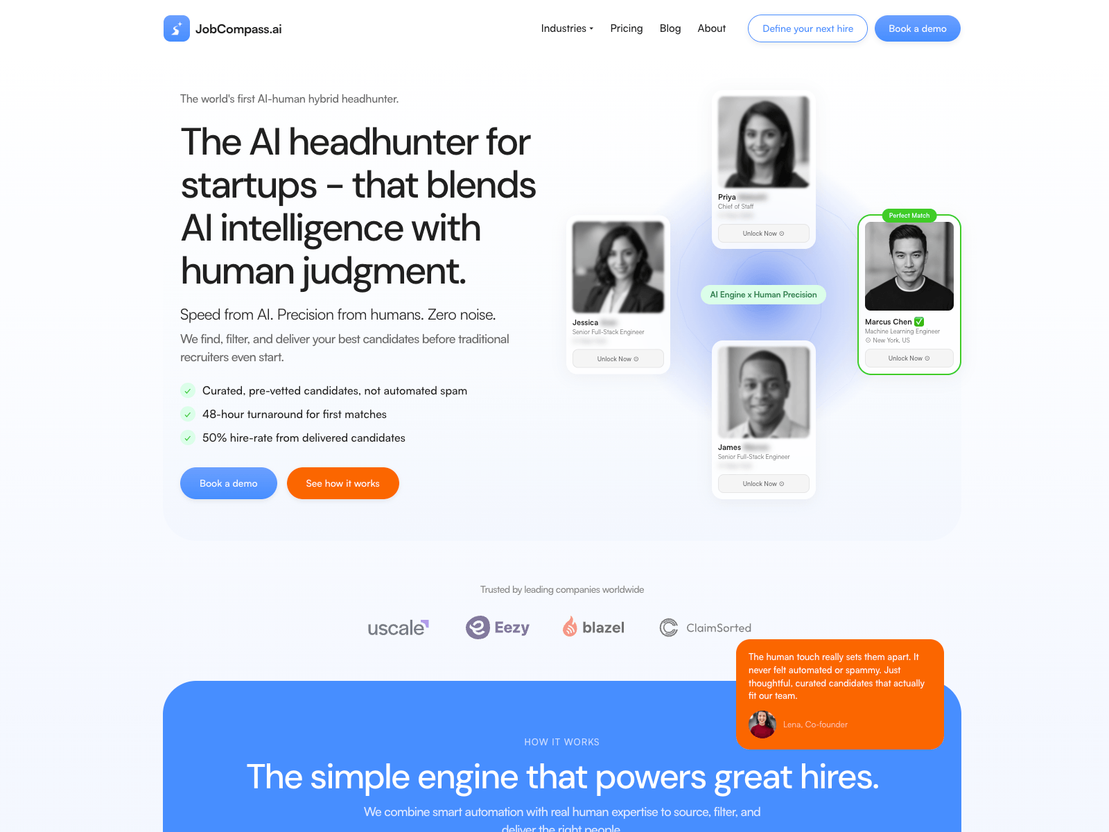
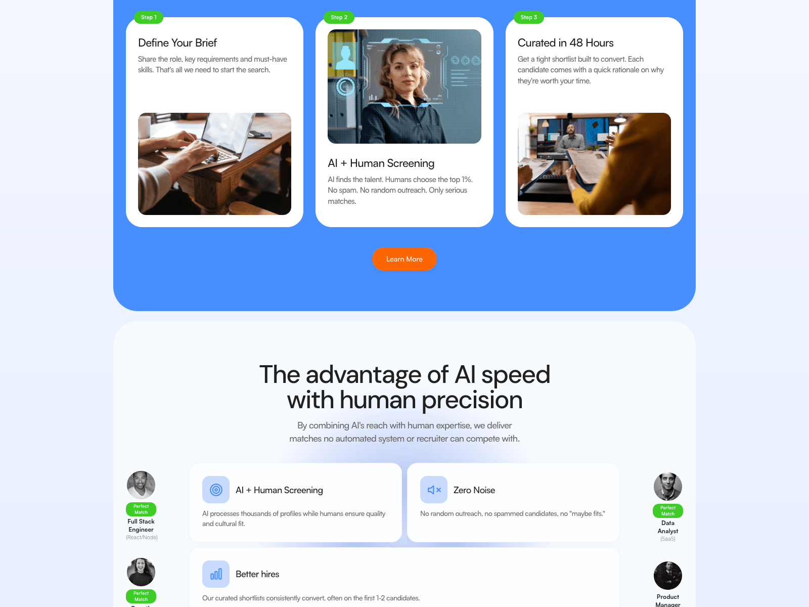
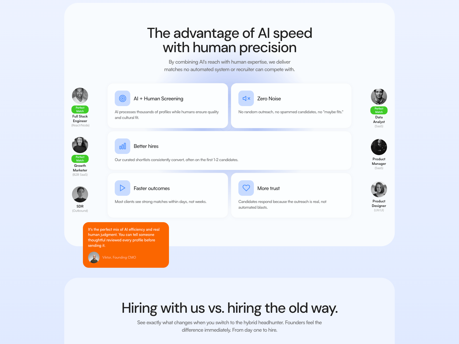
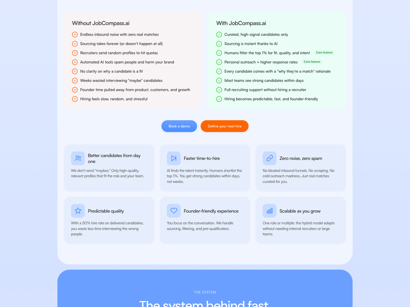
Built JobCompass - an AI-human hybrid headhunter for startups.
Hard positioning problem: the audience distrusts both sides of your category. Pure AI tools spam candidates, traditional recruiters send quota filler. You're claiming the middle, which is the least believable place to stand.
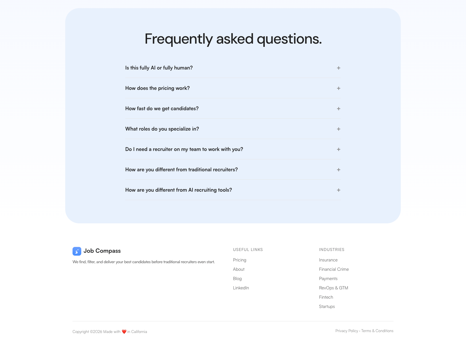
Solved it with numbers instead of adjectives - 48h turnaround, 50% hire rate, flat 12% versus the usual 20-30%, all stated openly including pricing in the FAQ.
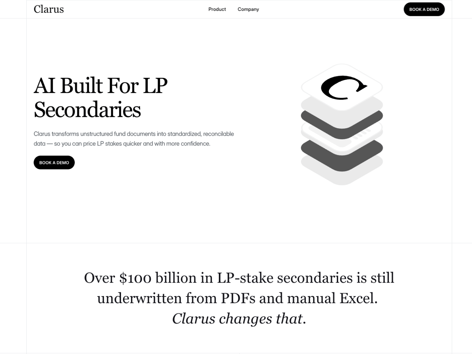
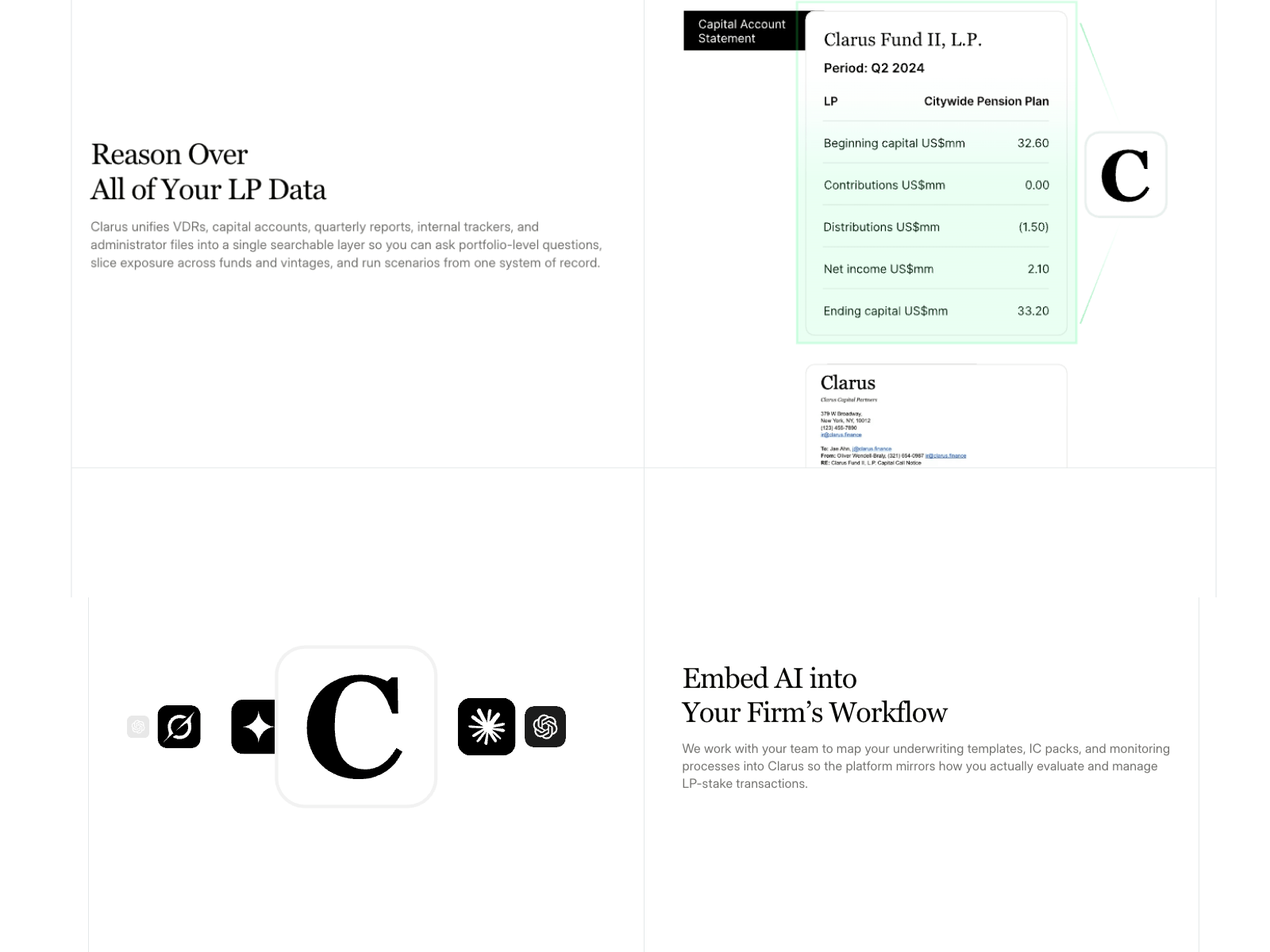
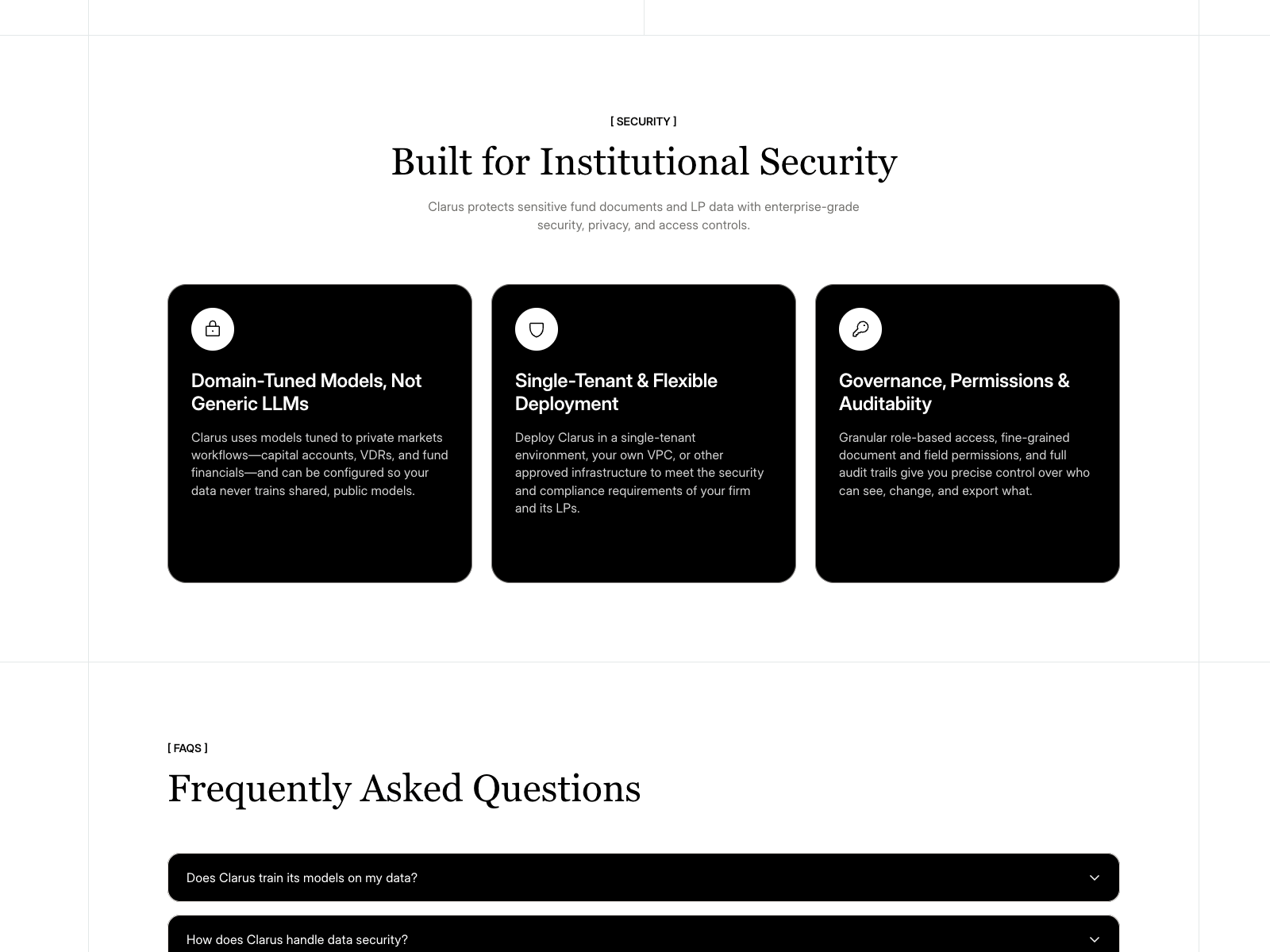
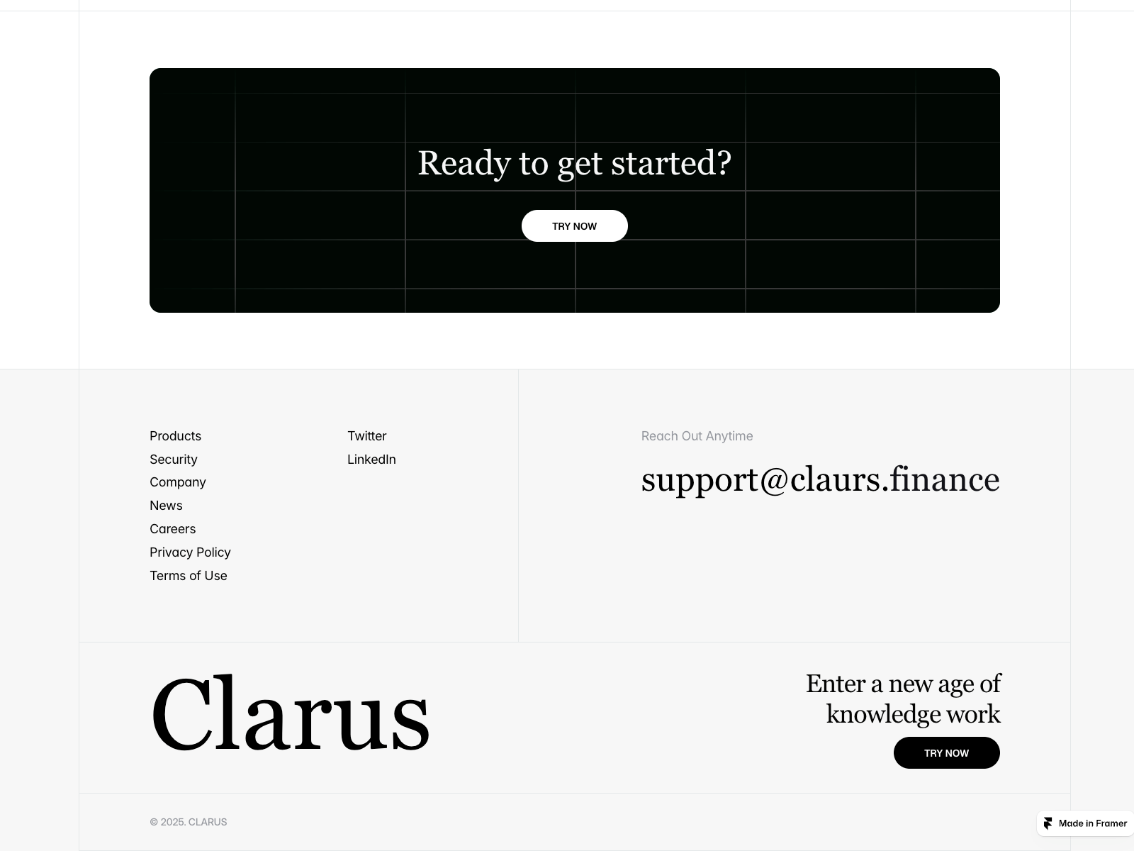
Built Clarus — AI for private market allocators.
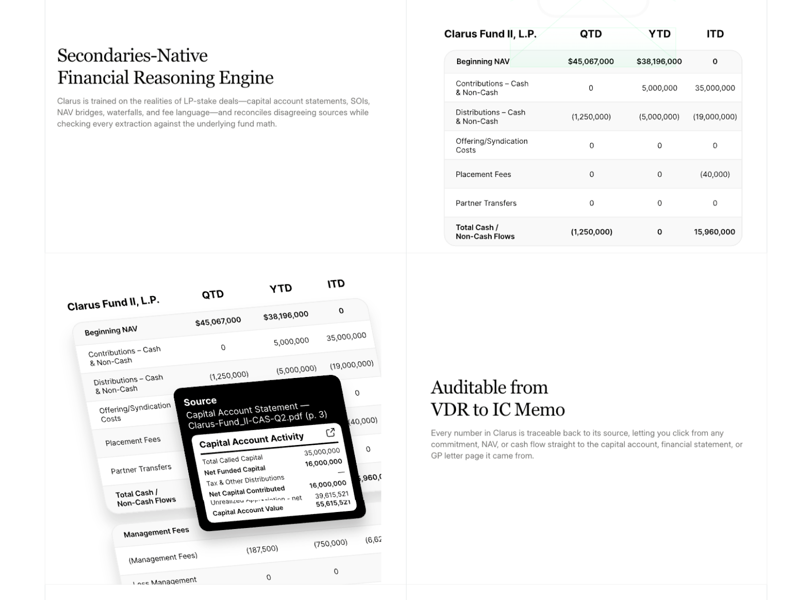
Enterprise fintech is a restraint problem. The buyer is handling LP capital accounts and fund financials, so every visual flourish reads as a reason not to trust you. Security and auditability got promoted from footer links to full sections.
Favourite detail: the FAQ isn't marketing questions, it's the six objections that actually kill enterprise deals — including "what if Clarus builds a model I don't like."
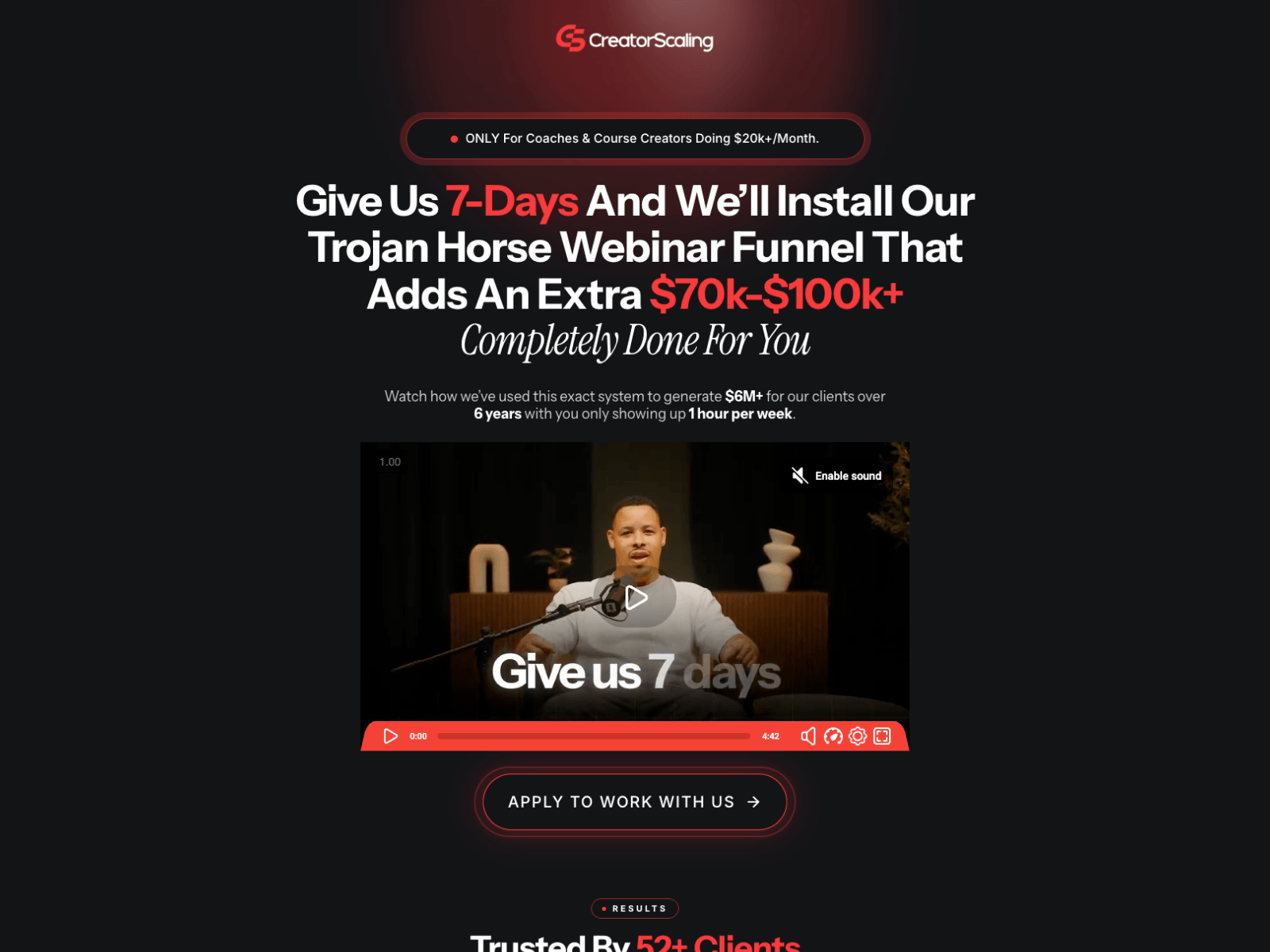
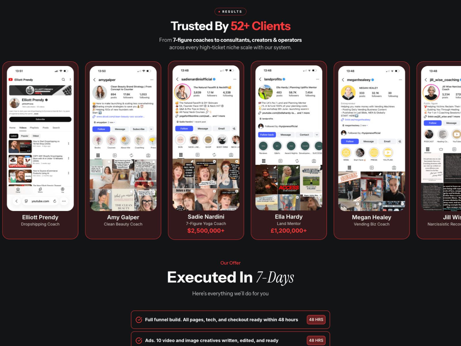
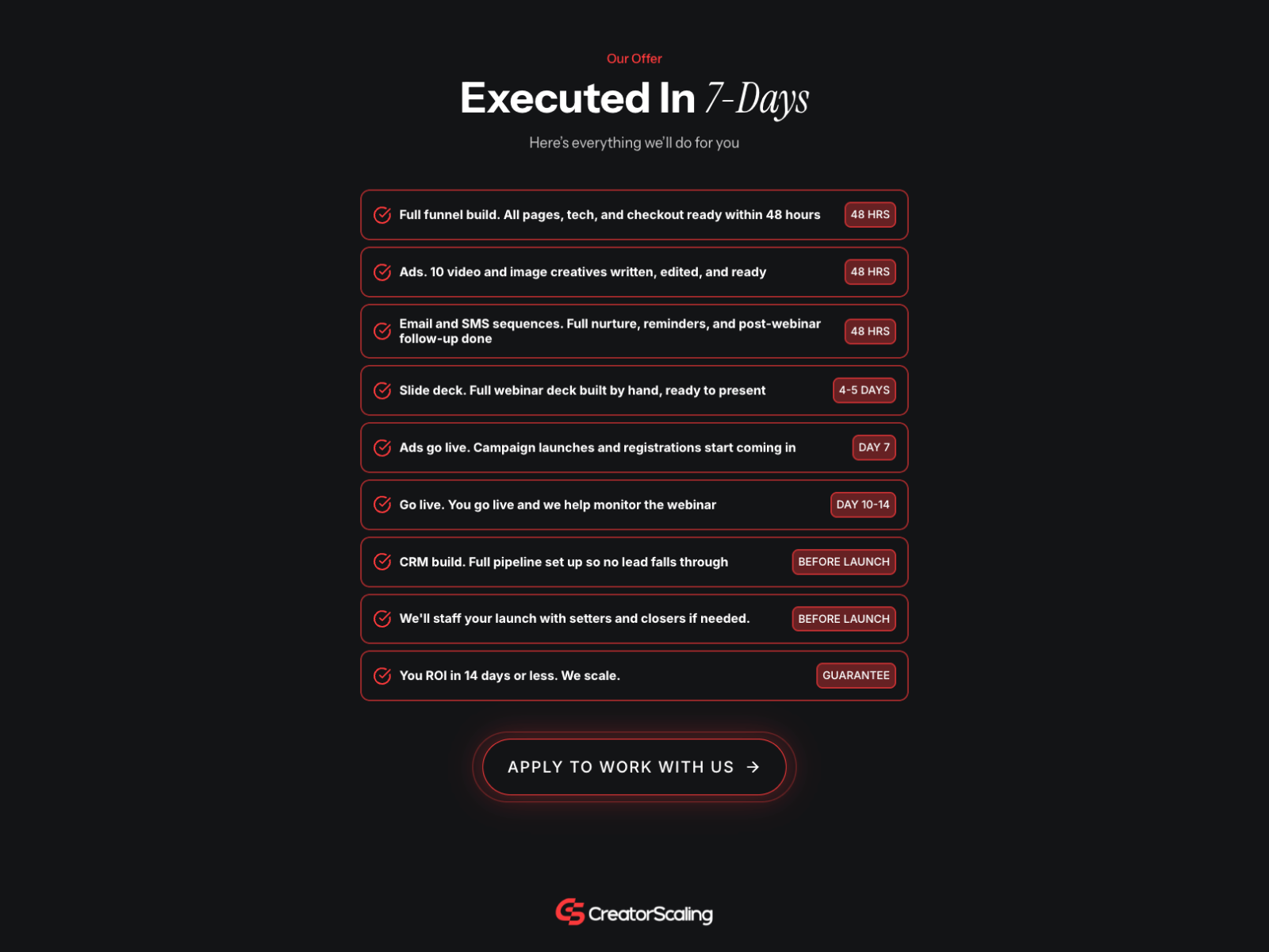
Built Creatorscaling - a done-for-you webinar funnel agency.
Direct response is its own craft. Brand sites earn attention slowly; a page like this has about four seconds. The whole build is claim, proof, claim, proof — with a qualifying line above the headline that deliberately turns away anyone under $20k/month.
No nav. No secondary links. Every CTA goes to the same application form.
Design work on Fellow — a Danish CX consultancy working with Grundfos, Energinet, Billund Airport and Blue Water Shipping.
Enterprise consultancies are a restraint exercise. When your client list is that strong, the design's job is to get out of its way — logos first, claims second, everything sourced.
Design mine, Framer build by @roman_webflow.
Built NimbleStax — a fractional data team for growing companies.
The problem with selling infrastructure: nobody can picture it. "Clean pipelines" means nothing until you see what you actually get.
So the whole page is animated dashboard mockups — metric cards, order tables, team views — built natively in Framer rather than dropped in as screenshots. The client sees the outcome, not the plumbing.
Also killed the contact form. Every CTA goes straight to the calendar.
Built Gwynn CPAs — an audit firm in Dallas.
Professional services have a specific emotional starting point. Nobody wakes up wanting an audit; a lender demanded one and there's a deadline. So the hero names the fear directly instead of talking about "excellence in accounting."
Then the whole page is trust architecture: named clients with logos, a six-step process laid out plainly, 20 years of credentials. No mystery about what happens next.
Framer + CMS, service-level pages for local search.
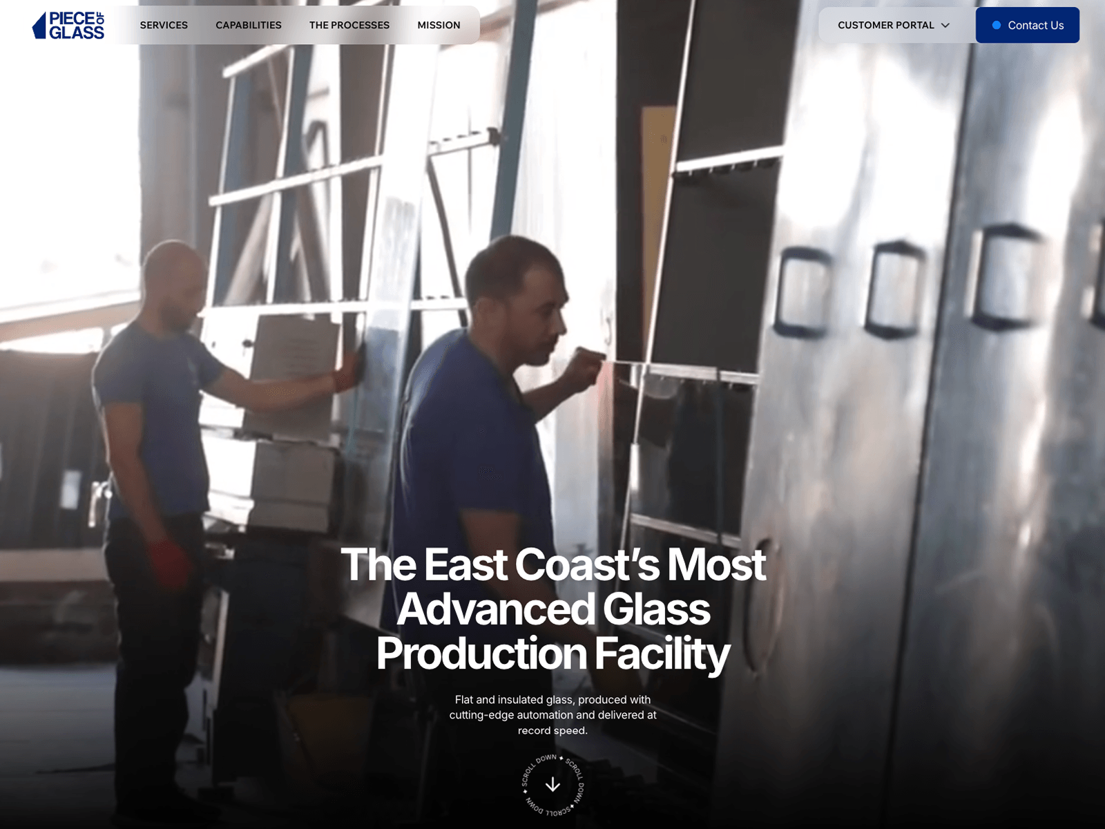
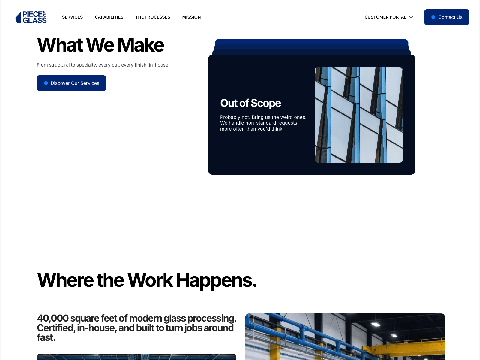
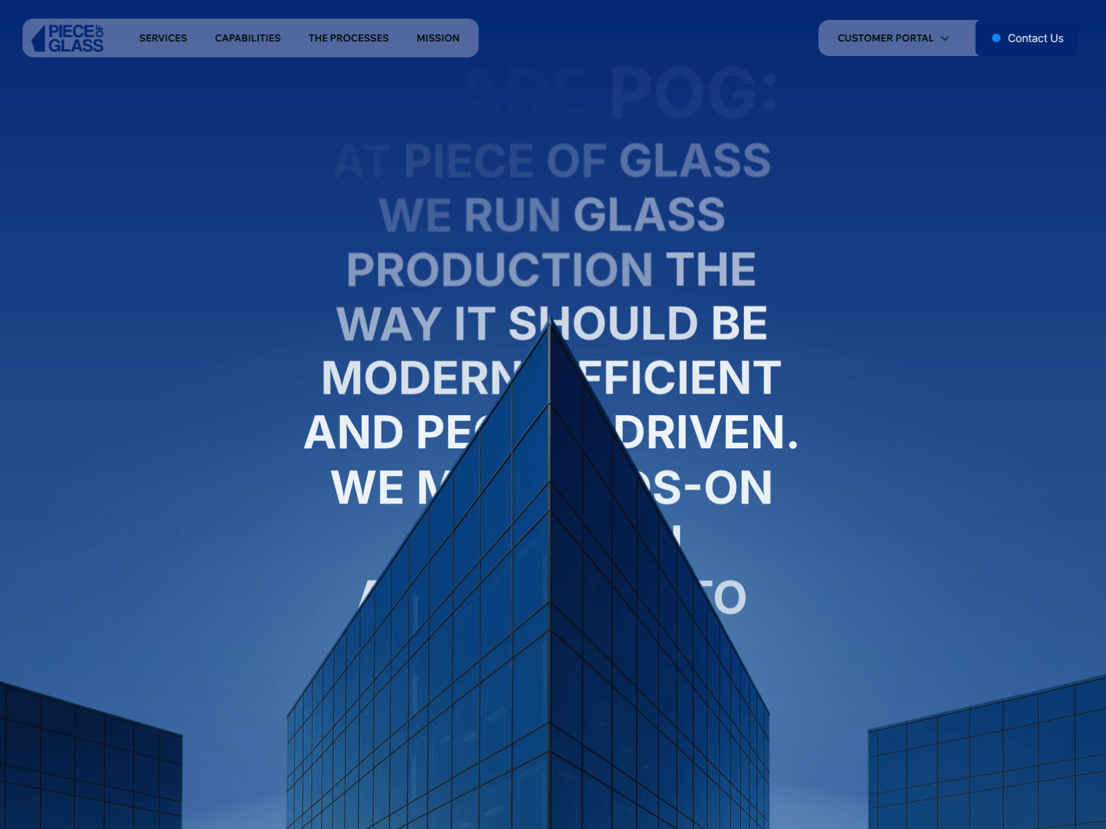
Built Piece of Glass — a 40,000 sq ft glass fabrication facility in New Jersey.
Industrial B2B in an old trade. The temptation is to modernise it into something that stops looking credible to the people who actually buy — glaziers and contractors want lead times and SGCC certification, not vibes.
So: editorial restraint on the surface, hard specifics underneath. Plus a full-screen kinetic manifesto that earns the brand some attitude without getting in the way of the spec sheet.
Built Antidote - an ecommerce growth accelerator led by a 3x Fortune 500 VP.
Founder-led consultancies are their own design problem. You're not selling a service menu, you're selling one person's judgement — so the whole page funnels to a direct email, not a lead form with six fields.
Kinetic type, animated stat counters, and a methodology block that makes an abstract process feel concrete.
Built The Lake Proposal — proposal videography on Lake Como.
Interesting part isn't the site, it's the funnel logic. Couples book proposal filming months before they book a wedding videographer. So this runs as a separate brand with its own domain and its own search intent, then hands the couple over to the studio's wedding brand once the ring is on.
Two brands, two rankings, one pipeline.
Framer, video-first, WhatsApp deep link for international enquiries.
Joined Wrench.ai — a B2B AI personalization platform — to work on SEO.
Classic story: the SEO audit turned into a publishing problem. Content wasn't the bottleneck, friction was. Every blog post needed engineering time, so nothing shipped.
Ended up moving the source of truth into Notion and automating the path to live posts. Marketing writes where they already work, metadata gets set at writing time, no developer in the loop.
SEO strategies only compound if publishing is frictionless.
Worked on LUCA - a women's cycling apparel brand running headless Shopify on a Framer front end.
Most interesting piece: a custom Notify Me When Available component. Sold-out variants are where storefronts quietly leak demand - the customer wanted a specific size in a specific colour, hit a dead button, and left. Now that intent gets captured against the exact variant.
Rest of the work was Shopify component output — getting product, variant and stock data to render properly in Framer so the storefront behaves like an actual shop.
Built ARDA - a sovereign AI platform for banks, utilities and telecoms.
Enterprise sites are a different discipline. The reader is a CISO deciding whether to trust you with regulated data, so every flourish you'd normally add works against you. Restraint is the design.
Most of the effort went into one animated architecture diagram - explaining deployment topology visually so nobody has to parse a paragraph about trust boundaries.
Framer, custom components, scroll-driven reveals.
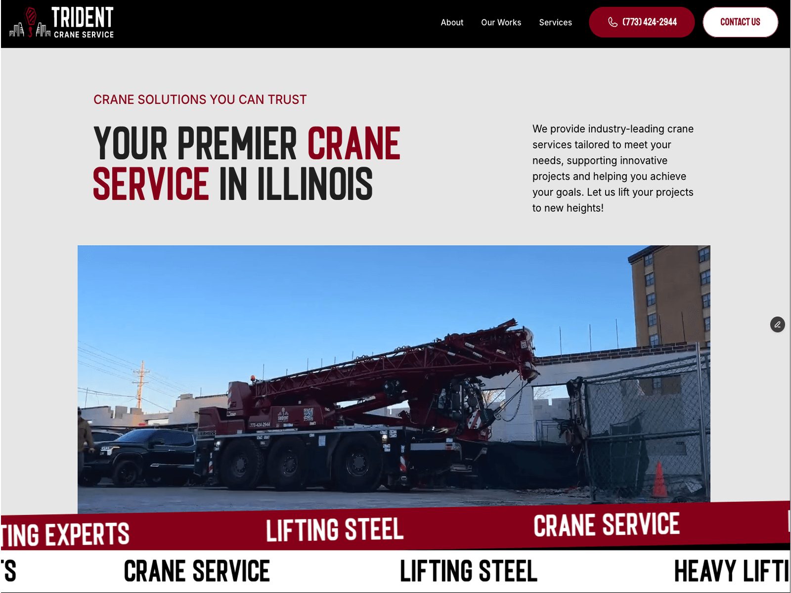
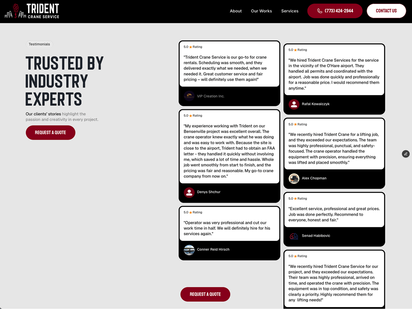
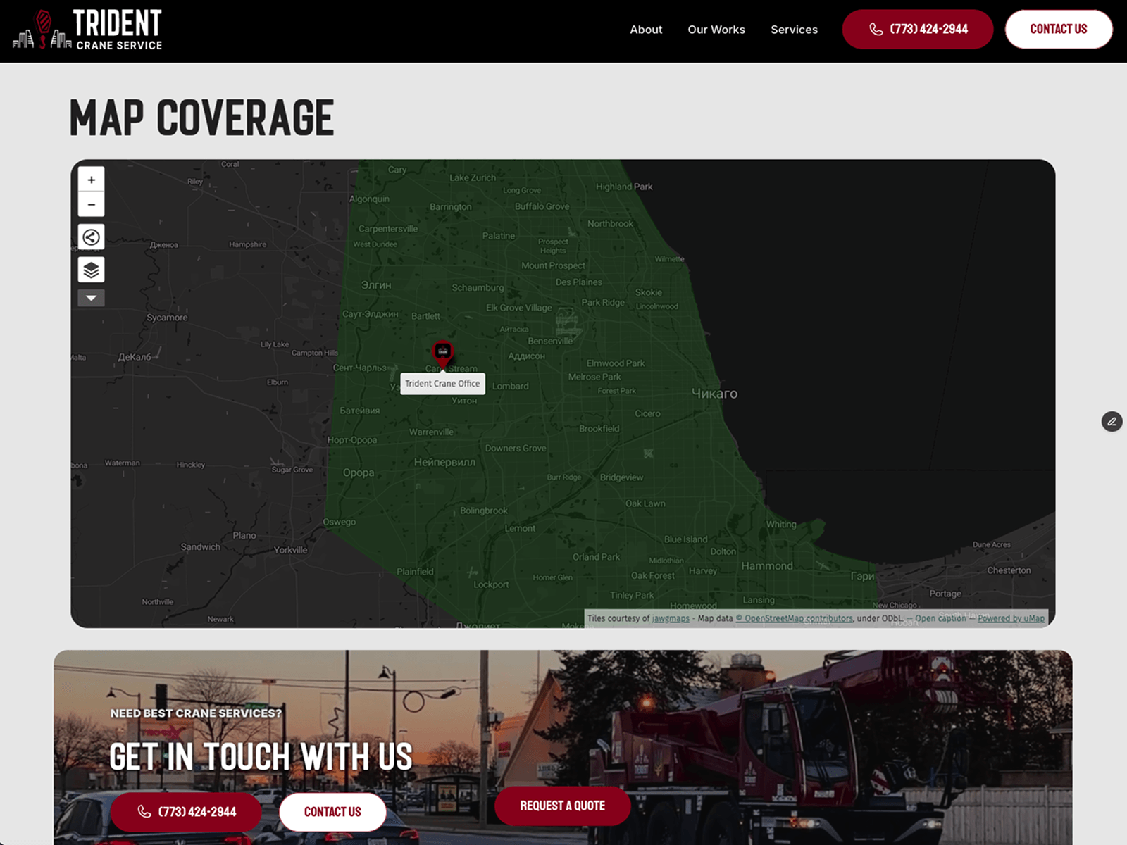
Built Trident Crane — a crane and lifting company in Illinois.
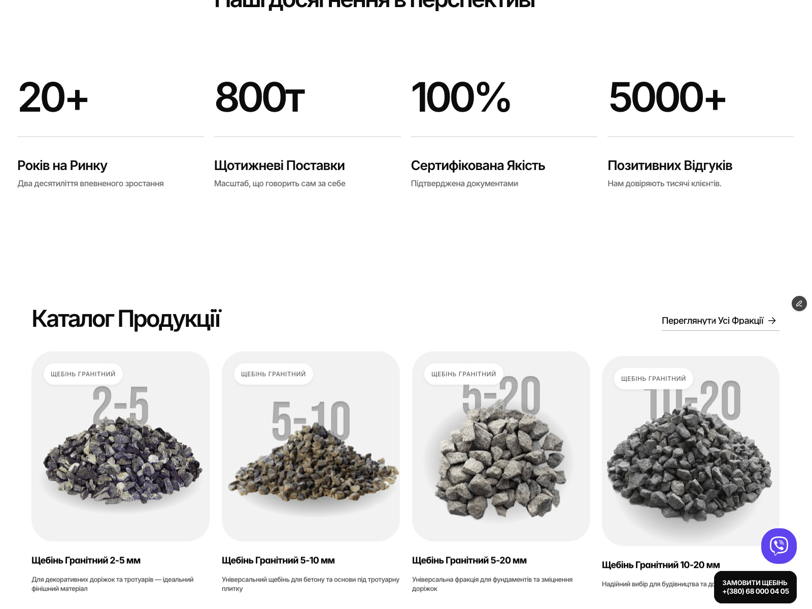
Industrial B2B is a different problem than a portfolio site. Nobody browses. A site manager needs a crane by Thursday, so the whole build is speed to quote: number in every viewport, union credentials above the fold, one page per service and city for local search.
Framer + CMS, interactive coverage map, six service pages.
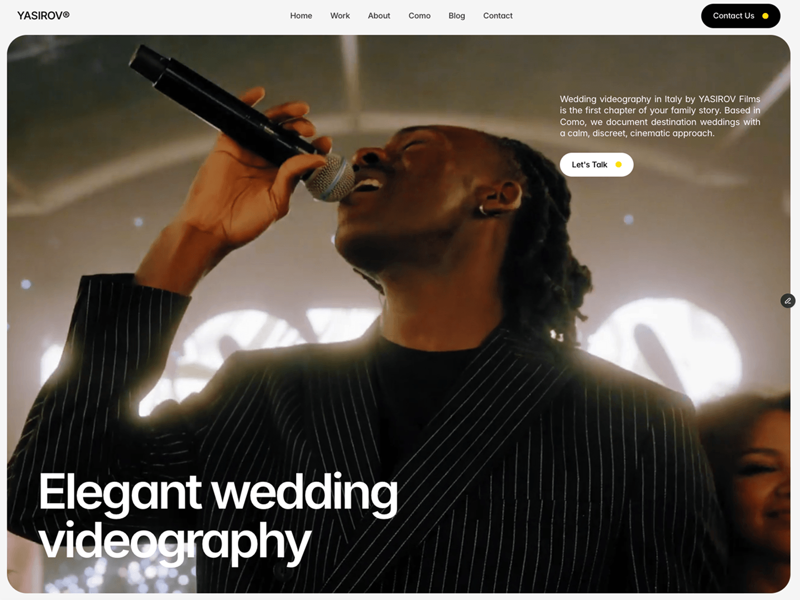
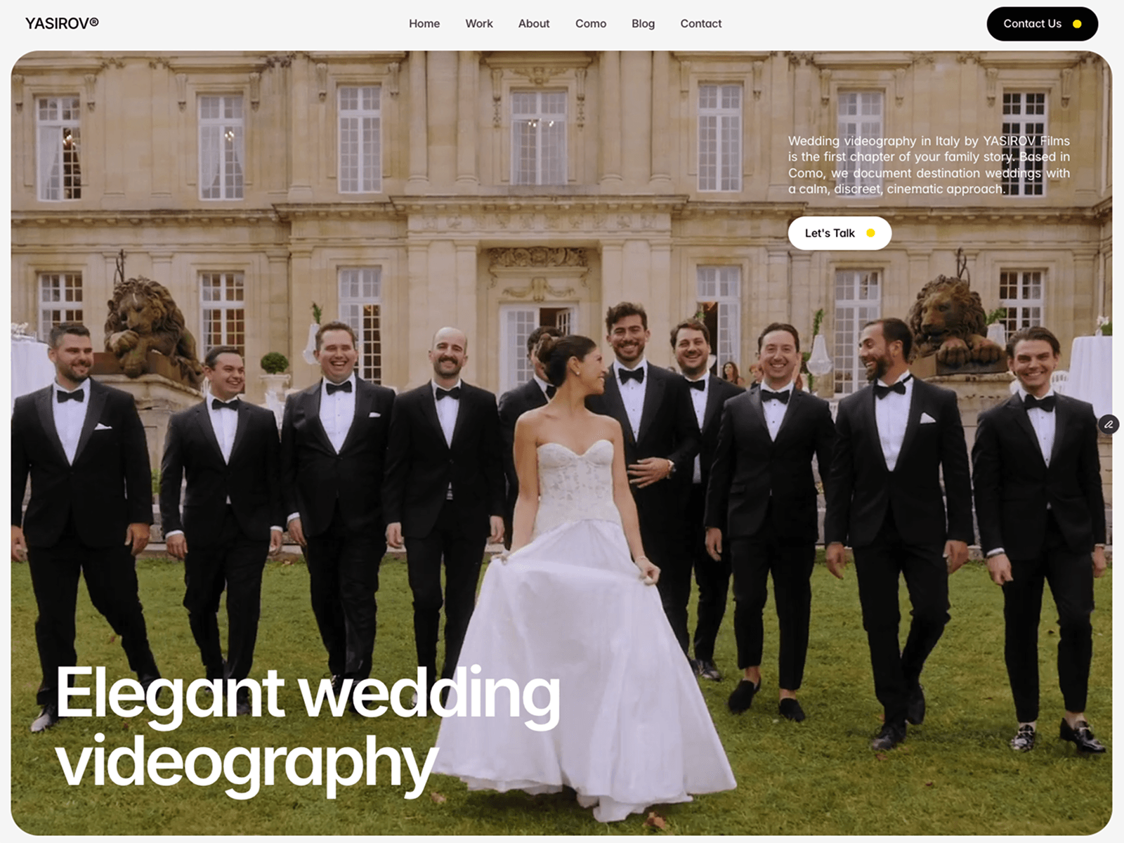
Wedding videography studio on Lake Como — built in Framer.
Full-bleed video hero, editorial type, CMS-driven film gallery. The work does the selling, the interface gets out of the way.
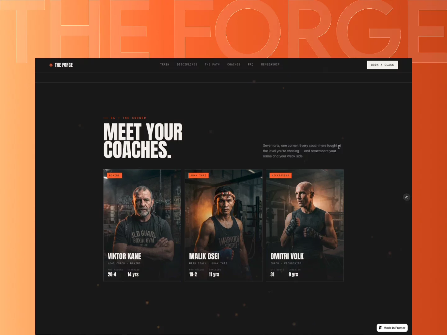
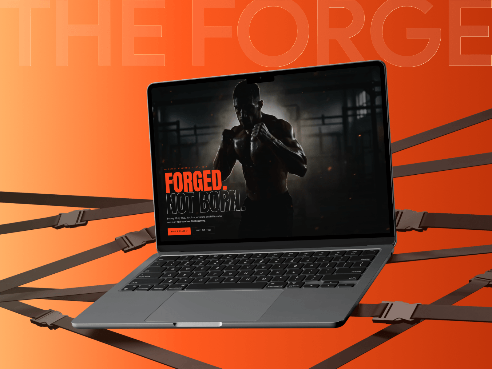
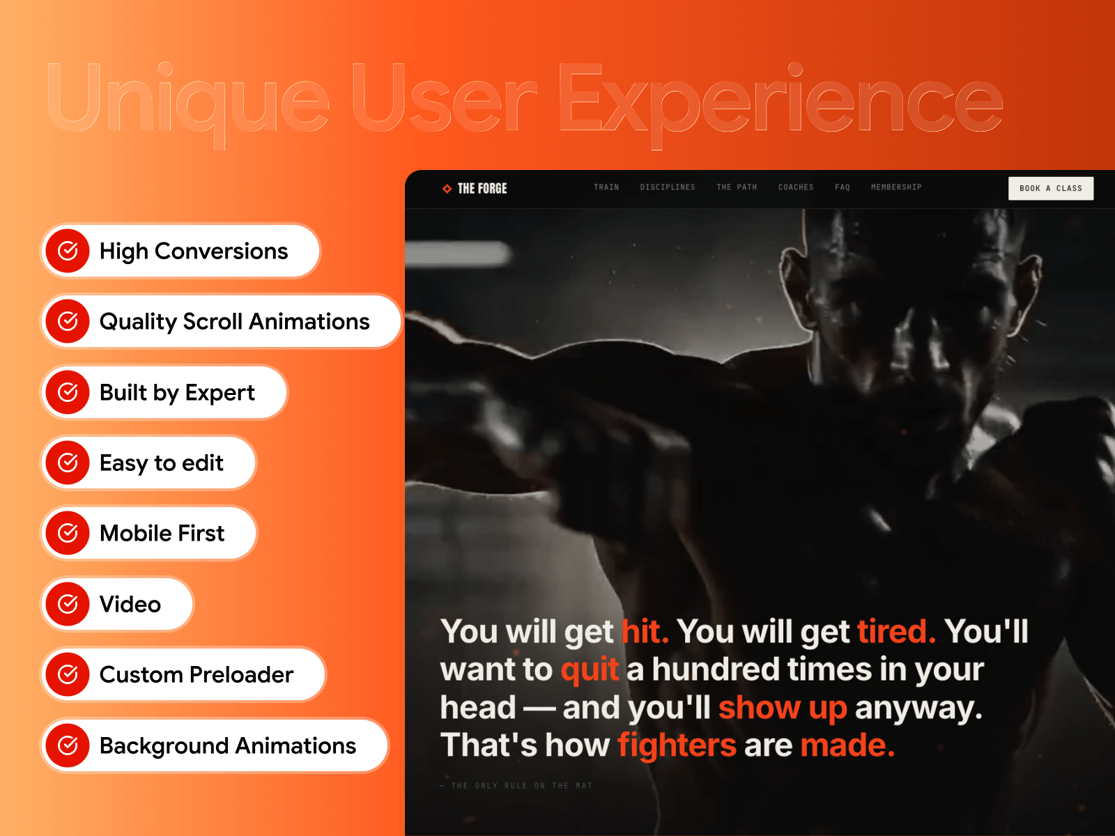
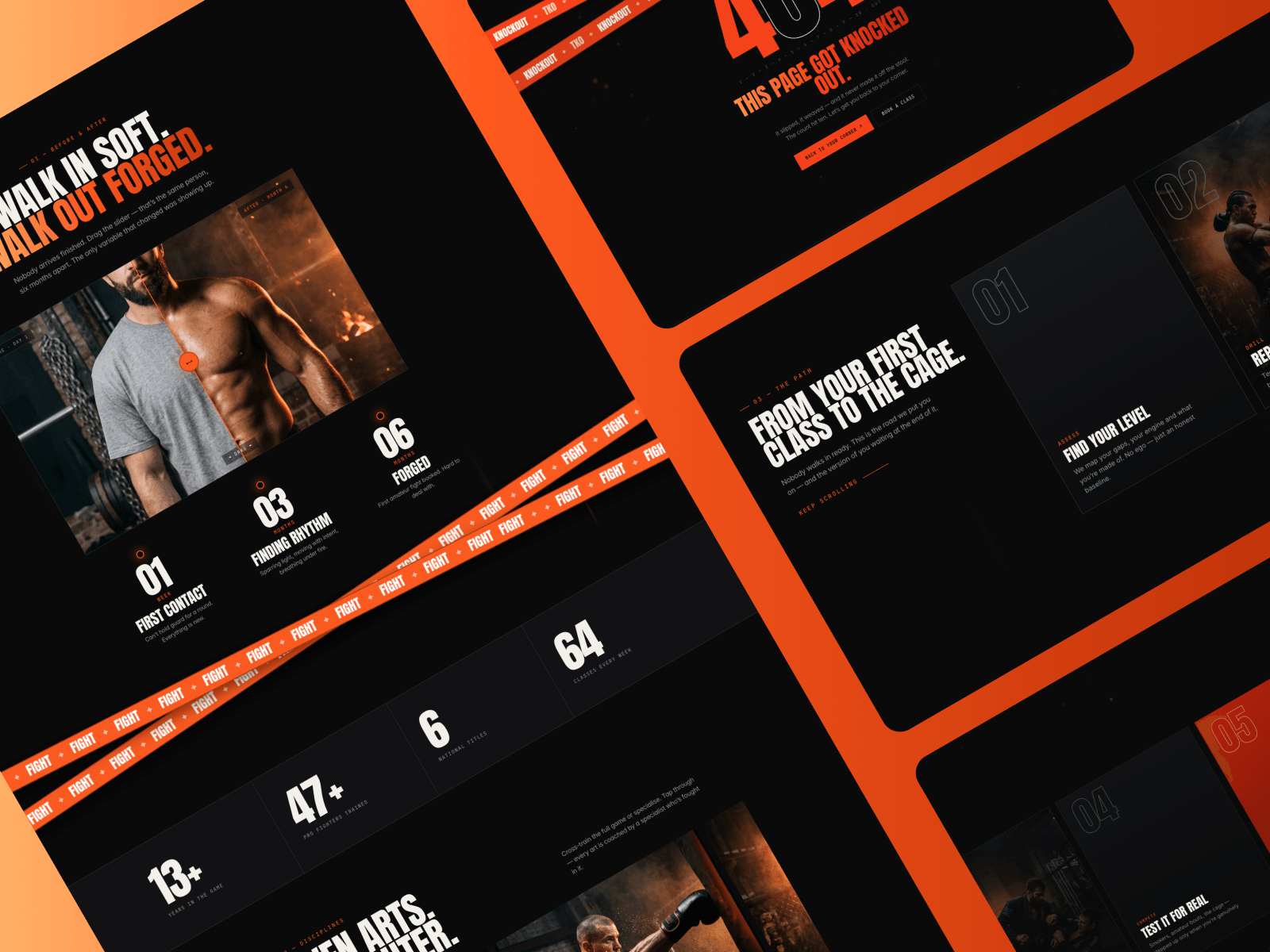
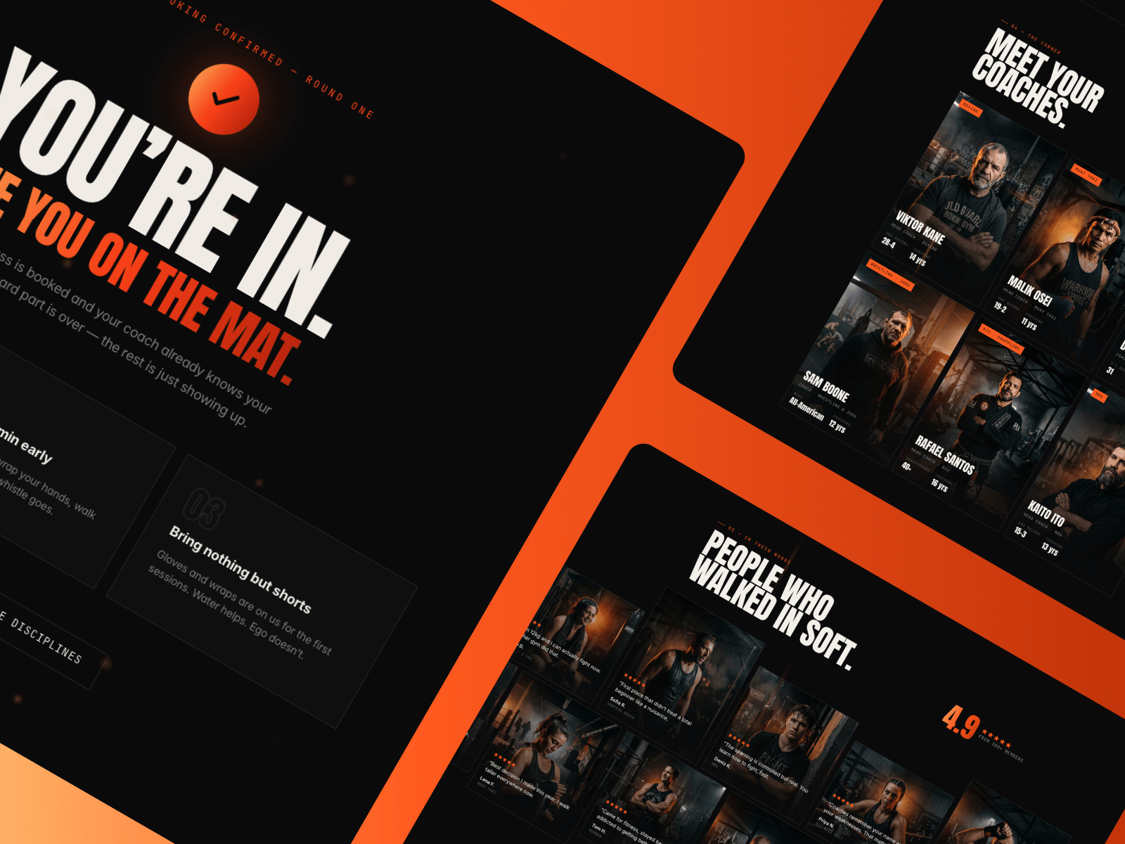
Hey everyone — just finished TheForge, a template for fight gyms 🥊
Most gym templates feel like soft fitness landing pages. Combat gyms sell something else entirely: intensity, respect, transformation. So I built one that actually looks like the room it's selling.
What's in it:
• Cinematic preloader that flies you into the site
• Hero video that scrubs as you scroll
• Before / after drag slider — the strongest proof a gym has
• Seven disciplines on an animated sliding track
• Pinned horizontal "The Path" section, fully native
• Coach cards, review marquee, pricing, FAQ
• Booking modal with a thank-you flow
Fully responsive, SEO-ready, and built from native components — every text layer is editable on the canvas.
Live demo → https://getforged.framer.website
Feedback very welcome 🙌