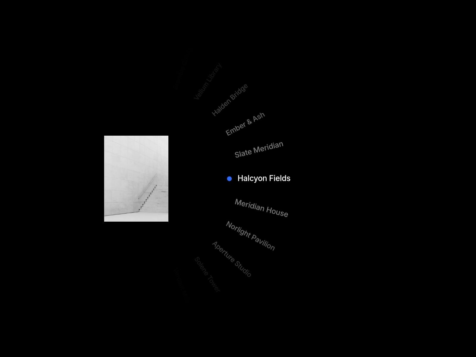
About this Component
Bring your visuals to life with a cinematic fullscreen slider built for smooth, immersive browsing.
This component combines scroll, drag, swipe, keyboard, and thumbnail navigation with polished animated transitions — perfect for portfolios, galleries, editorial layouts, and modern landing pages.
Unlike basic sliders, this is fully responsive by design
No messy setup. No fixed layout issues. No code edits required.
Just drop it into Framer, add your images, customize the controls, and it works.
Perfect For:
Portfolio showcases Editorial image stories Agency project highlights Photography galleries Product or campaign presentations Immersive landing page sections
Key Features:
Fully responsive across all breakpoints (desktop, tablet, mobile) Smooth fullscreen image transitions Hover-reactive thumbnail strip Animated line indicator system Editable top-left and top-right text Native Framer font controls Customizable colors, spacing, sizing, and transition timing No external setup required
How to Use:
Drop the component into your Framer project Upload your slide images and titles Customize the top-left and top-right text Adjust thumbnail size, spacing, fonts, colors, and transition timing
Important Note
This component is fully responsive and tested across breakpoints. It scales fluidly without layout breaking or fixed-width issues, making it safe to use in real production layouts.
Questions? Reach out at hasanwali6890@gmail.com
Refund Policy
All sales are final upon purchase as this is a non-tangible digital product. A refund is offered only if the component suffers a critical technical failure that prevents its core function and cannot be resolved within a reasonable timeframe. Refunds are not issued for buyer's remorse, aesthetic preference, or modifications made after purchase. Report confirmed technical failures with evidence within 14 days of purchase.

About this Component
Bring your visuals to life with a cinematic fullscreen slider built for smooth, immersive browsing.
This component combines scroll, drag, swipe, keyboard, and thumbnail navigation with polished animated transitions — perfect for portfolios, galleries, editorial layouts, and modern landing pages.
Unlike basic sliders, this is fully responsive by design
No messy setup. No fixed layout issues. No code edits required.
Just drop it into Framer, add your images, customize the controls, and it works.
Perfect For:
Portfolio showcases Editorial image stories Agency project highlights Photography galleries Product or campaign presentations Immersive landing page sections
Key Features:
Fully responsive across all breakpoints (desktop, tablet, mobile) Smooth fullscreen image transitions Hover-reactive thumbnail strip Animated line indicator system Editable top-left and top-right text Native Framer font controls Customizable colors, spacing, sizing, and transition timing No external setup required
How to Use:
Drop the component into your Framer project Upload your slide images and titles Customize the top-left and top-right text Adjust thumbnail size, spacing, fonts, colors, and transition timing
Important Note
This component is fully responsive and tested across breakpoints. It scales fluidly without layout breaking or fixed-width issues, making it safe to use in real production layouts.
Questions? Reach out at hasanwali6890@gmail.com
Refund Policy
All sales are final upon purchase as this is a non-tangible digital product. A refund is offered only if the component suffers a critical technical failure that prevents its core function and cannot be resolved within a reasonable timeframe. Refunds are not issued for buyer's remorse, aesthetic preference, or modifications made after purchase. Report confirmed technical failures with evidence within 14 days of purchase.
 Hasan Wali