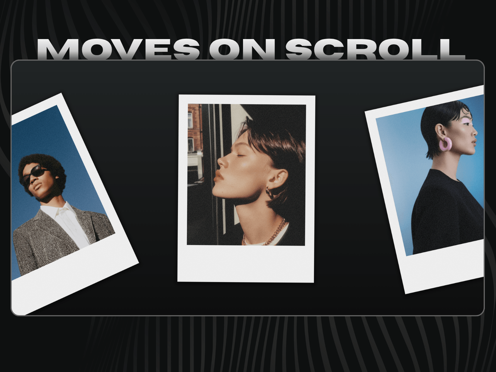
Most scroll text reveal components require you to enter text in the control panel, which breaks your ability to apply global text styles in Framer.
Text Reveal Scroll works differently..
Instead of replacing the native text layer, it works directly with your existing text. This preserves all styles applied from the global assets panel, ensuring your font size, weight, color, letter spacing, and line height remain exactly as designed.
You keep full control over your typography, while the component adds a smooth, cinematic scroll-driven text animation on top.
Add this component to the canvas on the desktop breakpoint.
Place a Text layer outside the desktop breakpoint.
Wrap the Text layer in a Stack.
Set the Text layer's width to "Fill" so it will be responsive across screens.
In the component's property panel, use the "Text" property control to connect that Text layer.
You can configure the component settings from the right-side control panel.
The animation works in Preview and live site (not inside canvas)
Start %: Defines where the reveal begins in the viewport.
End %: Defines where the reveal completes
Dim Opacity: Controls opacity of unrevealed text (subtle ghost → fully hidden)
Reveal By: Choose between:
Characters → letter by letter reveal
Words → smoother word-by-word animation
Font Size: Toggle between Global (uses the connected Text layer's style) or Custom (set a fixed px size).
Style-safe text splitting: Preserves all Framer typography styles.
Scroll-driven reveal: True scroll-driven text animation.
Smooth progressive animation: Partial opacity transitions create a cinematic text opacity scroll effect.
Performance optimized: Uses passive scroll listeners and efficient DOM updates.
Support CMS: Works with dynamically loaded content.
Made with ❤️ by Soyeb
Have questions or need a custom Framer component? Reach out at heysoyebali@gmail.com

Most scroll text reveal components require you to enter text in the control panel, which breaks your ability to apply global text styles in Framer.
Text Reveal Scroll works differently..
Instead of replacing the native text layer, it works directly with your existing text. This preserves all styles applied from the global assets panel, ensuring your font size, weight, color, letter spacing, and line height remain exactly as designed.
You keep full control over your typography, while the component adds a smooth, cinematic scroll-driven text animation on top.
Add this component to the canvas on the desktop breakpoint.
Place a Text layer outside the desktop breakpoint.
Wrap the Text layer in a Stack.
Set the Text layer's width to "Fill" so it will be responsive across screens.
In the component's property panel, use the "Text" property control to connect that Text layer.
You can configure the component settings from the right-side control panel.
The animation works in Preview and live site (not inside canvas)
Start %: Defines where the reveal begins in the viewport.
End %: Defines where the reveal completes
Dim Opacity: Controls opacity of unrevealed text (subtle ghost → fully hidden)
Reveal By: Choose between:
Characters → letter by letter reveal
Words → smoother word-by-word animation
Font Size: Toggle between Global (uses the connected Text layer's style) or Custom (set a fixed px size).
Style-safe text splitting: Preserves all Framer typography styles.
Scroll-driven reveal: True scroll-driven text animation.
Smooth progressive animation: Partial opacity transitions create a cinematic text opacity scroll effect.
Performance optimized: Uses passive scroll listeners and efficient DOM updates.
Support CMS: Works with dynamically loaded content.
Made with ❤️ by Soyeb
Have questions or need a custom Framer component? Reach out at heysoyebali@gmail.com