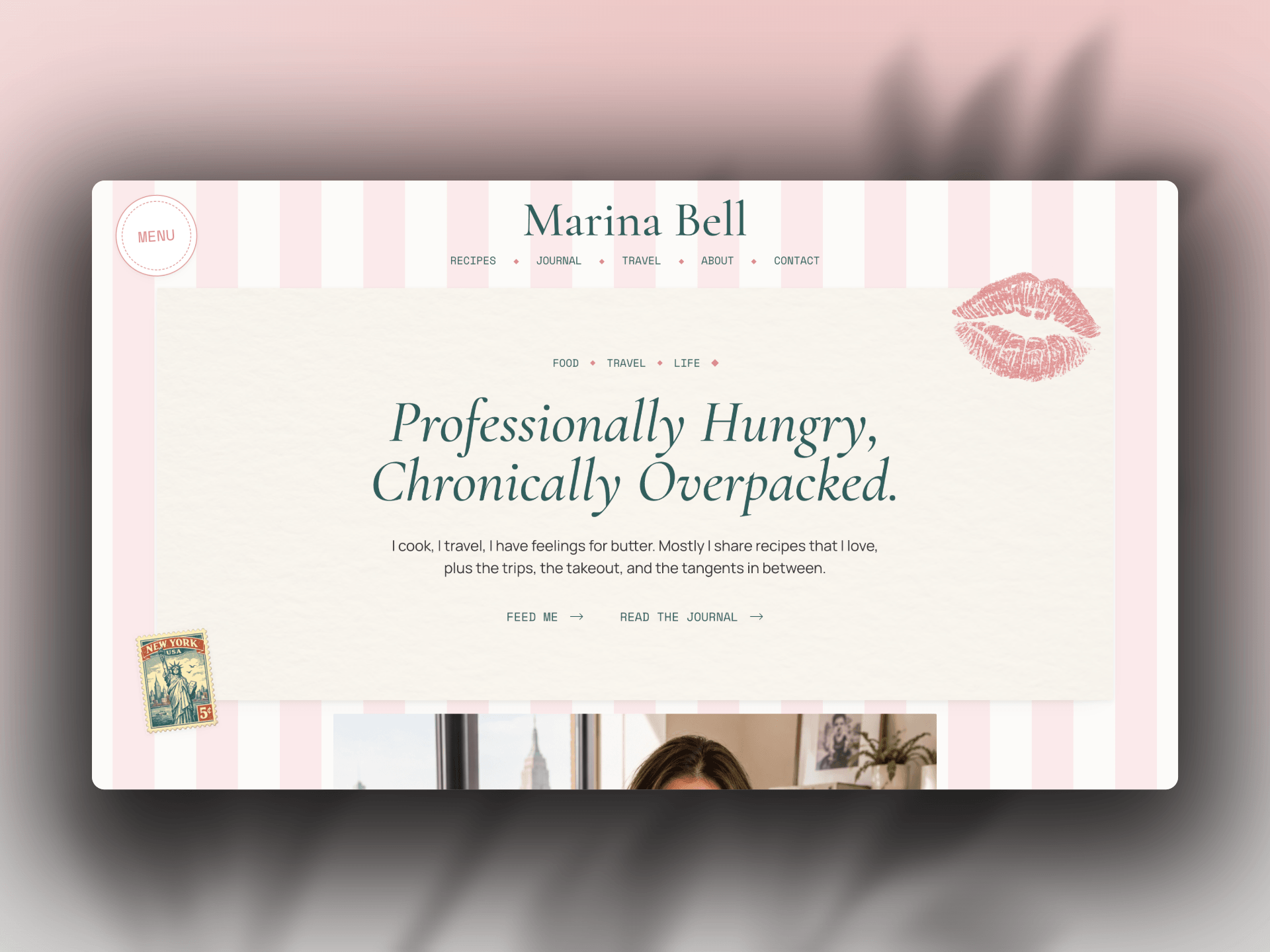
Marina Bell is a warm, editorial Framer template created for food writers, recipe developers, travel storytellers, and lifestyle creators.
Inspired by well-loved cookbooks, Euro summers, vintage postcards, and collected travel ephemera, the design combines expressive typography with layered photography, paper textures, tape details, stamps, and playful motion. Every page feels personal and considered while remaining easy to customize.
The template includes dedicated experiences for recipes, journal entries, travel guides, an about page, contact forms, newsletter sections, legal pages, and detailed CMS content. Responsive layouts are thoughtfully designed across desktop, tablet, and mobile—not simply scaled down.
A complete set of buyer documentation is included directly inside the Framer project, covering the design system, CMS collections, newsletter setup, and essential customization steps.
Perfect for creators who want the character of an independent editorial publication with the flexibility and performance of Framer.
Responsive desktop, tablet, and mobile layouts
Recipe, journal, and travel CMS collections
Fully designed CMS detail pages
Filtering and Load More functionality
Reusable card, navigation, newsletter, and interface components
Native Framer contact forms with complete interaction states
Editorial animations and scroll effects
Custom menu and responsive navigation
Design System Overview
CMS and newsletter setup instructions
SEO-ready page structure and metadata
Accessible, customizable color and typography styles

Marina Bell is a warm, editorial Framer template created for food writers, recipe developers, travel storytellers, and lifestyle creators.
Inspired by well-loved cookbooks, Euro summers, vintage postcards, and collected travel ephemera, the design combines expressive typography with layered photography, paper textures, tape details, stamps, and playful motion. Every page feels personal and considered while remaining easy to customize.
The template includes dedicated experiences for recipes, journal entries, travel guides, an about page, contact forms, newsletter sections, legal pages, and detailed CMS content. Responsive layouts are thoughtfully designed across desktop, tablet, and mobile—not simply scaled down.
A complete set of buyer documentation is included directly inside the Framer project, covering the design system, CMS collections, newsletter setup, and essential customization steps.
Perfect for creators who want the character of an independent editorial publication with the flexibility and performance of Framer.
Responsive desktop, tablet, and mobile layouts
Recipe, journal, and travel CMS collections
Fully designed CMS detail pages
Filtering and Load More functionality
Reusable card, navigation, newsletter, and interface components
Native Framer contact forms with complete interaction states
Editorial animations and scroll effects
Custom menu and responsive navigation
Design System Overview
CMS and newsletter setup instructions
SEO-ready page structure and metadata
Accessible, customizable color and typography styles
 Troy Miller