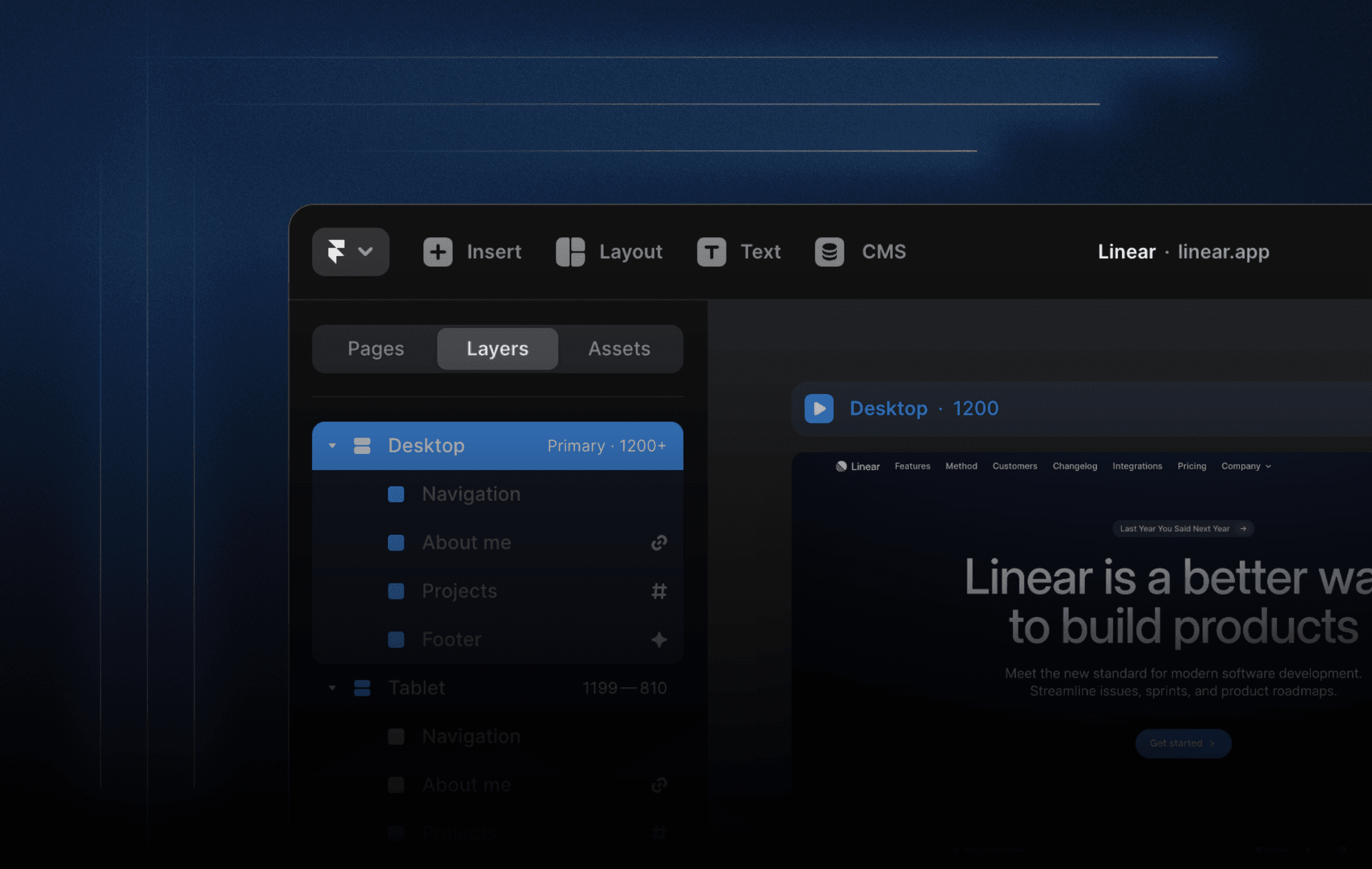
Here’s a project that you can remix to learn: how to set up an animated segmented control, how to combine it with other components using events, how to make an auto-playing gallery.
I’m excited to share a free project to help you learn how to create an animated segmented control, combine it with other components using events, and make an auto-playing gallery. The best part? You can remix the project and customize it to fit your needs!
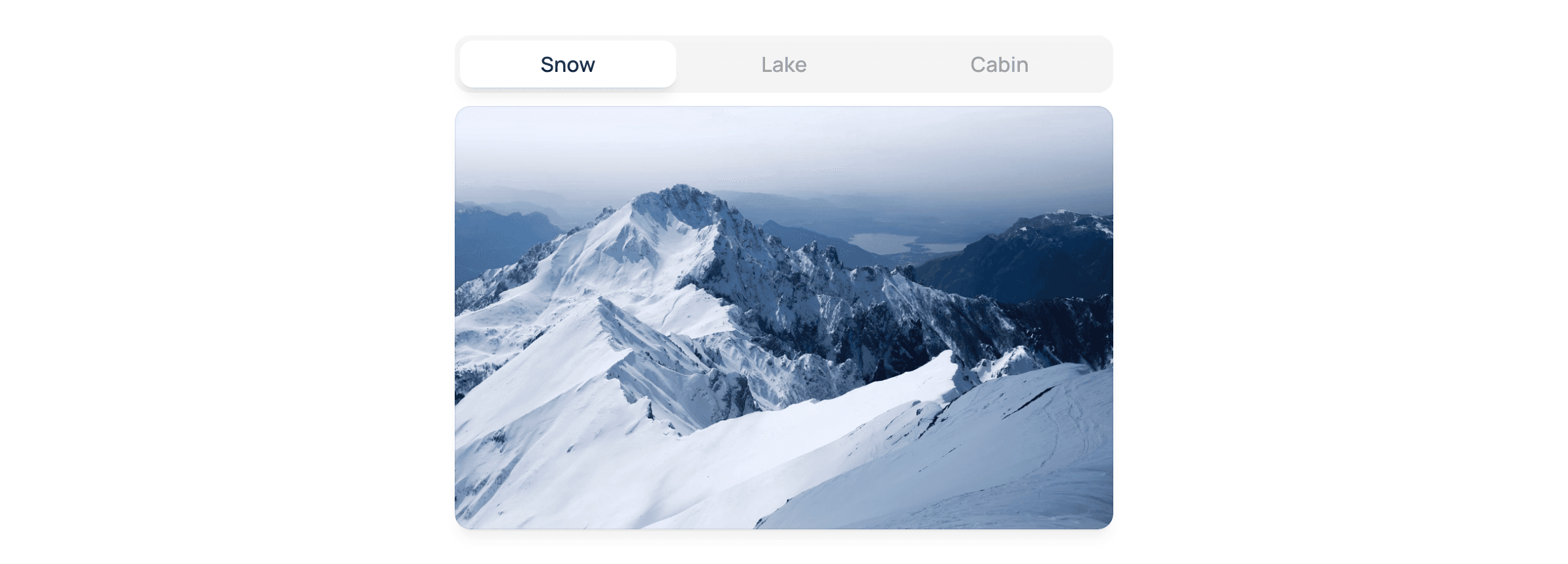
Control Component
Let’s start by taking a closer look at the Control component. It consists of two stacks on top of each other. The top stack contains clickable items that transition to different variants and fire events for each click. This is important because we will use these events later on, to switch to the correct variant in the Gallery component.
The bottom stack controls where the button should be. Animating the active state moves the active button to another position in each variant, and Framer does the rest. This makes it easy to create a polished and professional-looking segmented control.
Auto-Playing Gallery
Next, let’s take a look at the Photos component. This simple component comprises a few photos on top of each other, with the opacity values swapped in each variant. We can quickly create an auto-playing gallery that transitions to the next photo after a set time using variants.
Gallery Component
Now, we combine the Control and Photos components into a Gallery component. Here we create three variants and set both components to the correct variants. Using the events we set up in the Control component earlier, we can ensure we switch to the correct variant in the Gallery component when these events fire.
Customize and Reuse Your Gallery Component
Finally, we add simple appearance interactions on the variants, automatically allowing us to transition to the following variant after a set time. As a bonus, we expose the variables of both the Control and the Photos components through the Gallery component, making it reusable and easy to hook up to the CMS.
Conclusion
Overall, this project is a great way to learn how to create a reusable, responsive gallery component without writing code. And if you want to customize it further, you can easily remix the project and make it your own. So what are you waiting for? Dive in and start learning!
I’m excited to share a free project to help you learn how to create an animated segmented control, combine it with other components using events, and make an auto-playing gallery. The best part? You can remix the project and customize it to fit your needs!
Control Component
Let’s start by taking a closer look at the Control component. It consists of two stacks on top of each other. The top stack contains clickable items that transition to different variants and fire events for each click. This is important because we will use these events later on, to switch to the correct variant in the Gallery component.
The bottom stack controls where the button should be. Animating the active state moves the active button to another position in each variant, and Framer does the rest. This makes it easy to create a polished and professional-looking segmented control.
Auto-Playing Gallery
Next, let’s take a look at the Photos component. This simple component comprises a few photos on top of each other, with the opacity values swapped in each variant. We can quickly create an auto-playing gallery that transitions to the next photo after a set time using variants.
Gallery Component
Now, we combine the Control and Photos components into a Gallery component. Here we create three variants and set both components to the correct variants. Using the events we set up in the Control component earlier, we can ensure we switch to the correct variant in the Gallery component when these events fire.
Customize and Reuse Your Gallery Component
Finally, we add simple appearance interactions on the variants, automatically allowing us to transition to the following variant after a set time. As a bonus, we expose the variables of both the Control and the Photos components through the Gallery component, making it reusable and easy to hook up to the CMS.
Conclusion
Overall, this project is a great way to learn how to create a reusable, responsive gallery component without writing code. And if you want to customize it further, you can easily remix the project and make it your own. So what are you waiting for? Dive in and start learning!

Step into the future of design
Step into the future of design
Step into the future of design
Join thousands using Framer to build high-performing websites fast.
Join thousands using Framer to build high-performing websites fast.
Join thousands using Framer to build high-performing websites fast.