Framer’s new video button from their homepage has been making waves lately. It’s a cool feature that adds a touch of cinematic flair to your website. In this tutorial, Aleks will show you how to create your own cinematic video button in Framer.
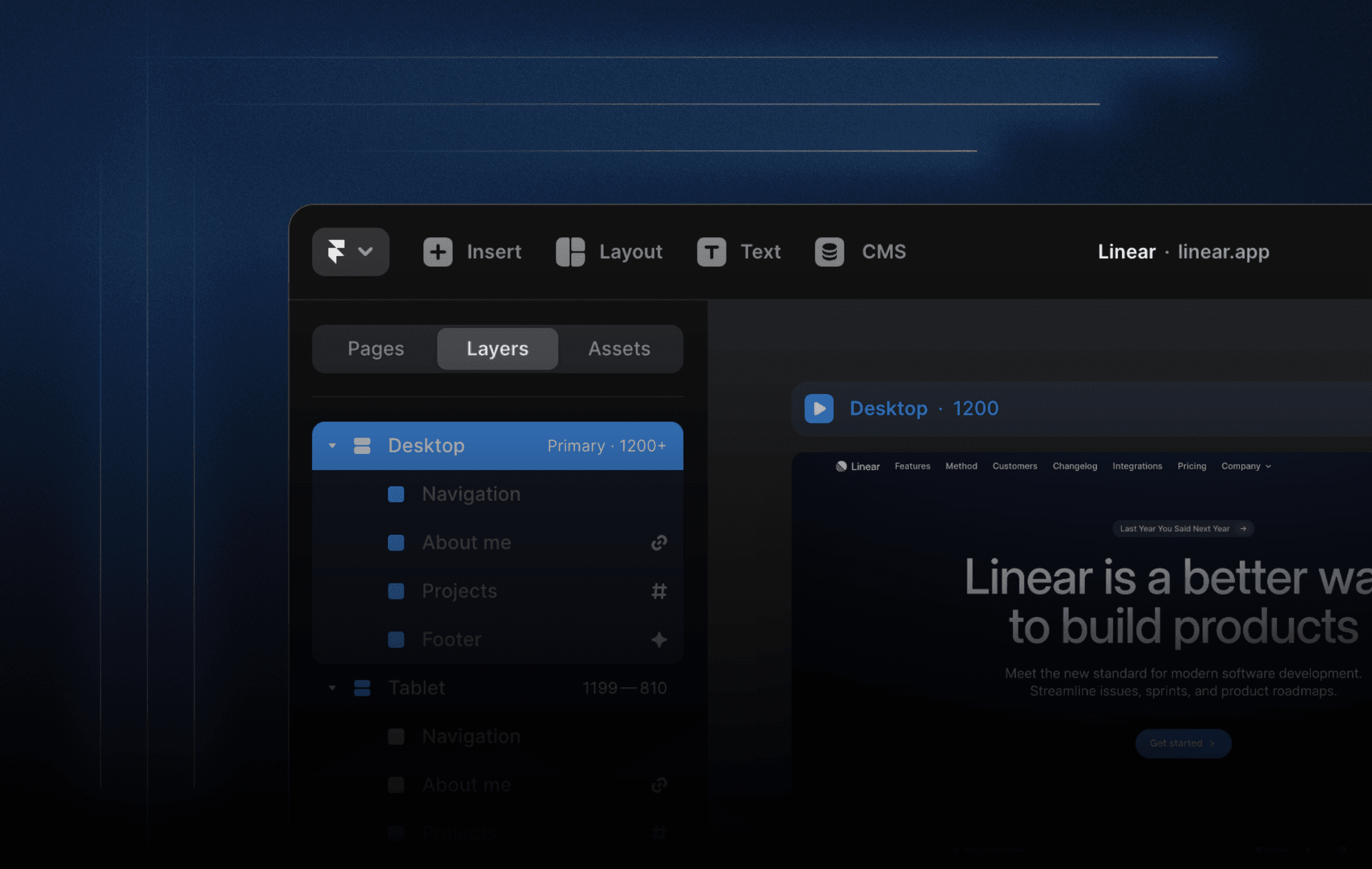
Step 1: Draw a Frame and Insert a Video
Begin by drawing a frame, which will serve as the background of your button. You can resize the frame and round the corners to your liking. Once you have your frame, insert a video and scale it up to the width of your button. Drag the video into your frame and upload it.
Step 2: Add Text and Style Your Button
Next, add text and an icon to your button. Style it however you want. With both the text and icon selected, hit ⌥ +⌘+ ⏎ to add a stack. Then drag the stack into the frame. To make your text more readable, lower the video's opacity a little bit.
Step 3: Create a Component
Select your button and create a component. Add a variant, and up the video opacity back to 1. Add a pointer cursor to the primary variant. Finally, link up the variants using "mouse enter/leave."
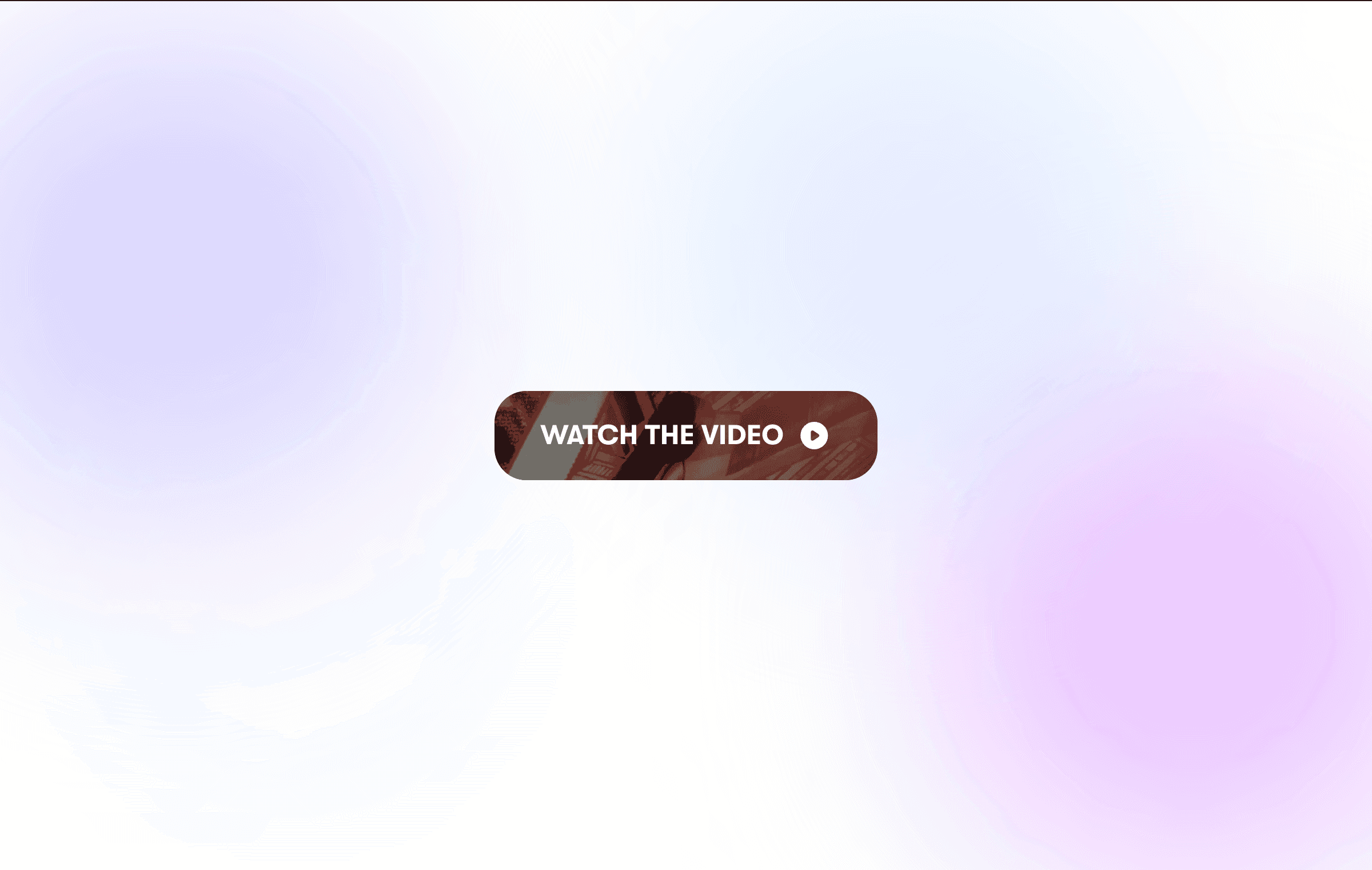
Step 4: Add a Hover Effect (Optional)
You can stop here, but if you want to add an extra touch of flair, you can add a hover effect. Select your button component and add an overlay. Style it however you want, then drag in another video block. Resize the video block, round the corners, and upload the same video you used for the button.
Step 1: Draw a Frame and Insert a Video
Begin by drawing a frame, which will serve as the background of your button. You can resize the frame and round the corners to your liking. Once you have your frame, insert a video and scale it up to the width of your button. Drag the video into your frame and upload it.
Step 2: Add Text and Style Your Button
Next, add text and an icon to your button. Style it however you want. With both the text and icon selected, hit ⌥ +⌘+ ⏎ to add a stack. Then drag the stack into the frame. To make your text more readable, lower the video's opacity a little bit.
Step 3: Create a Component
Select your button and create a component. Add a variant, and up the video opacity back to 1. Add a pointer cursor to the primary variant. Finally, link up the variants using "mouse enter/leave."
Step 4: Add a Hover Effect (Optional)
You can stop here, but if you want to add an extra touch of flair, you can add a hover effect. Select your button component and add an overlay. Style it however you want, then drag in another video block. Resize the video block, round the corners, and upload the same video you used for the button.

Step into the future of design
Step into the future of design
Step into the future of design
Join thousands using Framer to build high-performing websites fast.
Join thousands using Framer to build high-performing websites fast.
Join thousands using Framer to build high-performing websites fast.