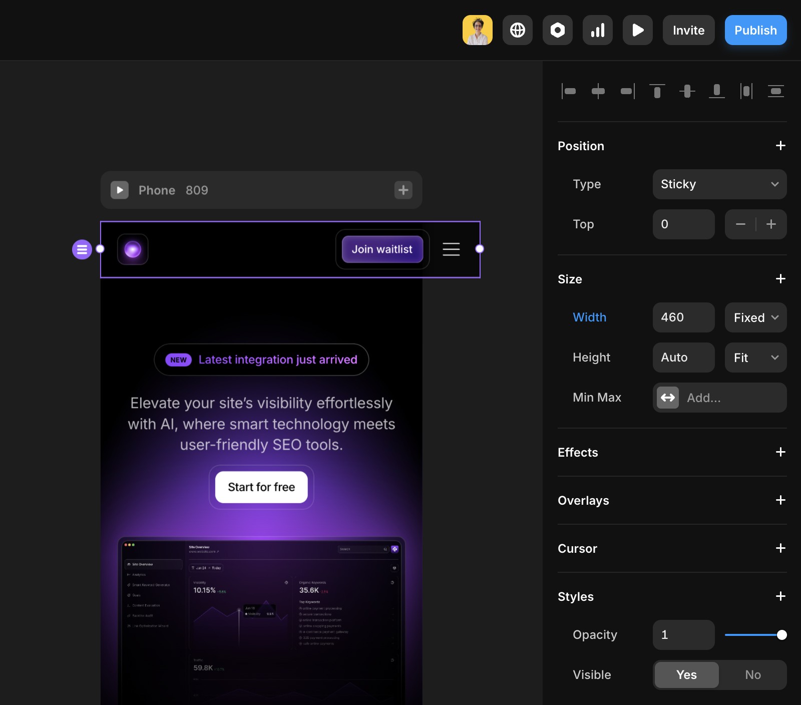
Why is my site not filling the screen on the Phone breakpoint?
Learn how to fix your site if it isn't filling the screen on a phone breakpoint.
Why is your site not filling the screen on a mobile viewport?
The most common cause is an element on your page that is wider than the mobile viewport.
Identify problematic elements
Look for elements with:
Fixed widths (e.g.,
321px) instead of responsive widths like100%or1fr.Max Width settings that are too large for mobile screens.
Fixed widths and overly large Max Width settings prevent elements from resizing properly on smaller screens.
Adjust the width settings
Change fixed widths to relative units like percentages (
100%) or fractions (1fr).Remove or modify Max Width settings that exceed the mobile viewport.
Republish your site
Once adjustments are made:
Update your design.
Republish your site to apply the changes.

By following these steps, you should see your site properly filling the screen on the phone breakpoint, enhancing the user experience on mobile devices.
Still experiencing the issue after following the steps above? Feel free to reach out to us through our contact page for further help.