What’s new.

Light and Dark Mode

Light and Dark Mode

·

March 16, 2023

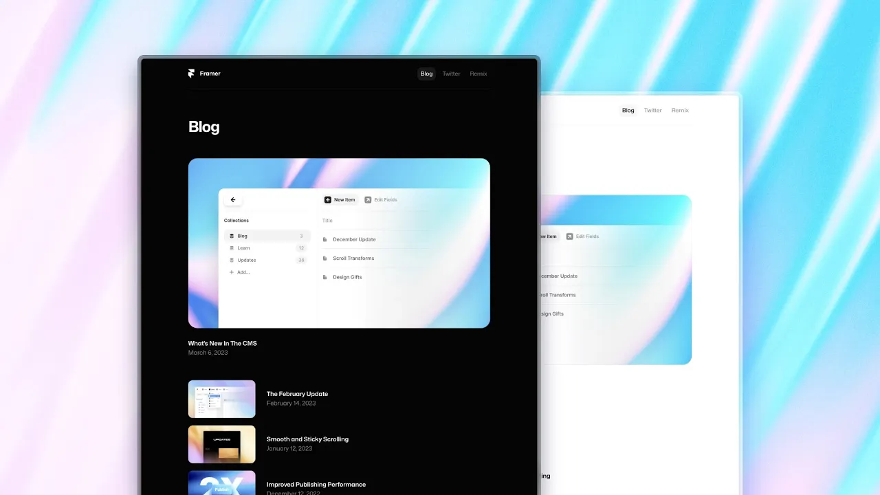
We’re excited to introduce Light and Dark Mode for your websites, with all new Color Styles. Add a Color Style, define a Light and Dark Theme, then use the Styles throughout your project. Color Styles with Themes even work within interactions and animations—from Effects to Components. You can now find these in the Assets panel as well, where they can be created and customized.

  • Color Styles can now have two themes: Light and Dark

  • Color Styles are now visible by default in the Fill pop-out

  • Color Styles can now be duplicated from anywhere

  • You can now find Color Styles within the Assets Panel

  • It’s now easier to differentiate Text and Link Styles in Assets

  • Text Styles now also preview Line Height, besides Size

  • We’ve refreshed the Color Picker and Styles UI

  • You can now pick custom colors with a Style selected

  • It’s now easier to rename both Text and Color Styles

  • We’ve renamed Shared Colors to Color Styles