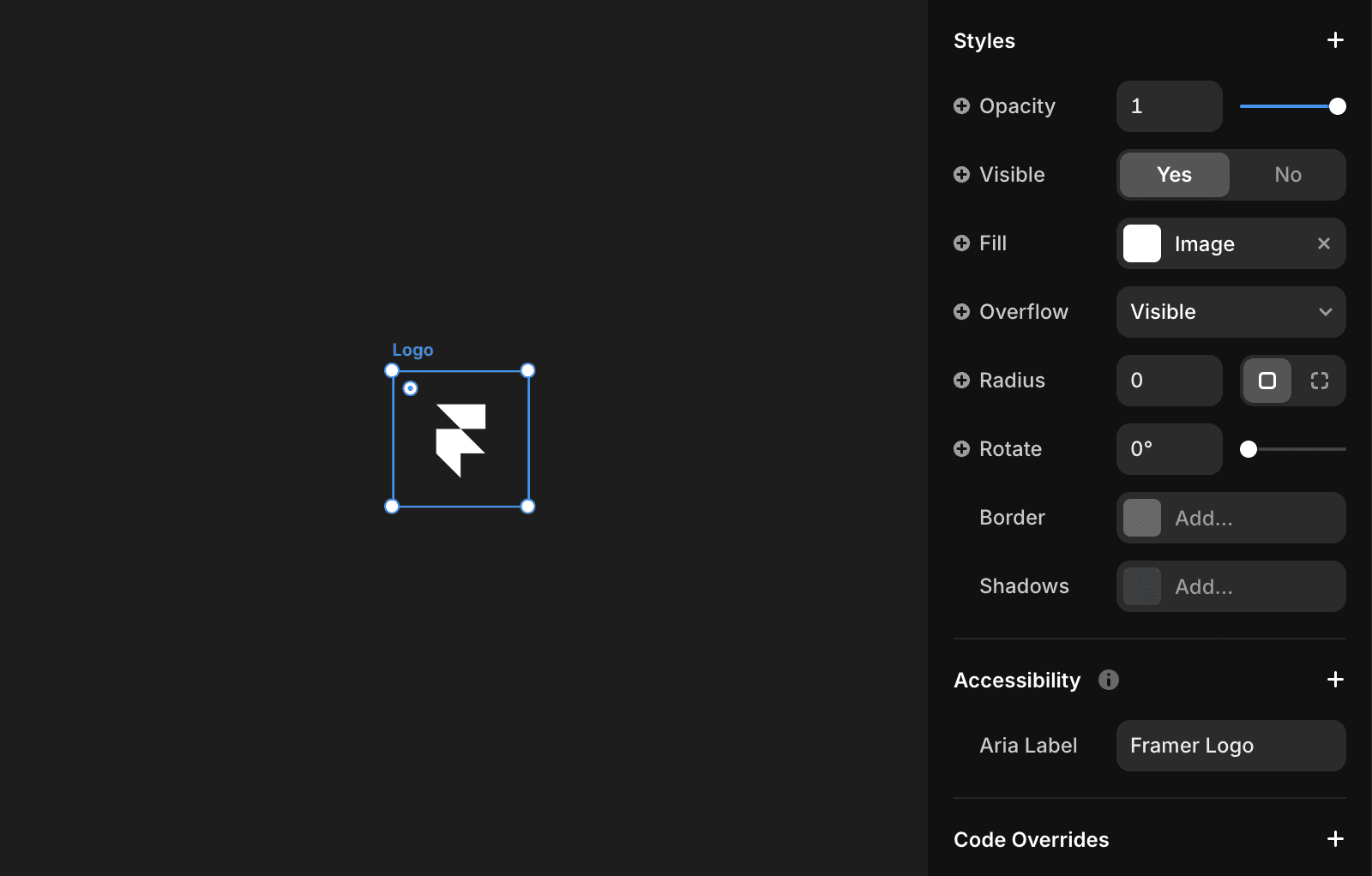
Improving Accessibility with ARIA Labels
Sometimes, elements on your website may lack a default accessible name or have a name that doesn’t accurately describe their content.
The aria-label attribute is helpful in such cases. It allows you to provide a concise label for an element, enhancing accessibility. This is particularly useful when elements lack visible text or when the visible text doesn’t fully convey their purpose or meaning. See Optimizing images, icons & interactive elements.
For example, a button’s accessible name is typically the text within its tags, an image’s name is its alt text, and a form input's name is the label text associated with it. However, when these are insufficient or missing, you can use the aria-label attribute to provide a clear, descriptive label.

Example
Consider a button with an icon for a social media share feature. Without a visible label, this button might be unclear for screen reader users. By using aria-label, you can explicitly define its purpose:
By incorporating tools like aria-label and other accessibility strategies, you can significantly enhance your website’s inclusivity and user-friendliness, ensuring a better experience for all users, including those with disabilities.
FAQ
What is the purpose of the aria-label attribute in web accessibility?
The aria-label attribute allows you to provide a concise label for an element, enhancing accessibility. This is particularly useful when elements lack visible text or when the visible text doesn’t fully convey their purpose or meaning.
When should I use aria-label instead of visible text or alt text?
You should use the aria-label attribute when the accessible name for an element is insufficient or missing. For example, if a button has no visible text or an image lacks descriptive alt text, aria-label can provide a clear, descriptive label to ensure accessibility.
Can you provide an example of using aria-label to improve accessibility?
Yes. For a button with an icon for a social media share feature and no visible label, you can use aria-label to define its purpose: <button aria-label="Share on Twitter"> <!-- Icon or content for Twitter share --> </button>. This makes the button's function clear to screen reader users.
Updated