Mobile navigation works in preview but not on mobile
If your navigation works in preview but behaves unexpectedly on a mobile device, you may need to adjust how interactions and transitions are set up.
FAQ
Why does my mobile navigation menu work in preview but not on a real mobile device?
On single-page sites, you might notice that the navigation menu closes but doesn’t scroll to the correct section, or it stays open but still scrolls to the intended section. On multi-page sites, the most common issue is that clicking a link doesn't navigate to the correct page at all. These issues are often caused by how interactions and transitions are set up in your mobile menu.
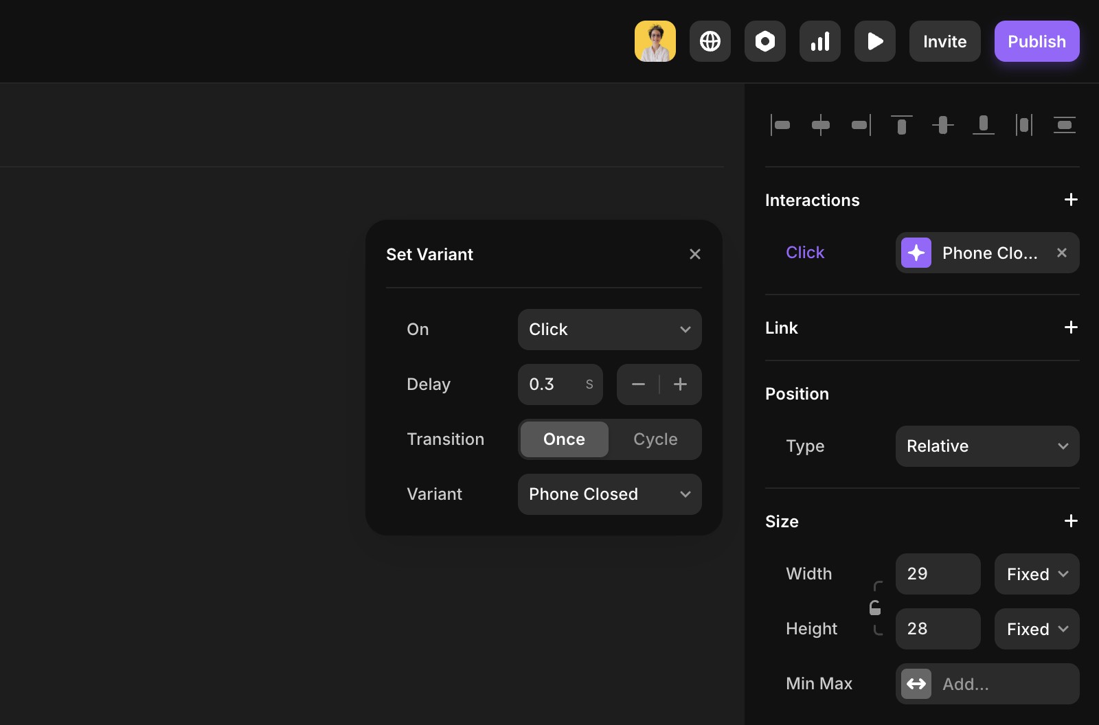
How can I fix mobile navigation issues in Framer?
Start by selecting the open variant of your mobile menu. Click the plus icon next to Interactions to add a transition. If your link uses an absolute URL, add a 0.1s delay to prevent issues on iOS. Then, set the closed phone variant as the target state. Finally, check for any overlapping interactions or delays on your menu links, and remove anything unnecessary.
What should I check if my mobile menu links are not working as expected?
Check for any overlapping interactions or delays on your menu links, and remove anything unnecessary. Also, ensure that if your link uses an absolute URL, you add a 0.1s delay to prevent issues, especially on iOS devices.
Updated