Setting up your Framer site for scale
In this guide, we offer tips for creating a scalable Framer website that evolves with your business.
FAQ
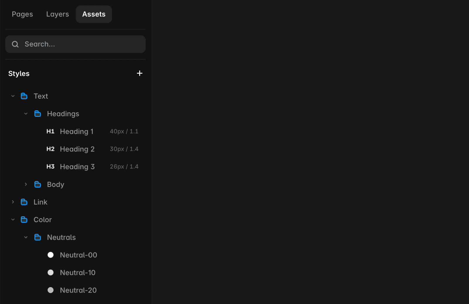
How do I set up a scalable design library in Framer?
To set up a scalable design library in Framer, define text styles for headings (H1, H2, etc.), paragraphs, and other elements. Add breakpoints so styles scale automatically across devices. Establish consistent color styles for backgrounds, text, and interactive elements, and set up dark and light values for theming. Create reusable components like buttons, navigation menus, or product cards, and use variants and variables to maximize flexibility.
What are best practices for creating flexible and responsive layouts in Framer?
Break down pages into modular sections (such as hero, features, testimonials) for easier rearrangement and scalability. Use stacks to create layouts that adjust automatically to content without manual changes. Start with a scalable design for the primary breakpoint, then add breakpoints and fine-tune for smaller displays.
How can I optimize my Framer site for performance and safe updates?
Test updates in a staging environment to ensure they are approved and functioning properly before deploying to the live site. Minimize animations, prefer YouTube or Vimeo over direct video uploads, and avoid unnecessary third-party scripts in custom code. For more tips, check out Framer’s site optimization resources.
Updated