13 best consulting website design examples
Here are 13 of the best consulting website examples, chosen for how effectively they combine visual design, positioning, and storytelling to communicate expertise, build credibility, and clearly articulate the value of their services. Each example offers concrete ideas and patterns worth emulating when designing a consulting website of your own.
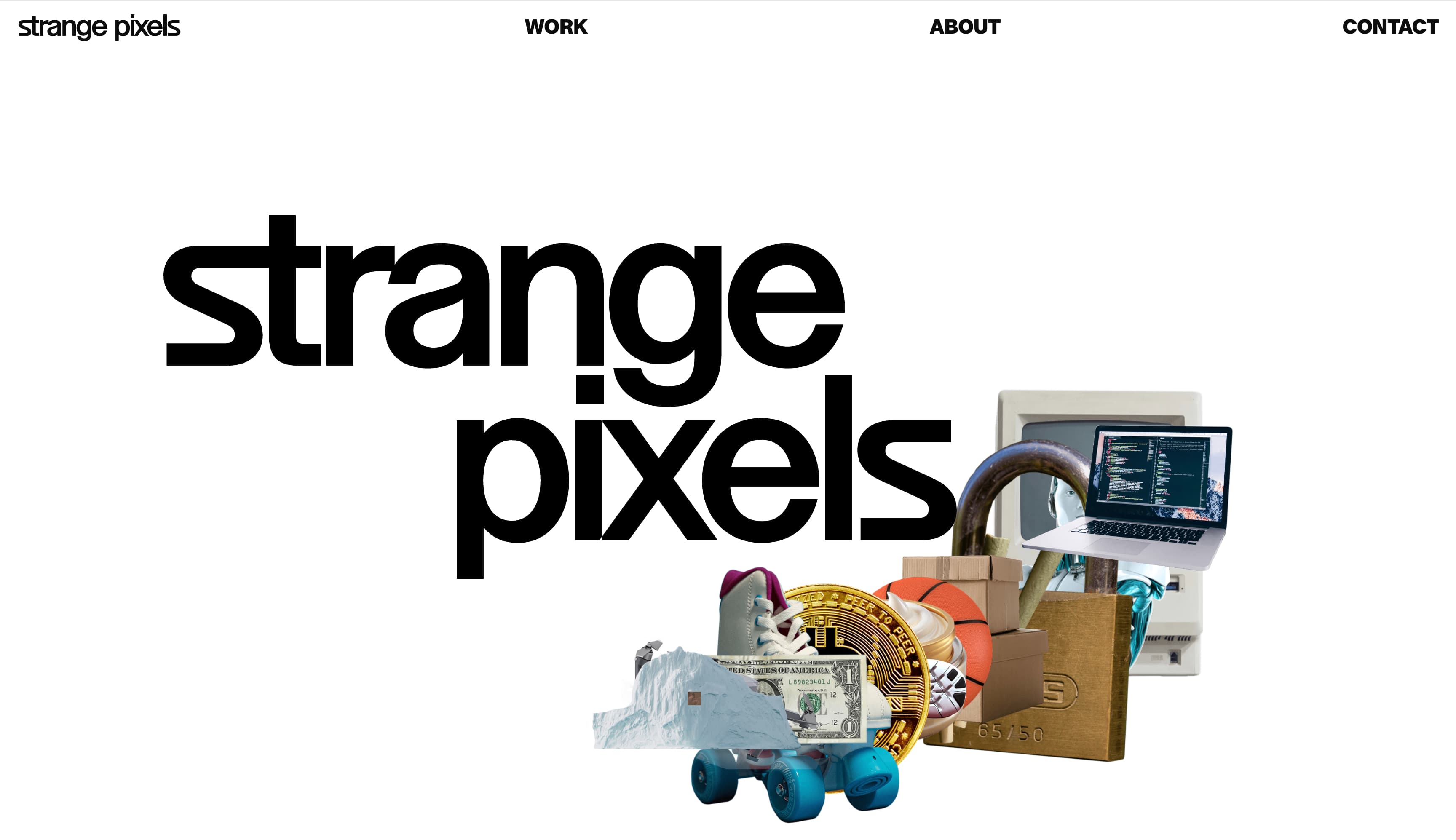
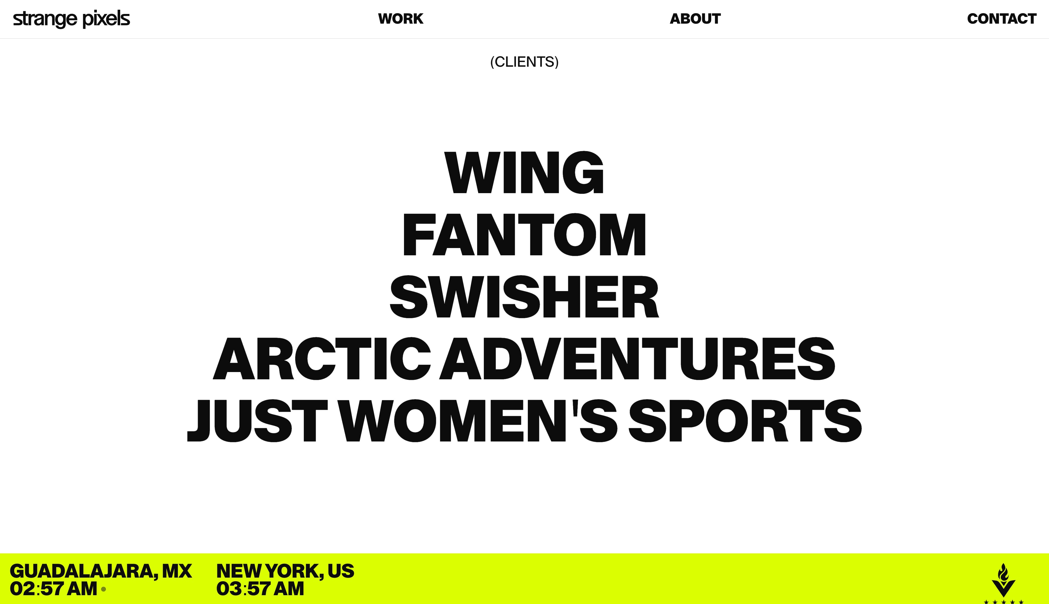
Strange Pixels
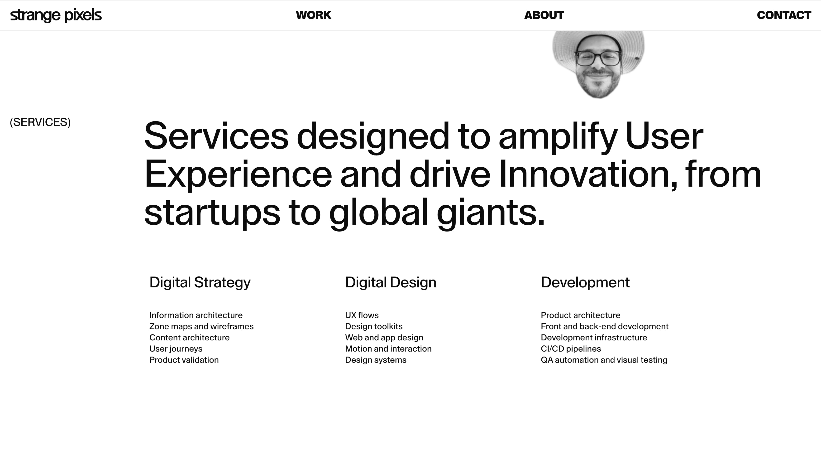
Strange Pixels, an studio collective, consults with brands on crafting unique digital experiences. Its site, which is packed with motion graphics and video, begins with an overview of the company, its values, and its expertise.
From there, it delves into specific services, organized into the broad categories of digital strategy, digital design, and development. Each offering is clearly outlined and presented in a way that makes the list easy to scan, helping visitors quickly understand the scope of the studio’s capabilities and how those services might apply to their own projects.
Video appears throughout the Framer-powered site, but it is always contained within a refined black-and-white core aesthetic. This shows that Strange Pixels can balance visual flair with restraint while advancing its clients’ brands.
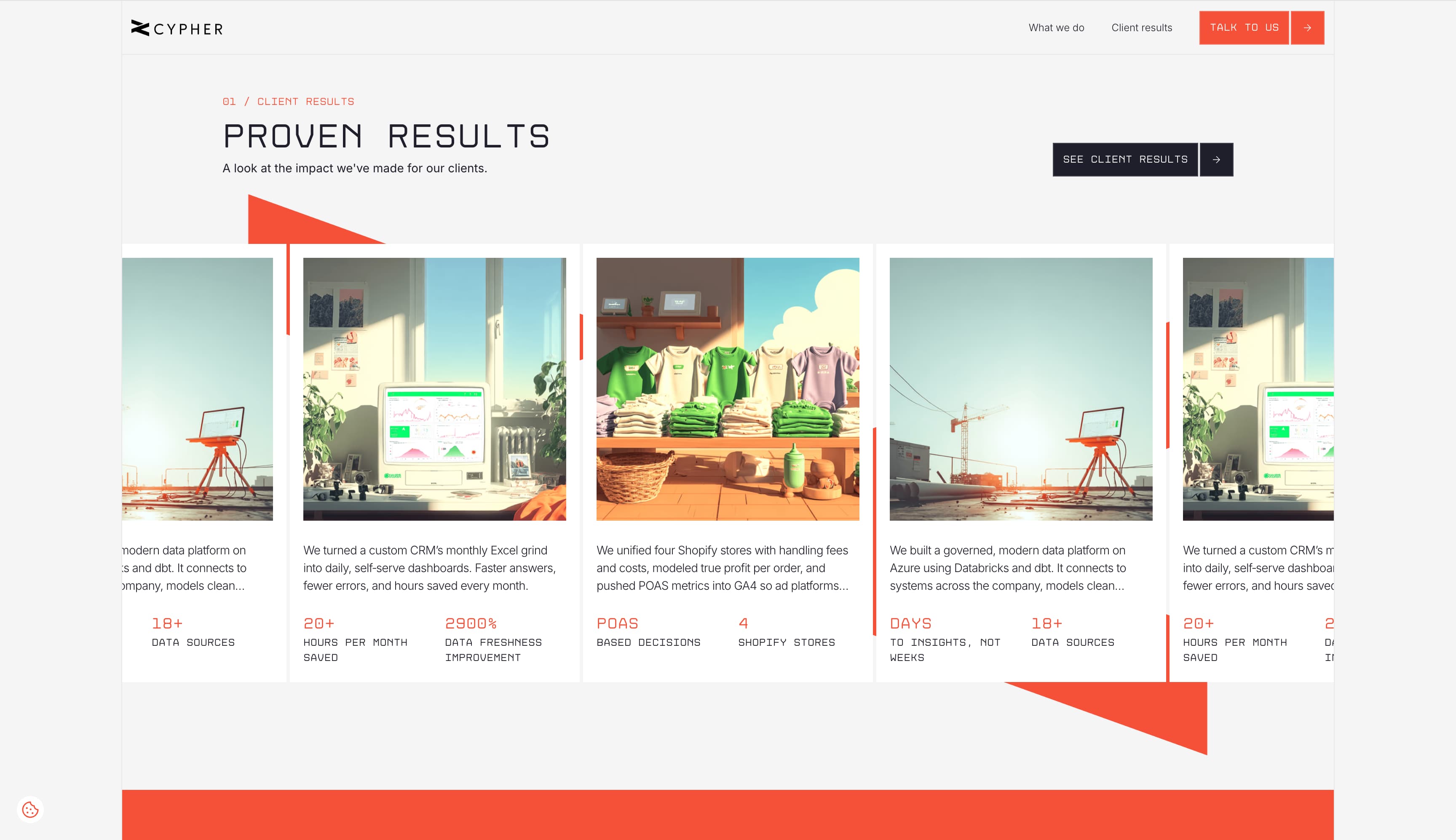
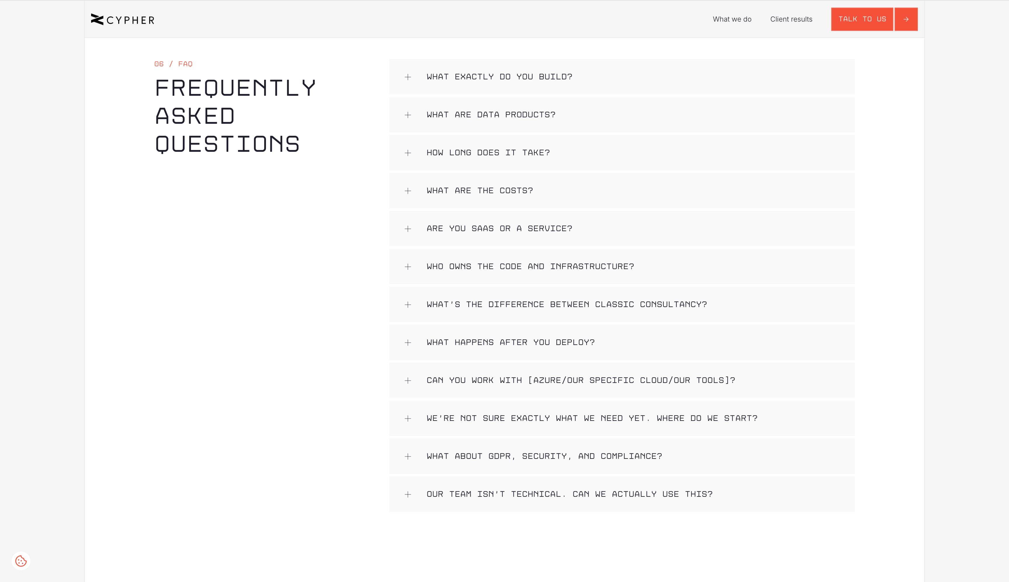
Cypher
Cypher specializes in building analytics solutions for direct-to-consumer businesses. Leaning into their expertise with data, the site’s case study card design highlights hard metrics from successful projects.
Even Cypher’s FAQ page is designed using a pixelated font, subtly sending the message that computers and data are at the core of its services.
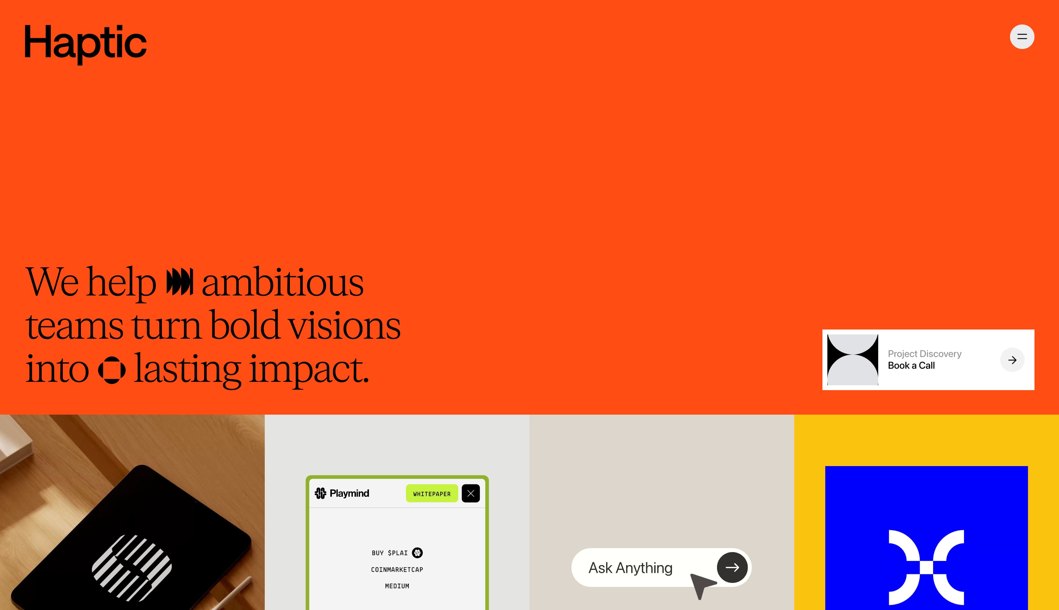
Haptic Studio
Haptic Studio is a design consultancy that specializes in user interface and user experience design, product strategy, and brand identity, among other disciplines, helping clients shape cohesive and thoughtful digital products.
The agency shows their point of view through their site design, with the bright orange hero punctuated by a unique animated button to book a call.
They give ample space to client testimonials, using a looping video block that lets site visitors hear directly from clients as they share their experiences working with Haptic and reflect on the value of the collaboration.
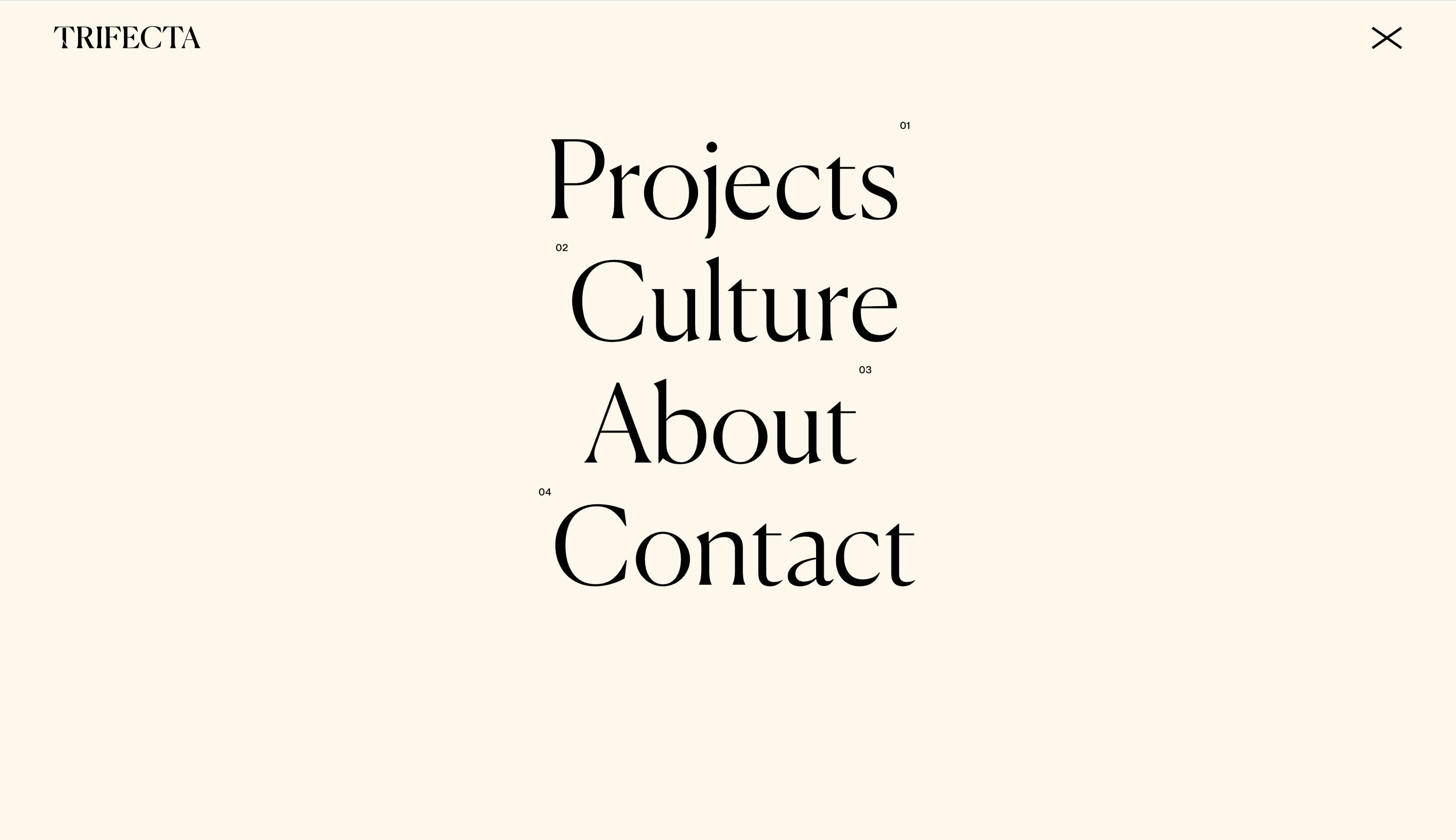
Trifecta
Trifecta is a New York-based boutique growth studio that differentiates itself through a “taste-led” approach. Its site brings that editorial sensibility to life with an elegant serif typeface and navigation styling that resembles a magazine’s table of contents, reinforcing the studio’s refined point of view.
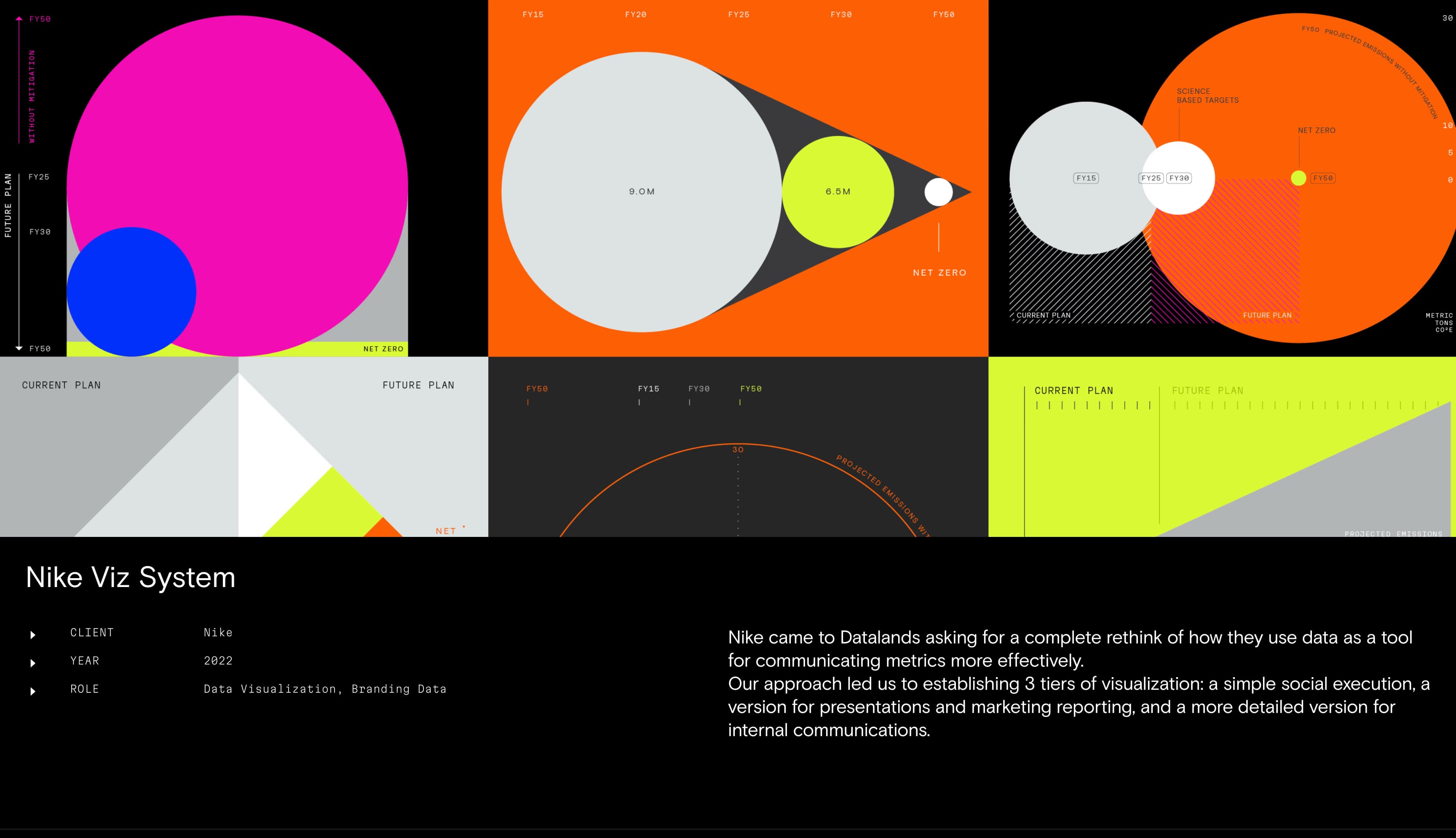
Datalands
As an independent design and branding studio, Datalands specializes in taking complex concepts and fashioning them into compelling narratives and intuitive designs. Their highly interactive website serves as a showcase for what the studio can do. For instance, hovering over a menu item labeled “Data Visualization” triggers a data graphic to pop up.
In another part of the site, interactive HTML5 elements let you see graphic-rich success stories from past clients, showing how Datalands addressed pain points and improved operations.
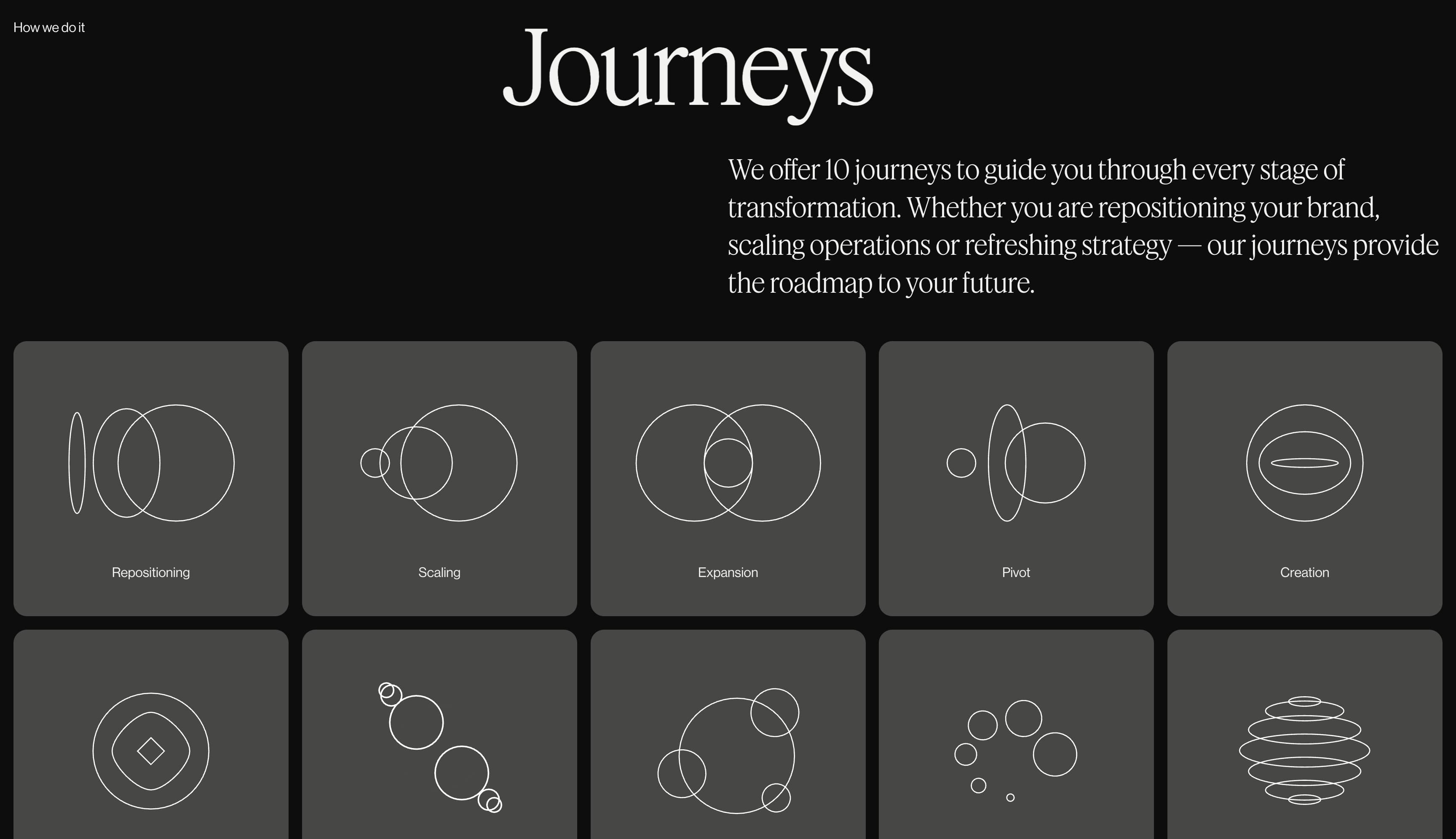
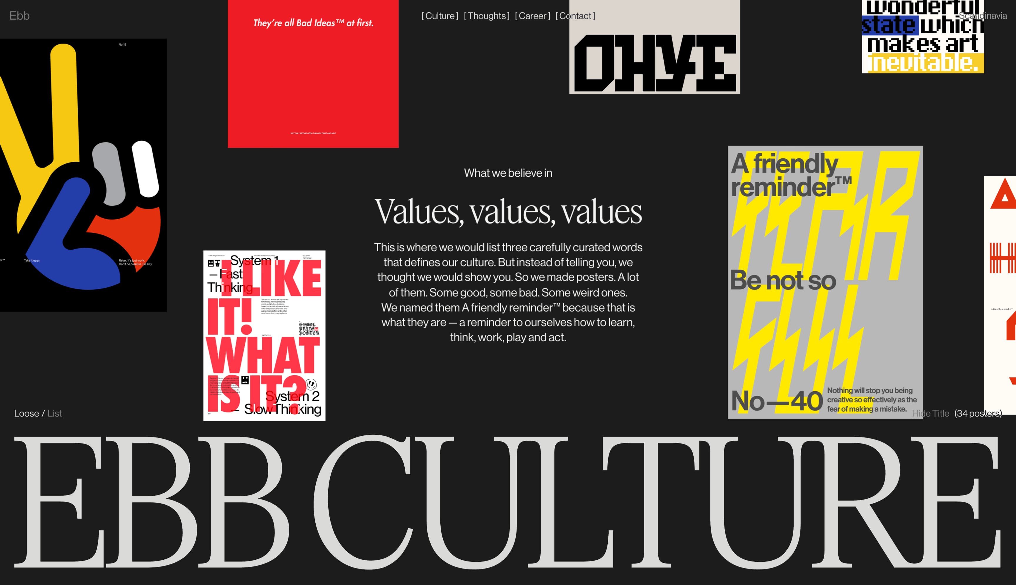
Ebb
Ebb is a Scandinavian agency that brands itself as a transformation studio, uniting business goals with creative endeavors to help clients navigate change and achieve lasting success. Its homepage introduces ten distinct “journeys” the studio offers, ranging from “expansion” and “pivot” to “turnaround,” with each path brought to life through its own animated graphic.
There’s also a page dedicated to Ebb’s organizational values, which they illustrate with custom posters, underscoring their commitment to each of them.
FLOC*
FLOC* is a digital brand strategy collective. Its site establishes a four-color palette—green, blue, red, and white—against a stark black background. Visually, it parallels the four core services they offer: strategy, branding, digital product, and motion design.
Click on the “Work” tab, and the color scheme changes to reflect the branding of FLOC* clients, making the work samples jump off the page.
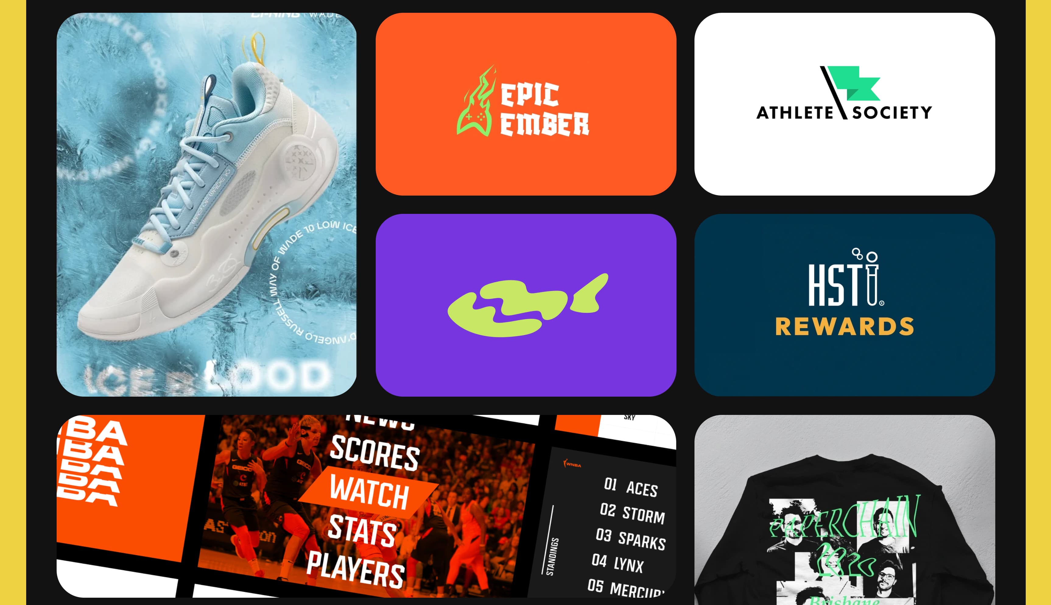
Strange Wolf
The website for Strange Wolf, designer and illustrator Danielle McCray’s personal consulting brand, puts the focus on work samples. The homepage dedicates most of its real estate to case study cards. At the bottom, a scrolling ticker of logos shows the brands that McCray has worked with, bolstering the proof of her experience.
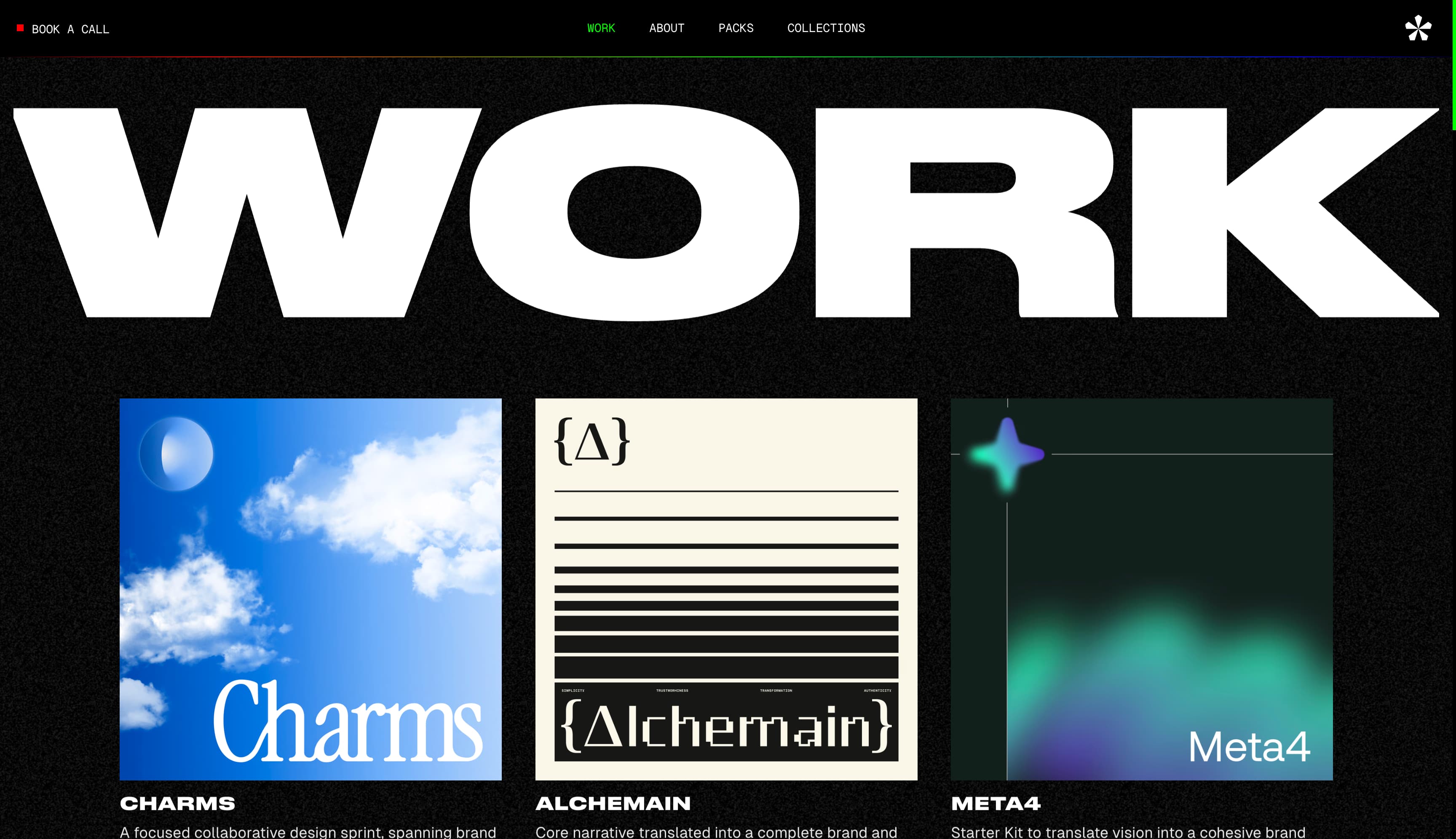
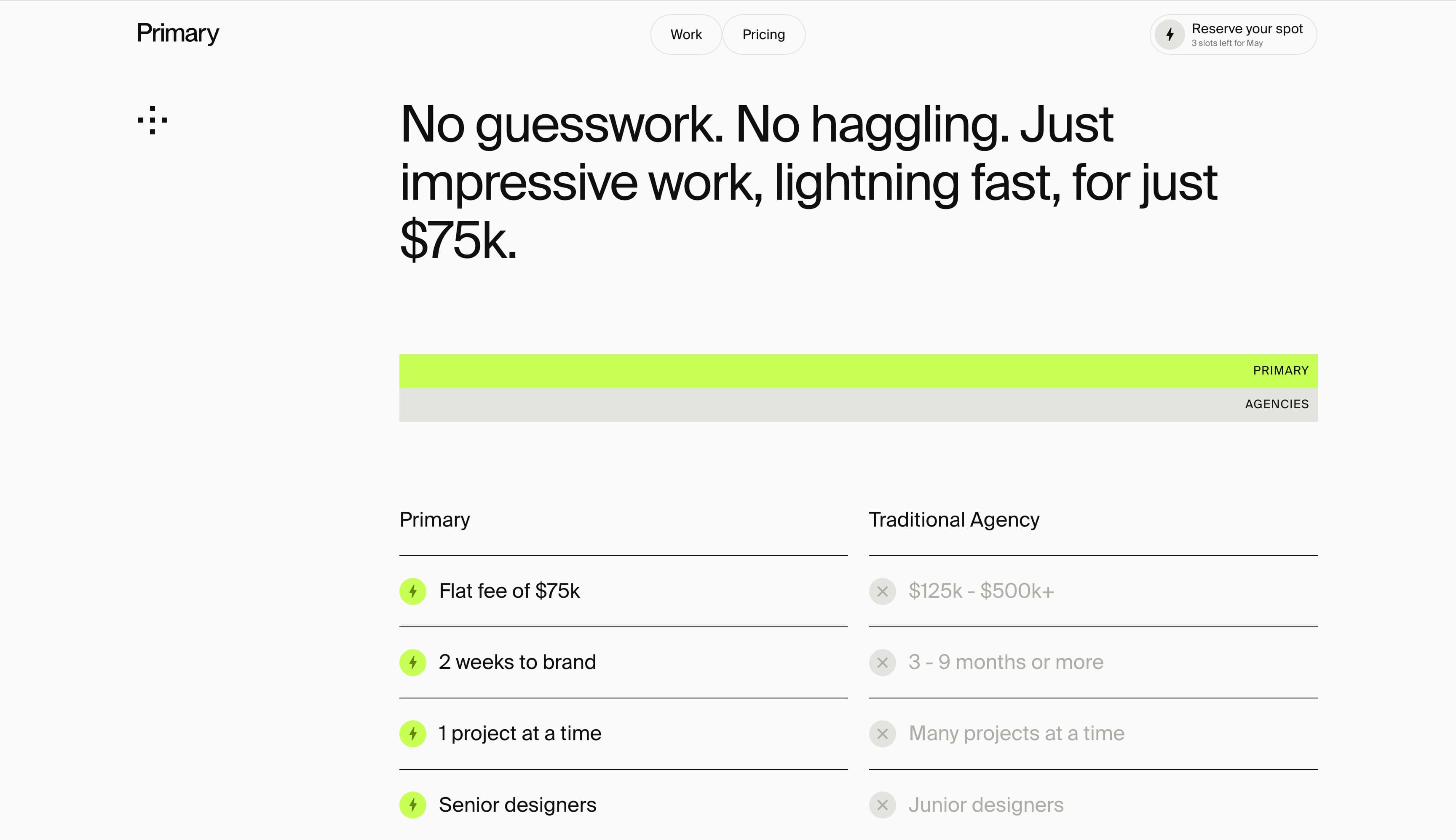
Primary Studio
Primary Studio describes itself as a “brand sprint agency” focused on guiding small business startups toward rapid growth. Beyond its elegant website design, the studio stands out for its transparency around pricing, clearly presenting a $75,000 flat fee and contrasting it with traditional agency pricing in a straightforward two-column table.
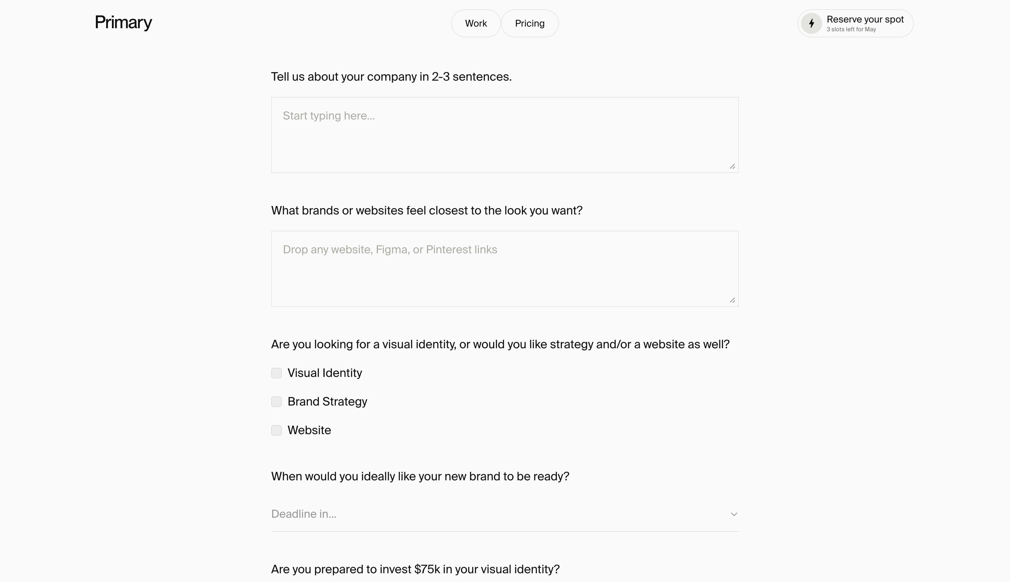
Primary Studio also uses a personalized intake form so that new clients feel heard from the outset. This sends a message to potential customers that Primary Studio is ready to get to work on bespoke brand-centric content.
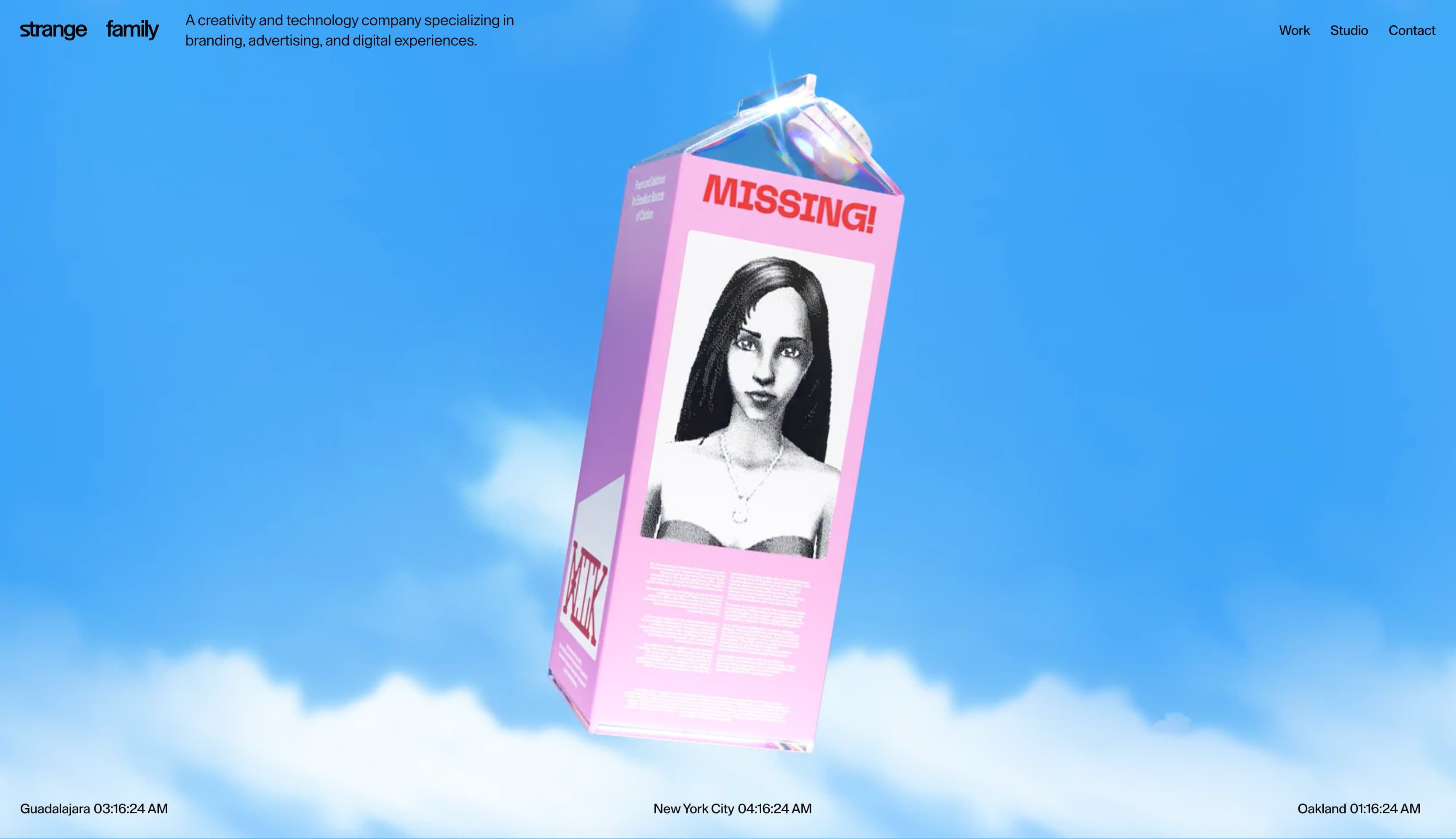
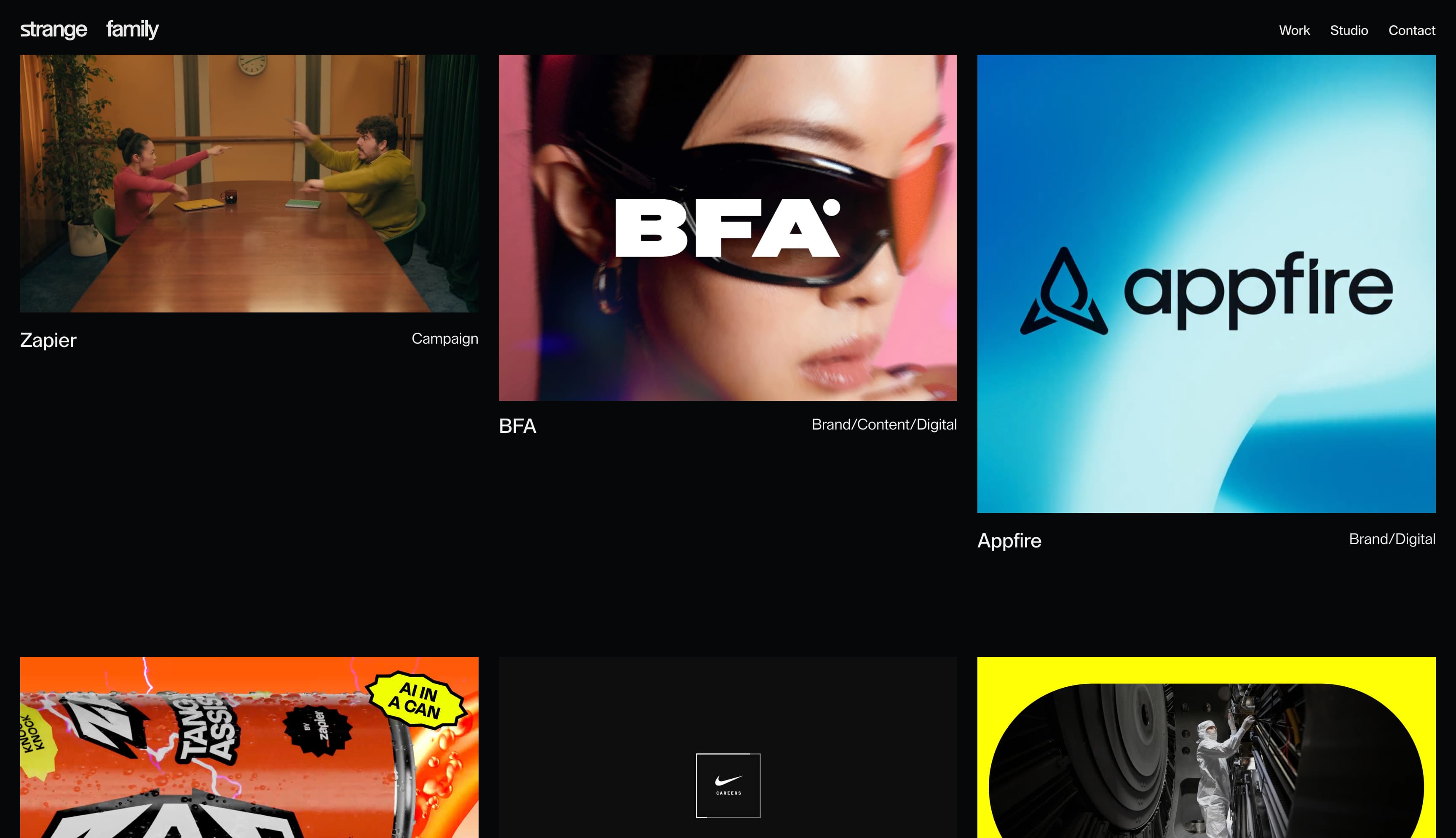
Strange Family
Strange Family serves clients looking for an all-in-one branding, advertising, and digital experience consulting agency. Its website grabs visitors with an arresting digital animation of a milk carton with a “missing” notice on it. The surrealist imagery begs you to click, in an effort to decipher it, which then takes you to the “Work” page. This tactic shows that Strange Family knows how to capture visitor attention and create engagement.
From the “Work” page, the site follows a more conventional flow, with detailed case studies available on various projects.
Oakline Studio
Oakline Studio, a design and technology studio, uses a minimal, design-first homepage that focuses on strong sticker-focused visual identity and clear positioning. The page opens with a bold logo, a short tagline, and a small set of calls to action, setting the tone without heavy explanation.
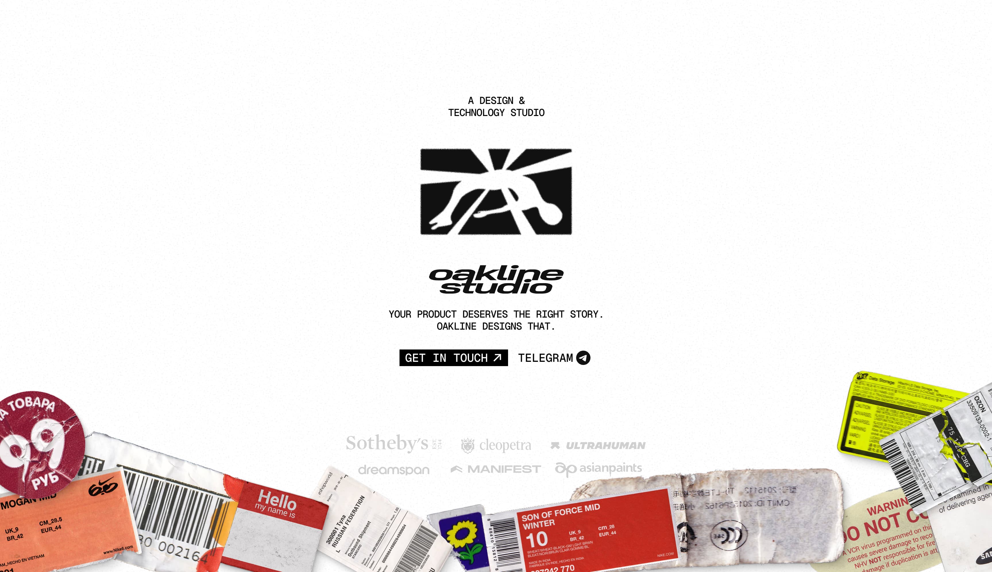
Oakline Studio lets the work speak for itself, presenting projects with minimal context and little more than a title. The site avoids long descriptions, instead relying on strong visuals to communicate quality and craft.
This stripped-back approach keeps the focus on the work and encourages exploration, while the restrained layout and typography reinforce a clear, confident studio identity.
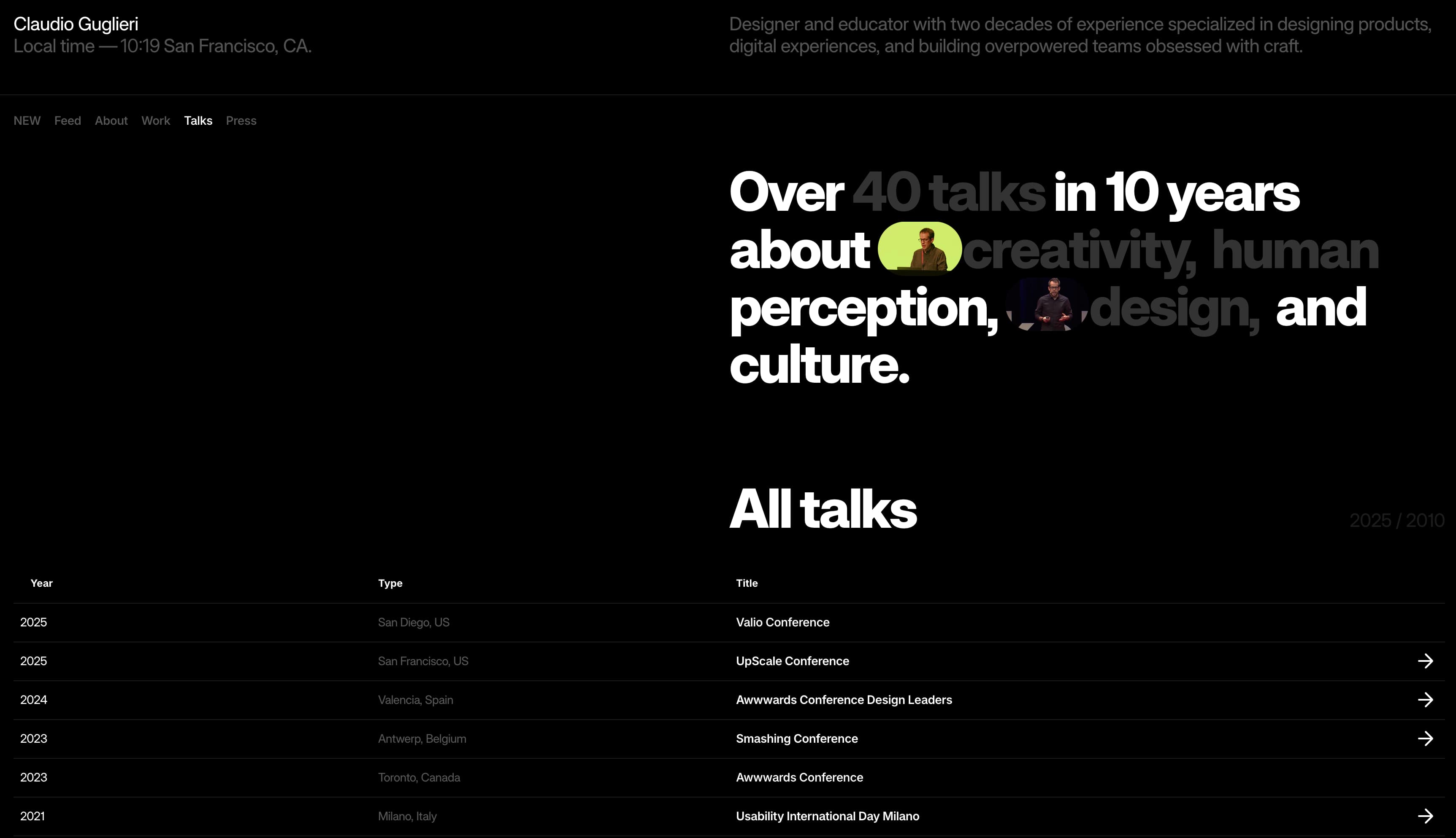
Claudio Guglieri
As a solo practitioner, Claudio Guglieri uses his website to articulate his philosophy as a consultant and team leader. The site offers past work as templates for future success. Claudio uses headings and text blocks to introduce himself, explain his approach, and highlight his successes.
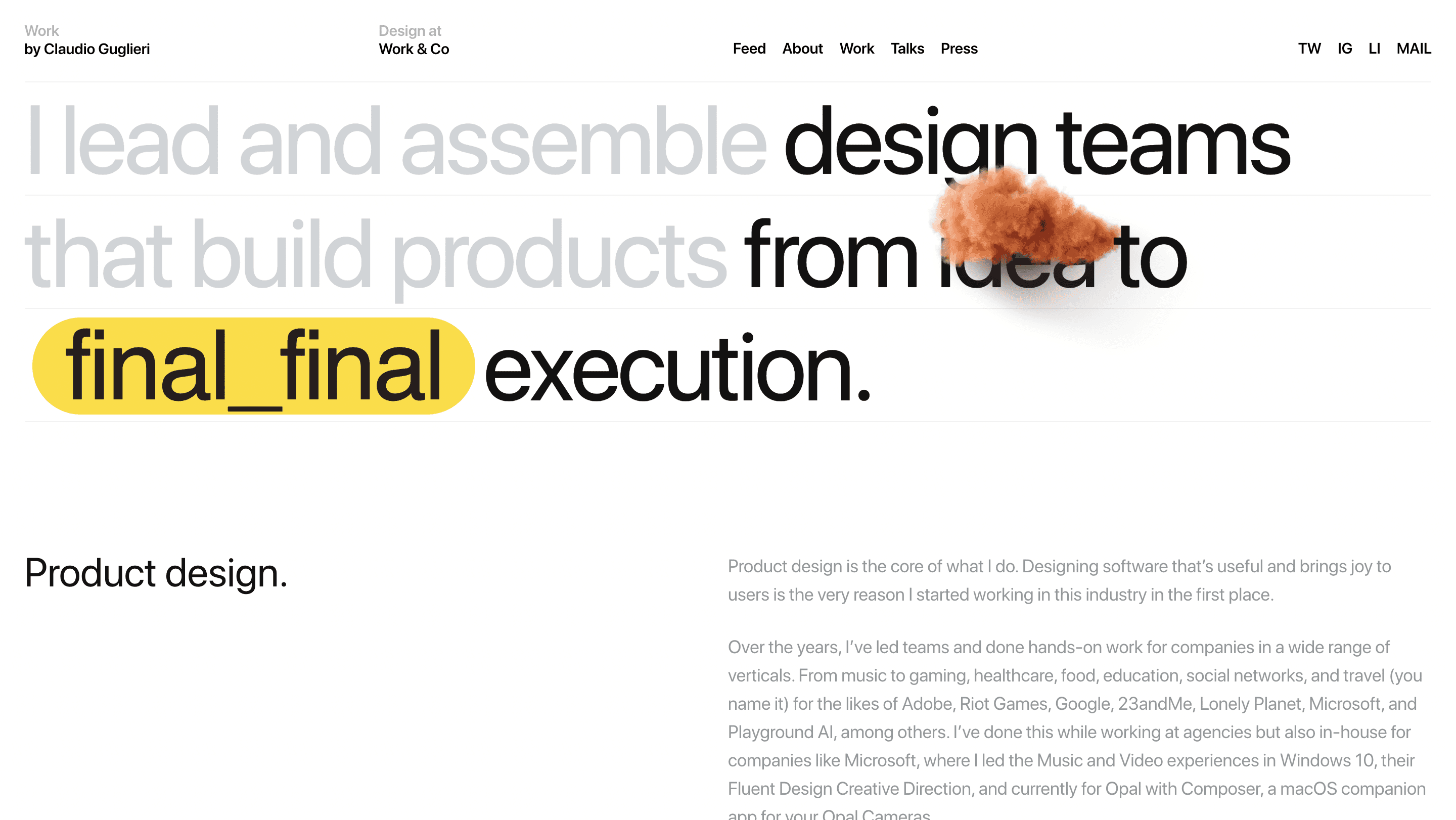
Elsewhere on the site, he establishes himself among the thought leaders in his industry, highlighting his experience giving talks—many of which are available as webinars in video podcast form.
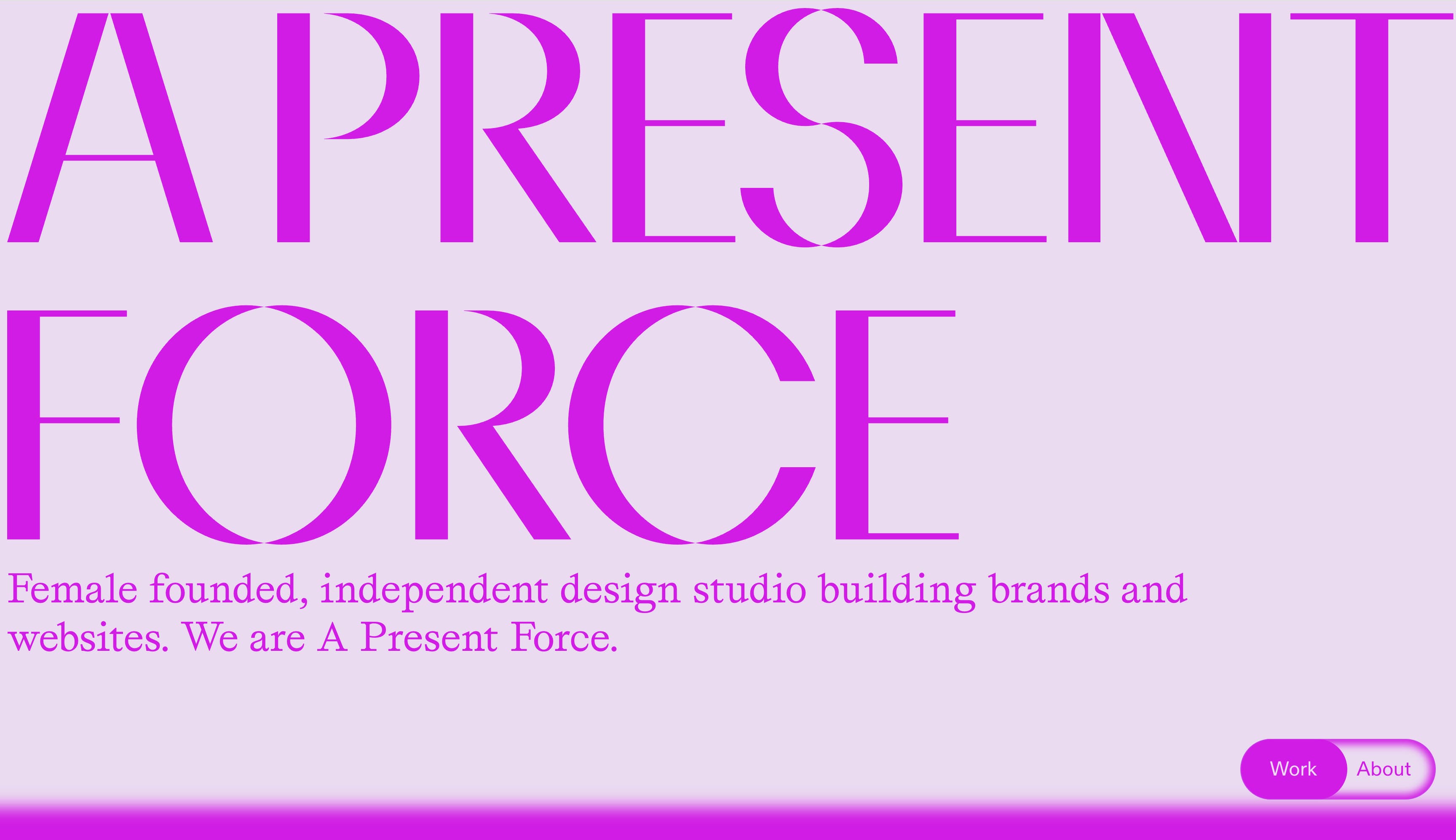
A Present Force
A Present Force distinguishes itself as a female-founded studio and further uses a bright color scheme to stand out.
The color scheme changes when a user clicks the “About” tab, becoming bronze-tinted amid text describing founder Meredith Hattam, who now leads A Present Force from Berlin.
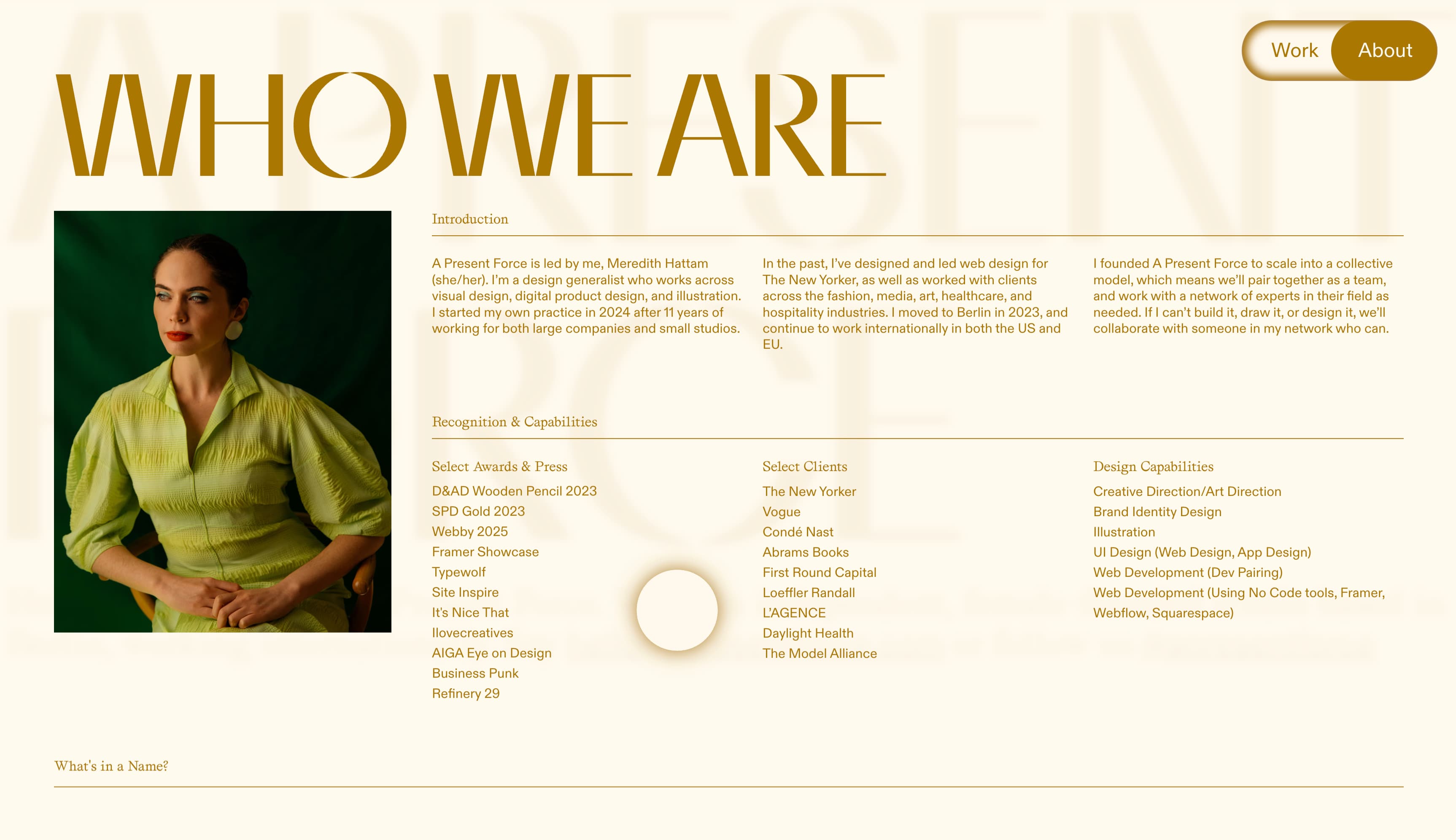
The site contains a combination of fonts to break up the mix of hard data and narrative storytelling, keeping the text-heavy pages skimmable and engaging.
Build your consulting website with Framer
Want more inspiration for your consulting business’s website? Browse Framer’s Marketplace of consulting templates to see what’s possible. Build for yourself or your firm with no need for engineering support. Plus, Framer optimizes sites for excellent SEO by default, offering full control over SEO markup, indexing rules, redirects, and more.