11 real-world homepage design examples
Here are 11 standout sites—five business pages and six portfolios—and how the homepage design supports site goals.
Curated Supply
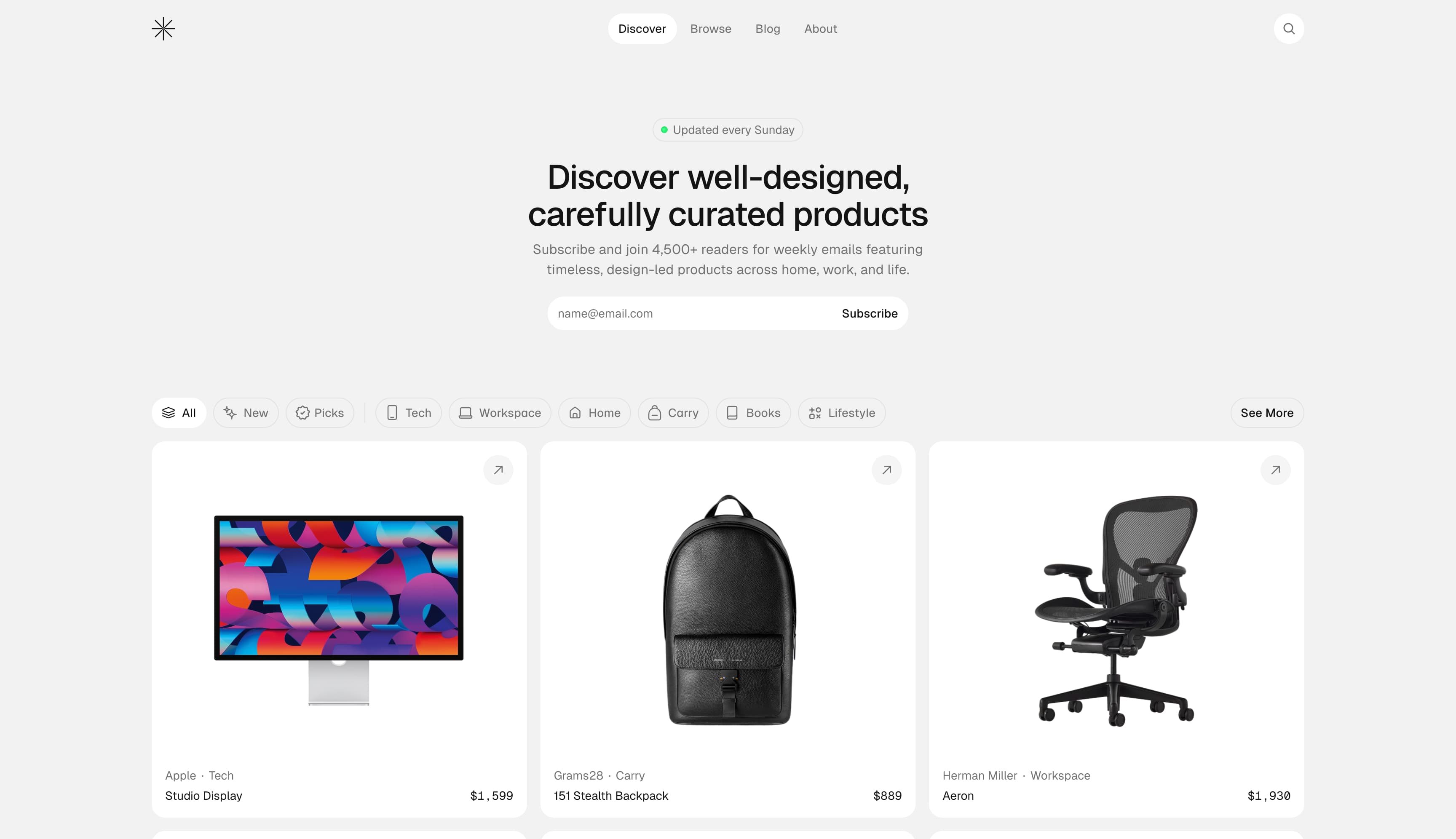
Best Practice: Get right into it.
Curated Supply is just that—a website full of curated products. The homepage is not so much a cover page as it is a direct entry point into everything the site offers, from the product grid to the invitation to sign up for the newsletter. The uncluttered, white grid of products with minimal distractions or marketing copy reinforces the curated aesthetic. The category buttons feature exponents that show how many products are in each category, but they’re otherwise very muted, practically blending in with the grey background. The minimalist features—from the stark white backgrounds to the sleek, sans-serif font—are intentionally designed to let the design of each product take center stage.
Flite
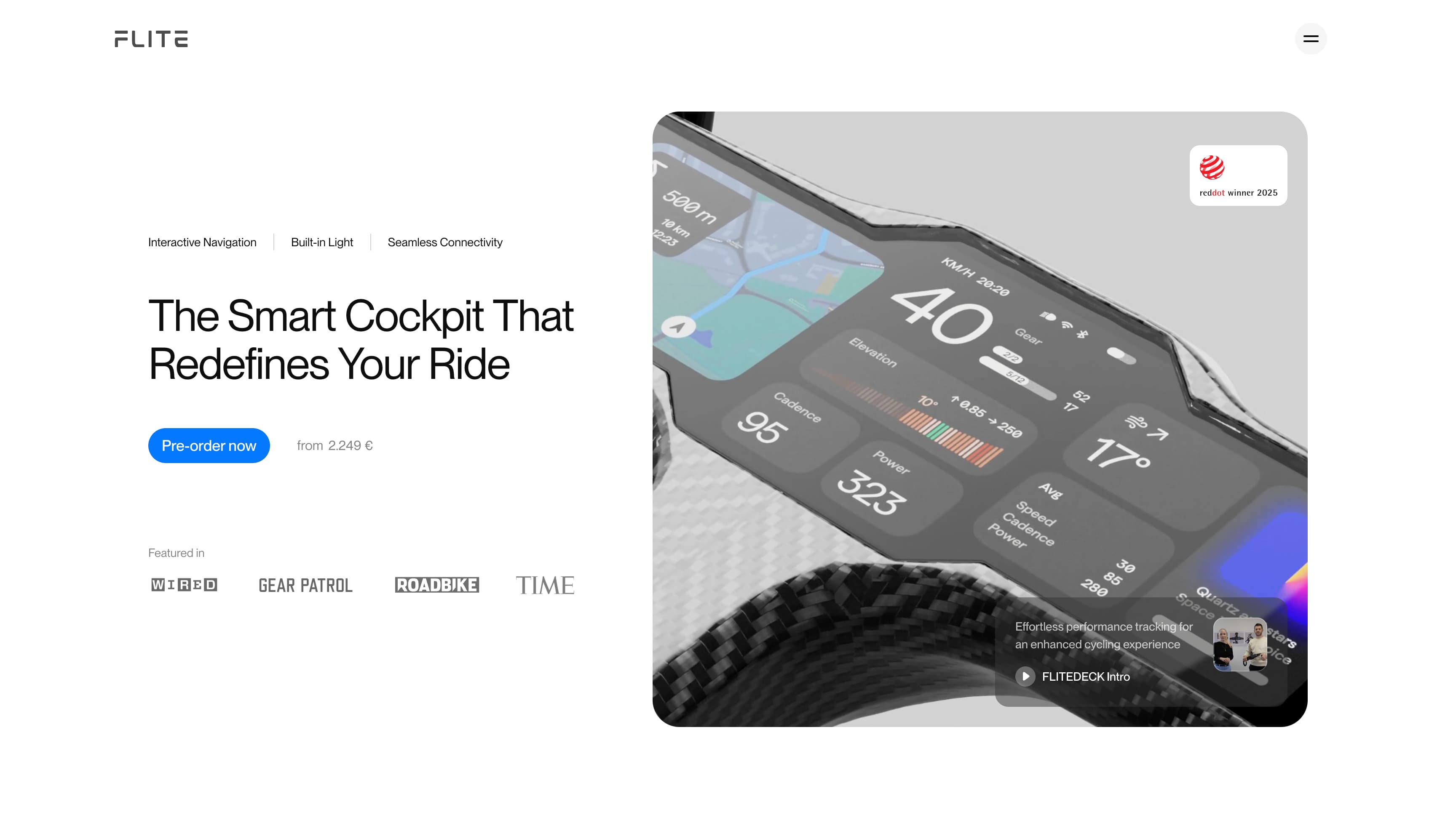
Best Practice: Focus on the core product.
Flite sells high-tech bike handlebars that collect ride data. Instead of showcasing a range of products, the homepage narrows in on the brand’s signature offering with a large animated image. It feels engineered and intentional, a statement of industrial design rather than marketing.
The homepage tells visitors exactly what the device offers: interactive navigation, a built-in light, and seamless connectivity, but the web design communicates even more with its layout. The single, large hero image of its display system signals that FLITE is a single-product brand with a premium focus. The high-contrast “Pre-order now” CTA sits right next to the large image, making it the next step on the path to purchase.
Unito
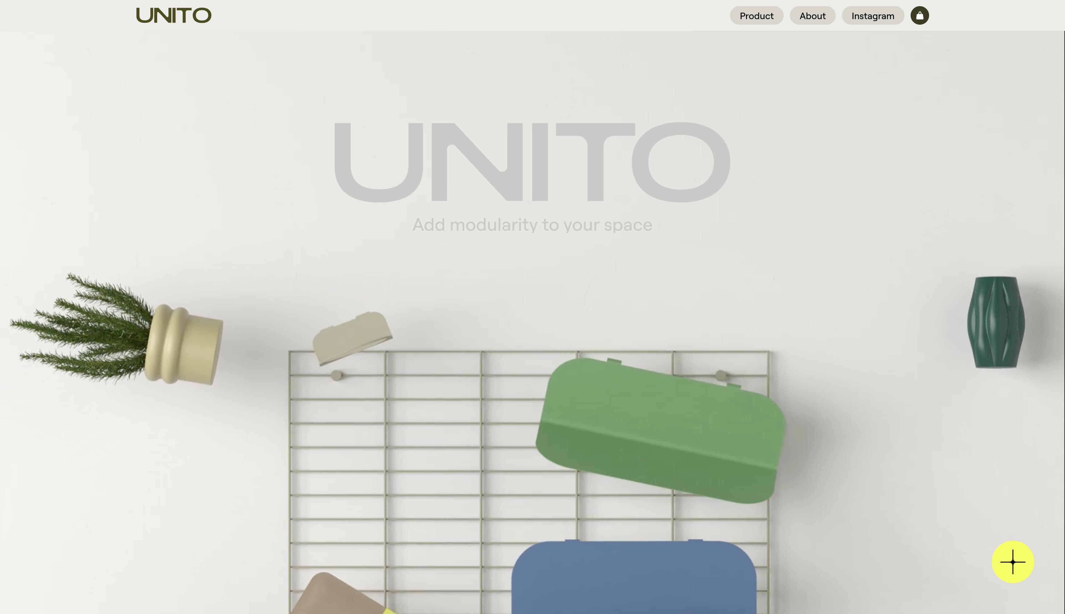
Best Practice: Incorporate a video centerpiece.
As a new brand, modular furniture and storage maker Unito’s homepage needs to do a lot of work: It needs to explain what the product is, express what the brand stands for, and establish credibility. It does this with a modular page design that progresses from product explainers to brand principles to press and reviews. But the showstopper is the product demo video in the third module. It shows the product in action, so that the viewer immediately understands what it is and what it solves for in a home or office.
Bauhaus Clock
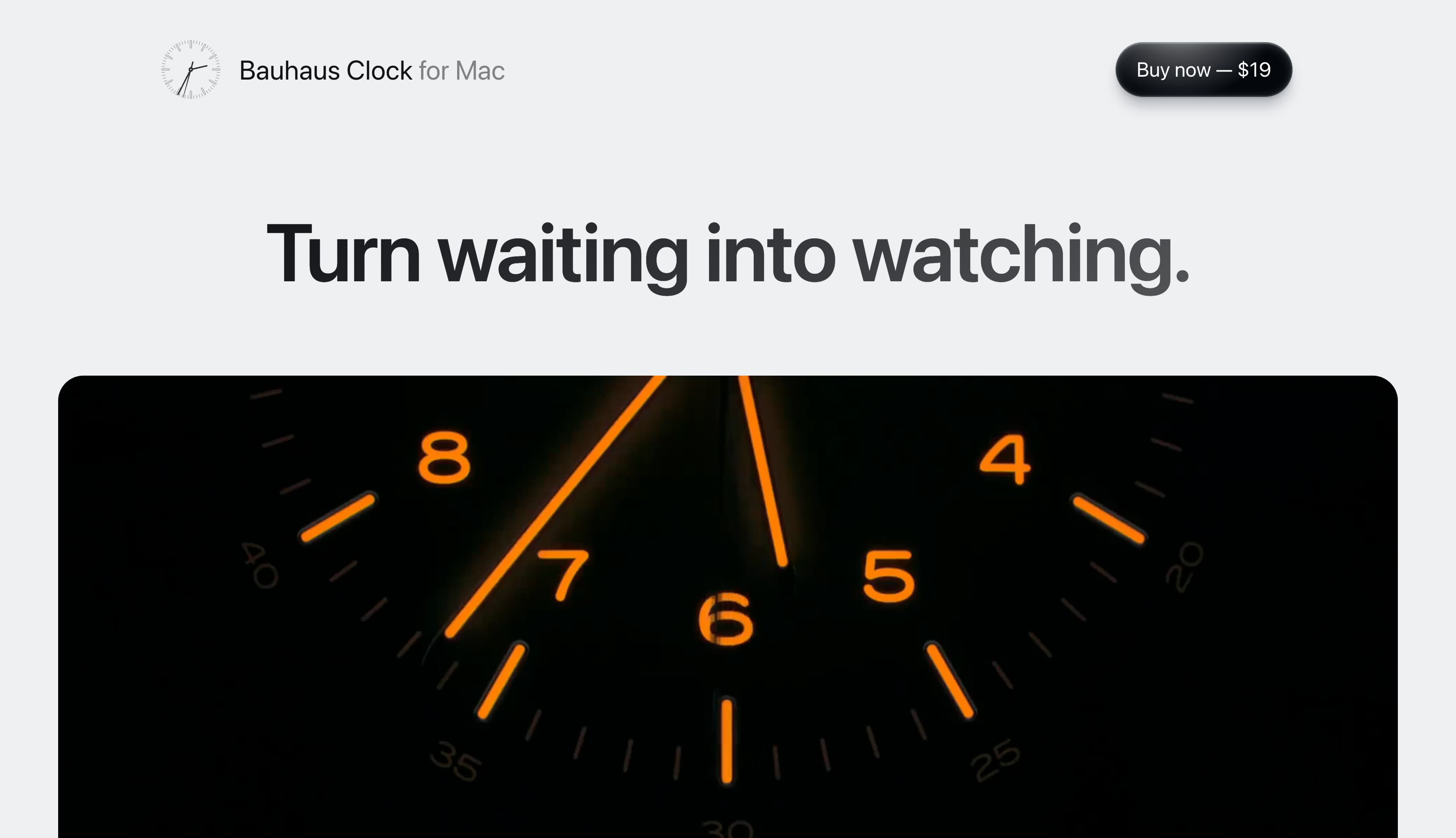
Best Practice: Focus on a single, frictionless purchase path.
The Bauhaus Clock homepage is designed to drive purchases of its Mac software, with a big “Buy Now — $19” button in the upper right corner, fixed and always within reach as you scroll. It’s designed to convert viewers into purchasers and showcase the utility of a purely digital product. The bold value proposition, “Turn waiting into watching,” is even larger than the product name, set in a clean, sans-serif fonts that echo Apple’s own design aesthetic. In fact, the entire homepage borrows Apple’s visual language, appealing directly to Mac users who will recognize the familiar cues.
Delphi
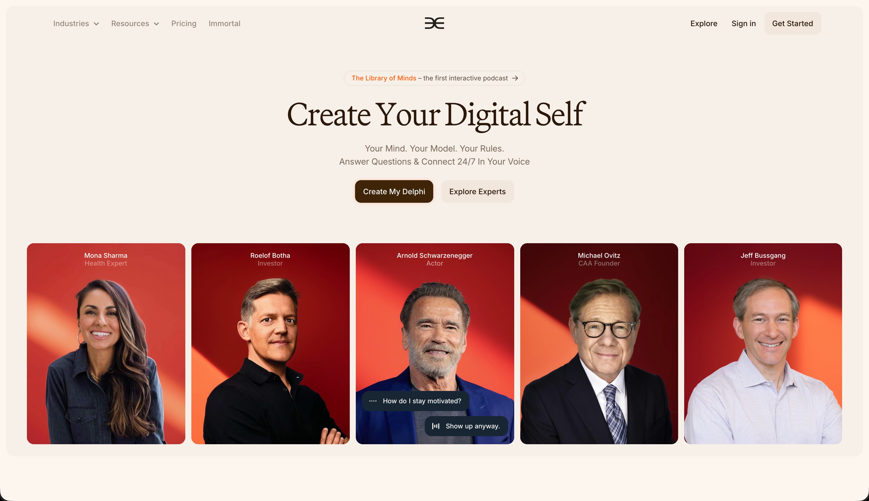
Best Practice: Use motion and visual hierarchy to clarify dense information.
Delphi uses AI to create digital personas for experts and creators that can help manage online relationships with their users. Because the product is in the emergent and constantly evolving AI space, Delphi’s homepage has a lot to explain: what the product is, who uses it, and how it works. But it simplifies the user experience with movement, contrast, and pacing. The portraits of business leaders and celebrities slide into view, each framed consistently on similarly colored backgrounds. The dark “Create My Delphi” grabs attention, while lighter buttons encourage exploration, creating a branded experience instead of plain marketing copy.
The1
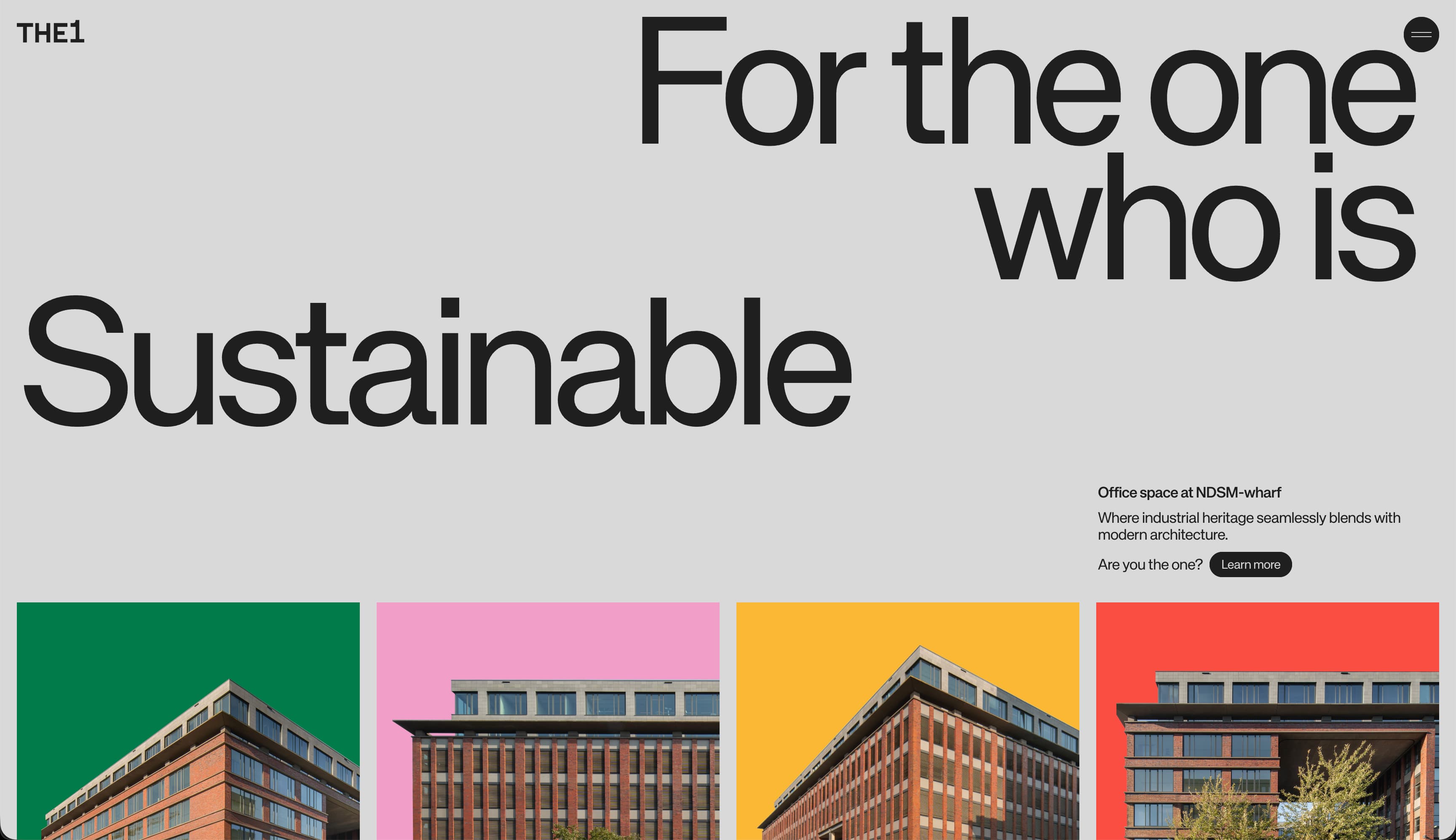
Best Practice: Challenge user expectations or industry conventions.
The1’s office space website bucks homepage design conventions in its industry. Leaning more on its brand color palette and typography than photography to tell its building’s story, it makes a personality-driven statement.
The site opens with a massive headline featuring a scrolling list of adjectives that connect to values-laden propositions, like Sustainable, Creative, and Connected. The “Learn more” CTA button stands out with a dark contrasting color amid all the white space after the massive headline and smaller explanatory text. The colored rectangles that show off the building exteriors give each space a dynamic visual identity (repeated as a colored circle next to each label) that invites visitors to identify with each. As you scroll, you’ll see animated cues like slight fade-ins and parallax-like movement that create a sense of depth and interactivity.
Has Works
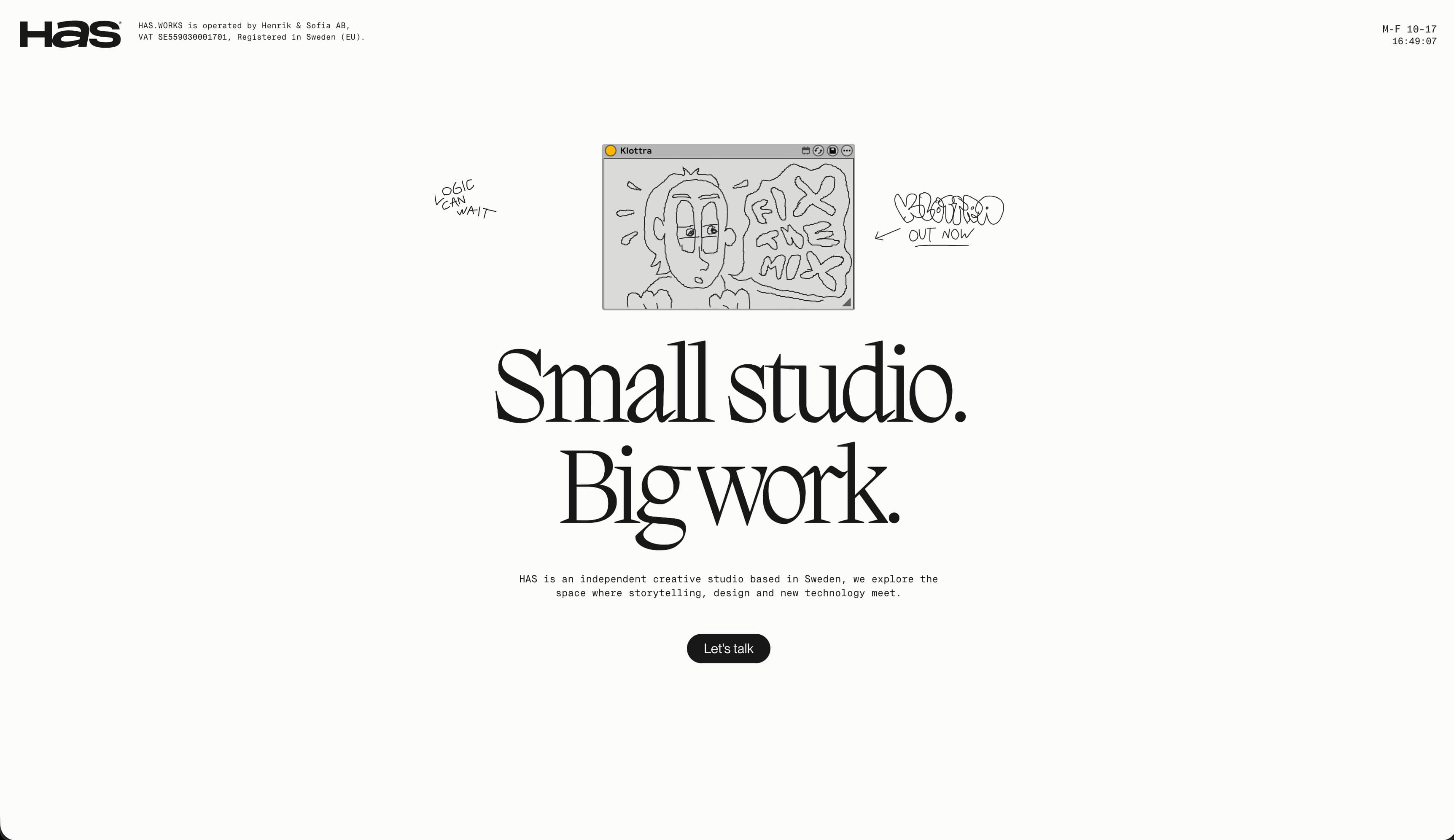
Best Practice: Pair layout, typography, and motion to highlight your creative identity.
Load the homepage of Swedish design firm HAS.WORKS and you’ll immediately get a sense of who they are, creatively. The bold, oversized headline “Small studio. Big work.” offers the same thing: this is what the firm values and what clients will benefit from. The rotating silver dog figure catches your eye after the site loads. The contrasting button with the smiley face image on it invites you to click and injects a sense of humor into the otherwise reserved design. When you do click, the rotating figure changes to a tomato, a rock, a cowboy robot, and more. It’s a whimsical button that expresses the personality of the firm.
Below that comes the portfolio section of the homepage, which hides complex motions and animations behind the sections themselves. The design leans into layered media, with static photos, short looping videos, and dark background panels to create depth within the minimal grid initially offered.
Bonded
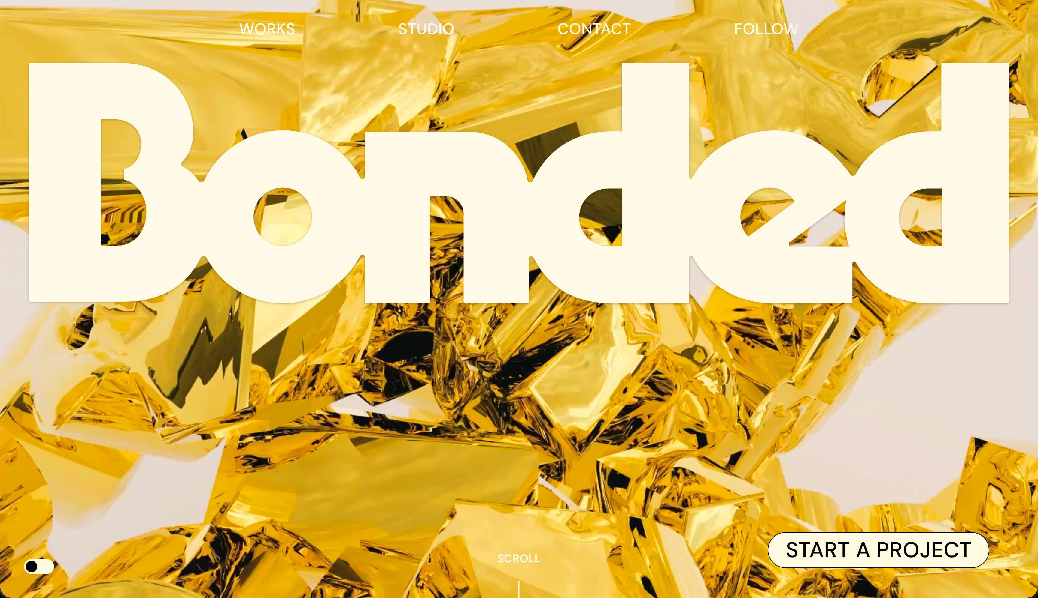
Best Practice: Use bold imagery to catch and hold visitor attention.
This boldly animated homepage from Madison, Wisconsin-based studio, Bonded, takes a maximalist approach, with a huge, thick-lined font headline and reflective gold background treatment of the studio name in the background. It’s eye-catching and feels luxurious.
The call to action button is easily seen in the lower right corner, and the homepage invites you to Start a Project with the firm. The navigation menu up top is of secondary importance, as shown by the light color, but it’s there for visitors who want to explore a bit more. Scroll to the bottom and find comically massive buttons that essentially disappear when you hover over them.
Scrolling up and down, however, shows that while the site moves and confounds the eye, it is incredibly linear. You can only go up or down, forcing you to experience the entire presentation, though you also have the option to “start a project” at the top if you want to get right to work. The animation does a lot of work keeping viewers engaged and moving around the page.
Janar Siniloo
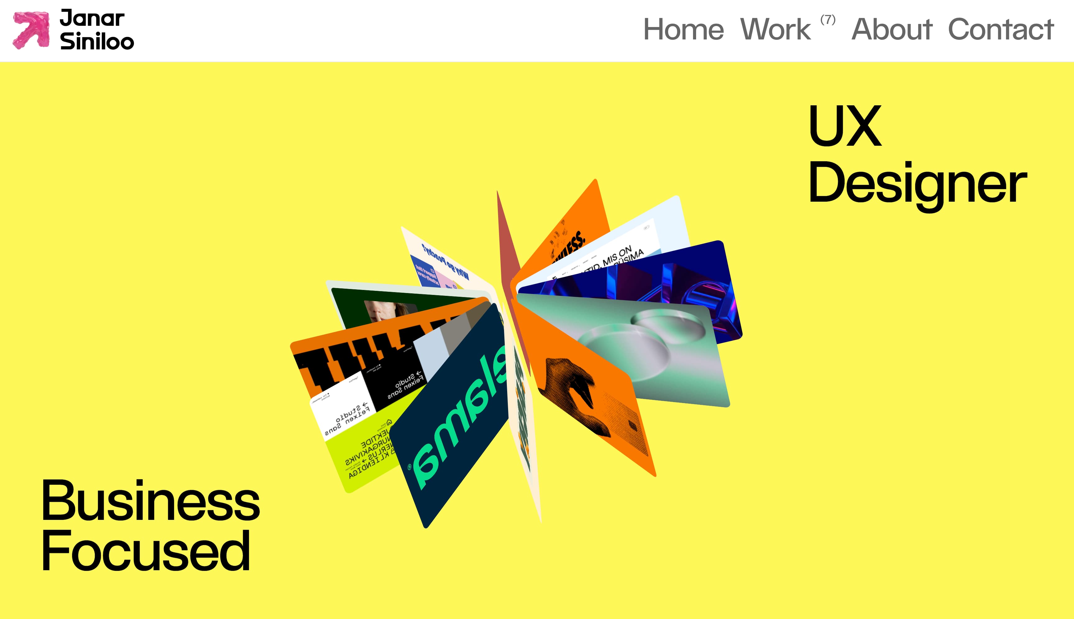
Best Practice: Blend function with fun.
Janar Siniloo’s homepage makes a strong first impression. “Business Focused” sets the tone, while the role next to it shifts through a ticker, moving between different titles to show range and flexibility. It feels confident, but not rigid.
At the center, a rotating 3D cluster of project visuals brings the page to life. The motion adds depth and energy without overpowering the layout. Set against a bold yellow background and crisp black type, the 3D element becomes an inviting focal point that hints at the variety and quality of the work inside.
Alina Papazova
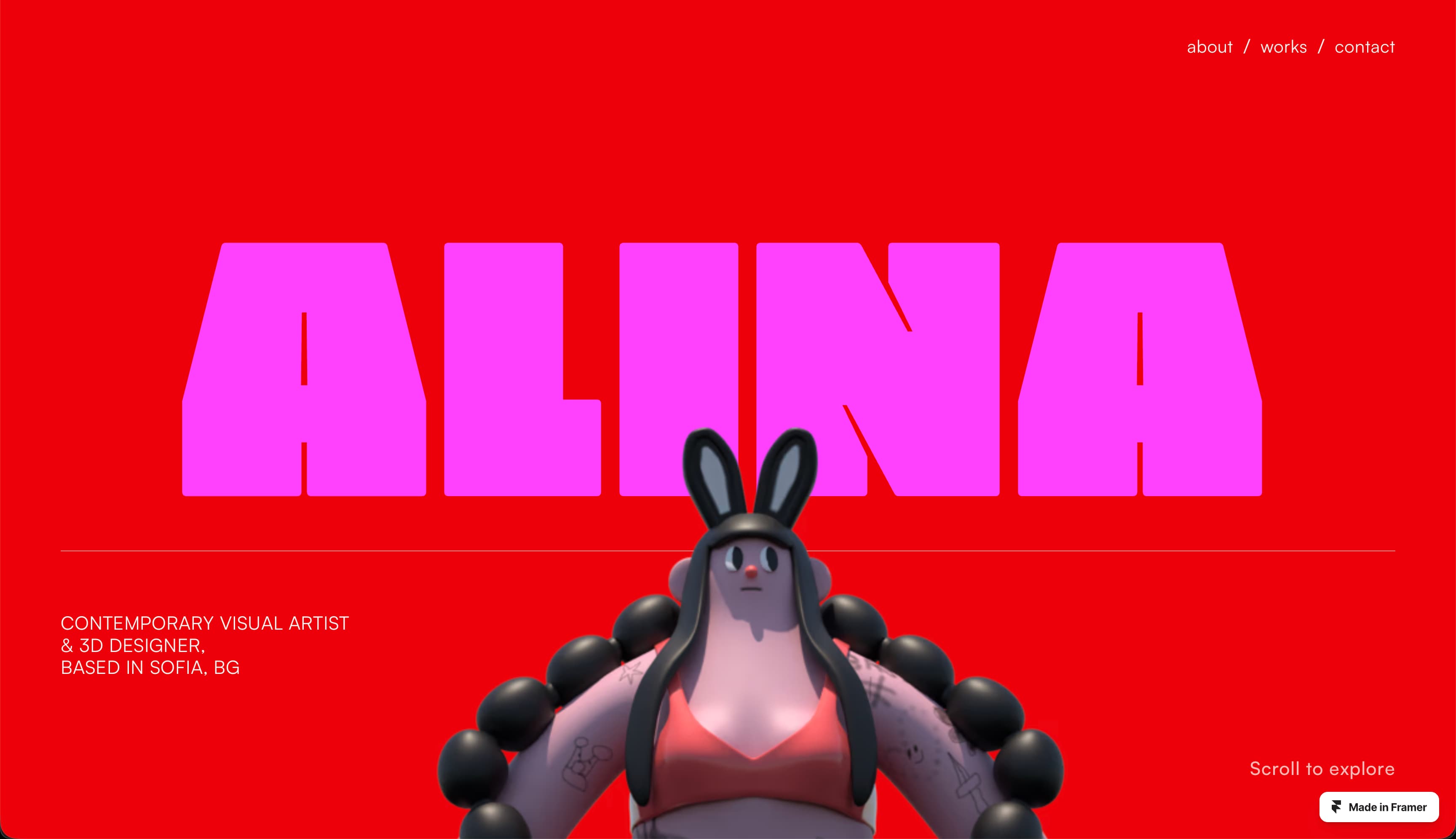
Best Practice: Use movement and a featured animation to create an immersive experience.
Alina Papazova, a visual artist and 3D designer from Bulgaria, uses a mix of saturated colors, contrasting fonts, and a dynamic 3D graphic to showcase her multidisciplinary expertise. As you scroll down the page, a parallax effect causes the 3D figure to twirl and zoom in, drawing you into an immersive experience. It then cleanly transitions into a WORKS section that feels more gallery-like to let the photography of real-world art installations take focus. It brings the artist’s diverse work into one cohesive vision.
Thibault Baralon
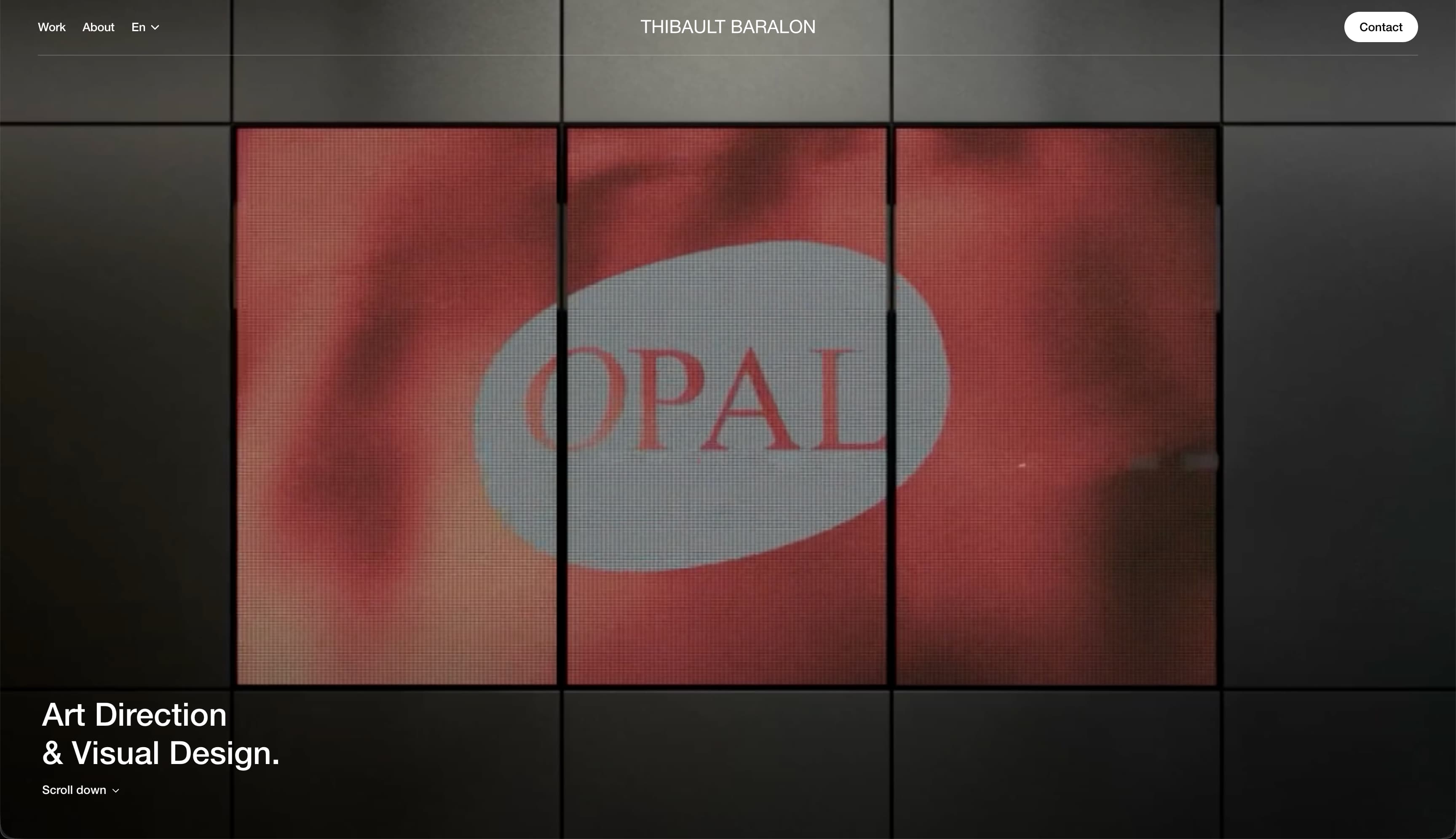
Best Practice: Showcase the most interesting part of your work.
Thibault Baralon’s homepage immediately lets the creative work speak for itself with a huge video on what appears to be a three-panel video display. Large gridded rectangles contain imagery from past work, some half-width, some full, creating visual interest. With minimal copy and full-bleed imagery, the homepage shows maximum restraint and projects confidence without overexplaining the agency’s work.
How do I design a homepage?
Use these steps as a guide to start designing your own homepage:
Write a brief. Document the target audience you’re looking to serve with your homepage, what primary and secondary actions you want visitors to take, and what central message they should take away.
Build your homepage project plan. Once the goal is clear, split the project into simple phases like copywriting and wireframing, and assign each to the right team member (like your copywriter and web designer).
Create a wireframe. A wireframe is a low-fi layout that shows the placement of elements—headlines, images, text blocks, and buttons—so you can adjust layout decisions before they’re committed to code.
Choose your typography and visual style. Decide whether you’ll use contrasting typefaces on your homepage or one for simplicity, lifestyle or product photography, illustrations or 3D graphics, or a mix of elements to preview the visual aesthetic of the rest of your site.
Develop a working homepage prototype. A working prototype allows you to click through the prototype homepage, experience the information flow, and see how one module transitions into the next.
Collect feedback and refine. Ask whether your homepage feels intuitive, clear, and functional across devices. Ultimately, you want to build a homepage that makes it crystal clear what you or your business does, what you want your users to do, and what their next steps should be.
Test and launch. Implement feedback from the prototype and polish your homepage until it feels like it satisfies your initial brief. In Framer, publishing your site is incredibly simple. If you’ve used the Staging tab to test your site, you can now switch to the Production tab and hit Deploy latest. If you’re not using the PRO plan, you can just hit the Publish button when ready.
Framer makes homepage design seamless
Make a great first impression with standout homepage design. Whether you’re minimalist or maximalist, humorous or refined, there are a million subtle ways to bring your personality to life on your site.
Framer supports the website design process with built-in tools that feel familiar, combining precise design controls, interactive previews, and full publishing capabilities in one platform. When you’re ready to build, there’s no handoff to engineering—only the push of a button. Explore Framer’s design features, or sign up to start building in a way that matches how you already work.