The look and feel of 90s website design was unmistakable. Neon color palettes, static pixelated images, table-based layouts, and custom cursers defined the aesthetic. This style was born from technical constraints like slow dial-up speeds and limited CSS.
Fast-forward to 2026, and modern web design has made huge gains in accessibility and performance. Yet some of the expressiveness has faded. There’s an opportunity to bring back that personality-forward visual style with modern quality standards.
15 classic 90s websites
Here are fifteen classic 90s websites that defined the early world wide web (back when it was still called that, unironically). Many of these old-school websites are preserved in Wayback Machine archives, giving you a peek into the digital past.
1. Space Jam
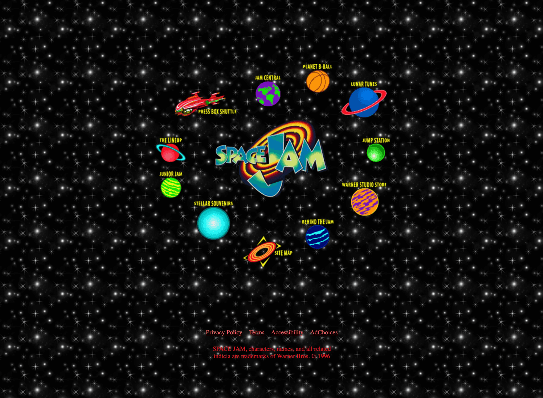
This promotional site is a time capsule of classic 1996 web design, featuring a tiled starfield background, low-res animated GIFs, and navigation built on clickable image maps. The content is organized within rigid table-based grids. A mirror of the original site is still live, testifying to the iconic status of late 90s to early 2000s design trends.
2. Yahoo!
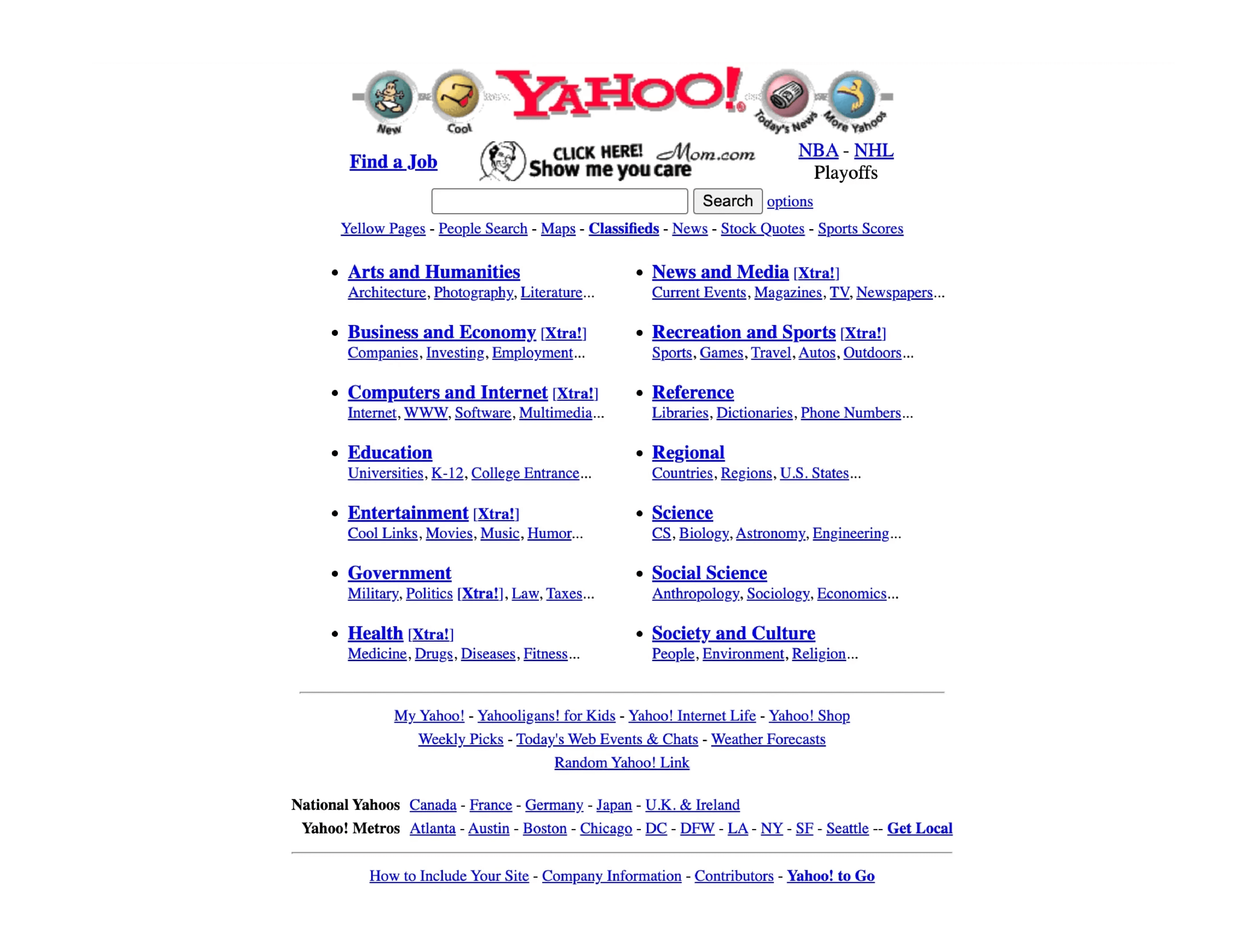
The early Yahoo! homepage functioned as one of the world wide web’s most popular digital directories, presenting a dense list of blue text links with minimal graphics. The layout was strictly defined by tables, organizing a massive amount of information into a compact, anchor text-heavy portal. The site is live, but in a modern form; originals are accessible via web archives.
3. GeoCities
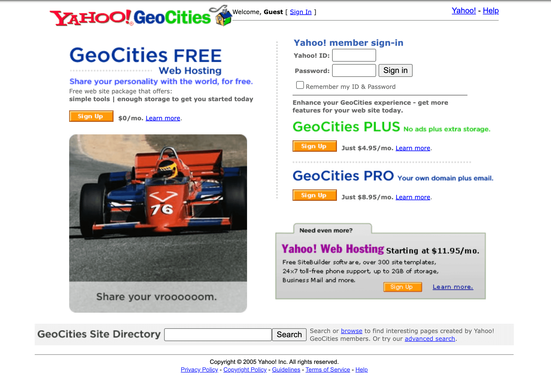
GeoCities’ massively popular personal website pages were the embodiment of do-it-yourself 90s website design, known for user-uploaded tiled backgrounds, blinking text, and busy sidebars. Features like “guestbooks” and “under construction” icons were common. While the service is defunct, but its pages are preserved in places like the Internet Archive.
4. NASA
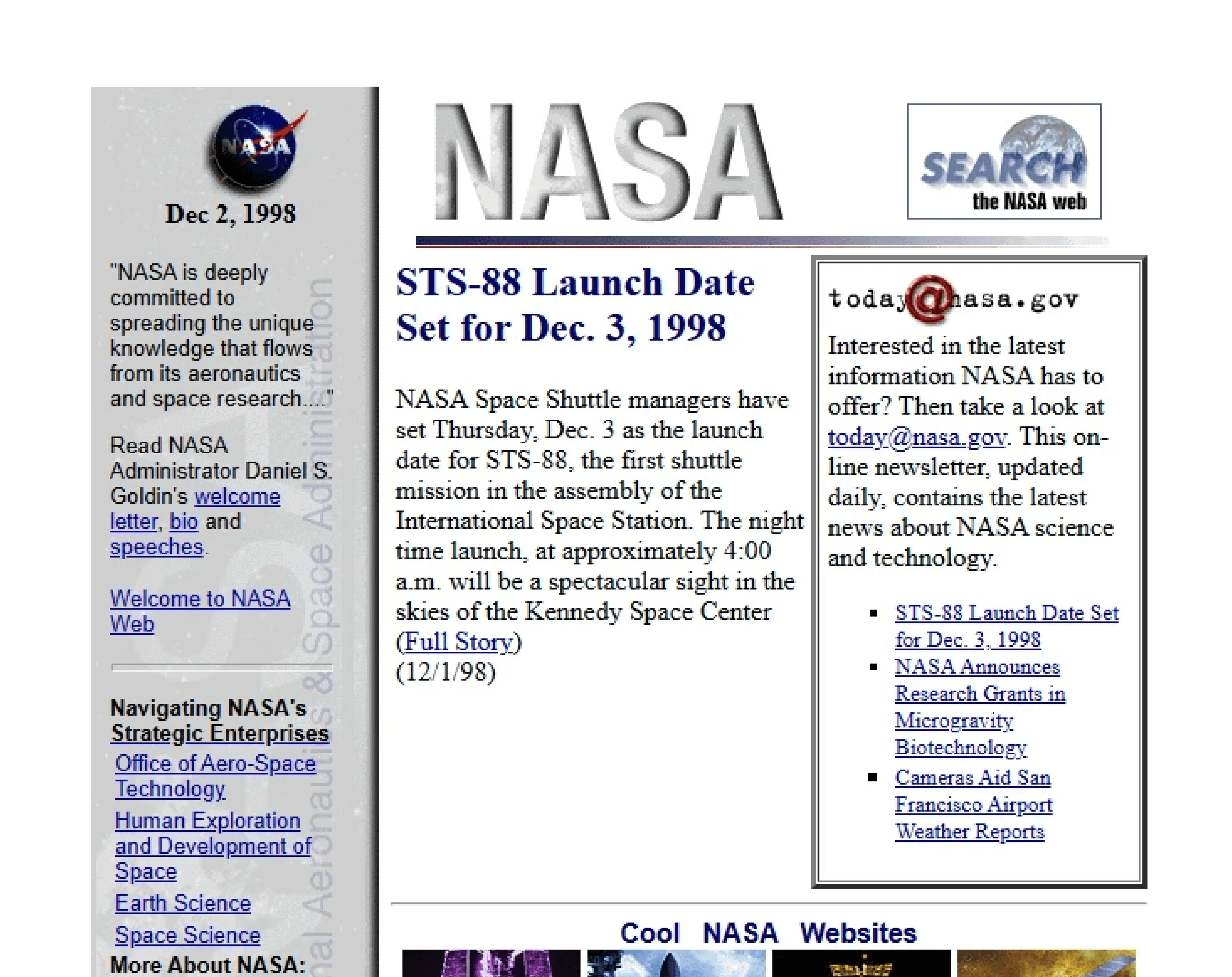
NASA’s early web presence was practical, using stark, functional layouts with standard system fonts like Times New Roman. Inline images with text captions delivered information efficiently, and navigation was purely utilitarian.
NASA maintains a strong, multi-functional web presence today. But its original look offers a window into peak 90s design pragmaticism.
5. Microsoft Windows 95
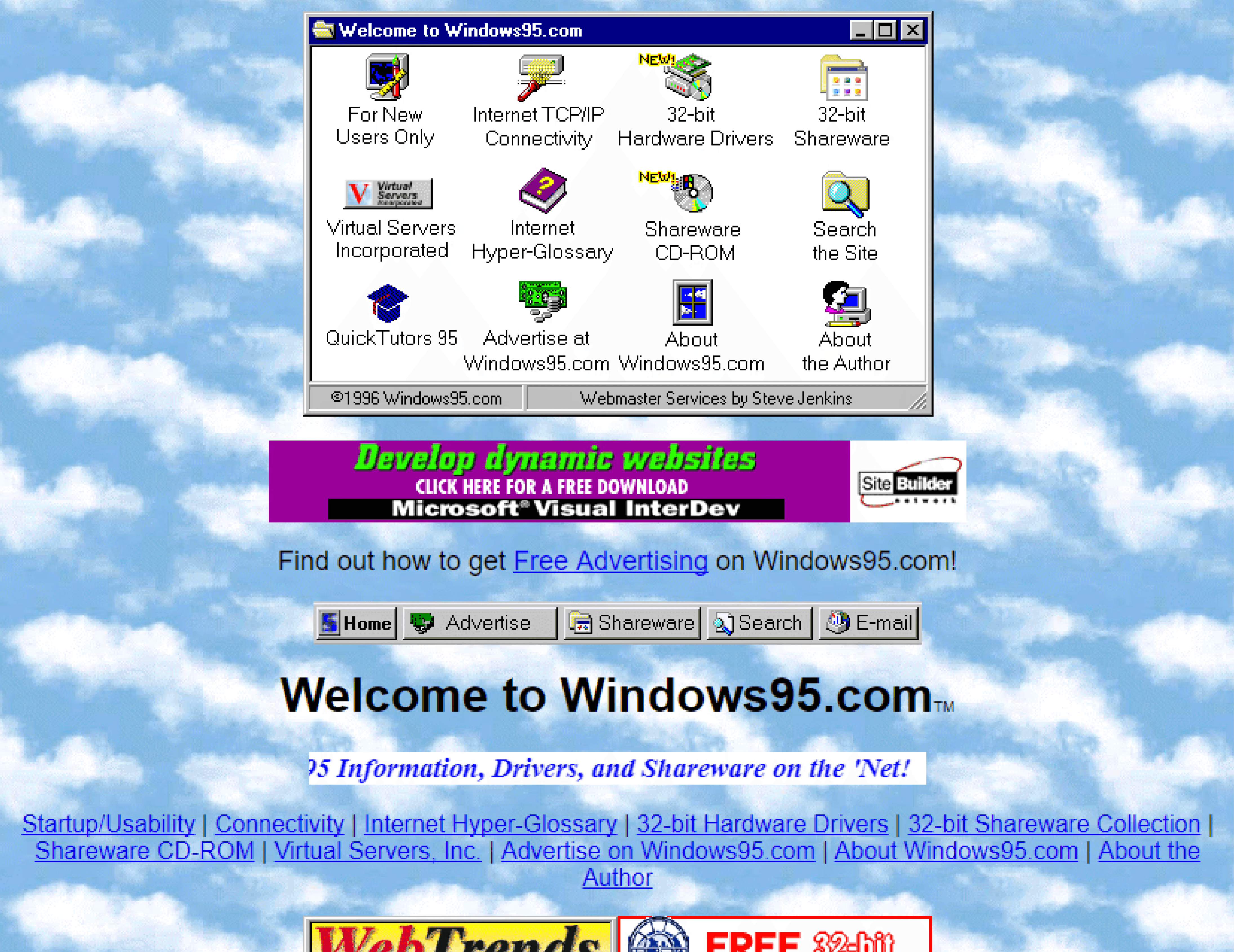
Can you talk about the evolution of the internet without talking about Microsoft? The tech OG’s Windows 95 used design elements from its namesake operating system, including beveled buttons and window-like visual frames. It served as a software promotional hub, using sliced images to create a splash-style landing page. Designers can still view that archived original site to witness a key moment in software marketing.
6. AOL
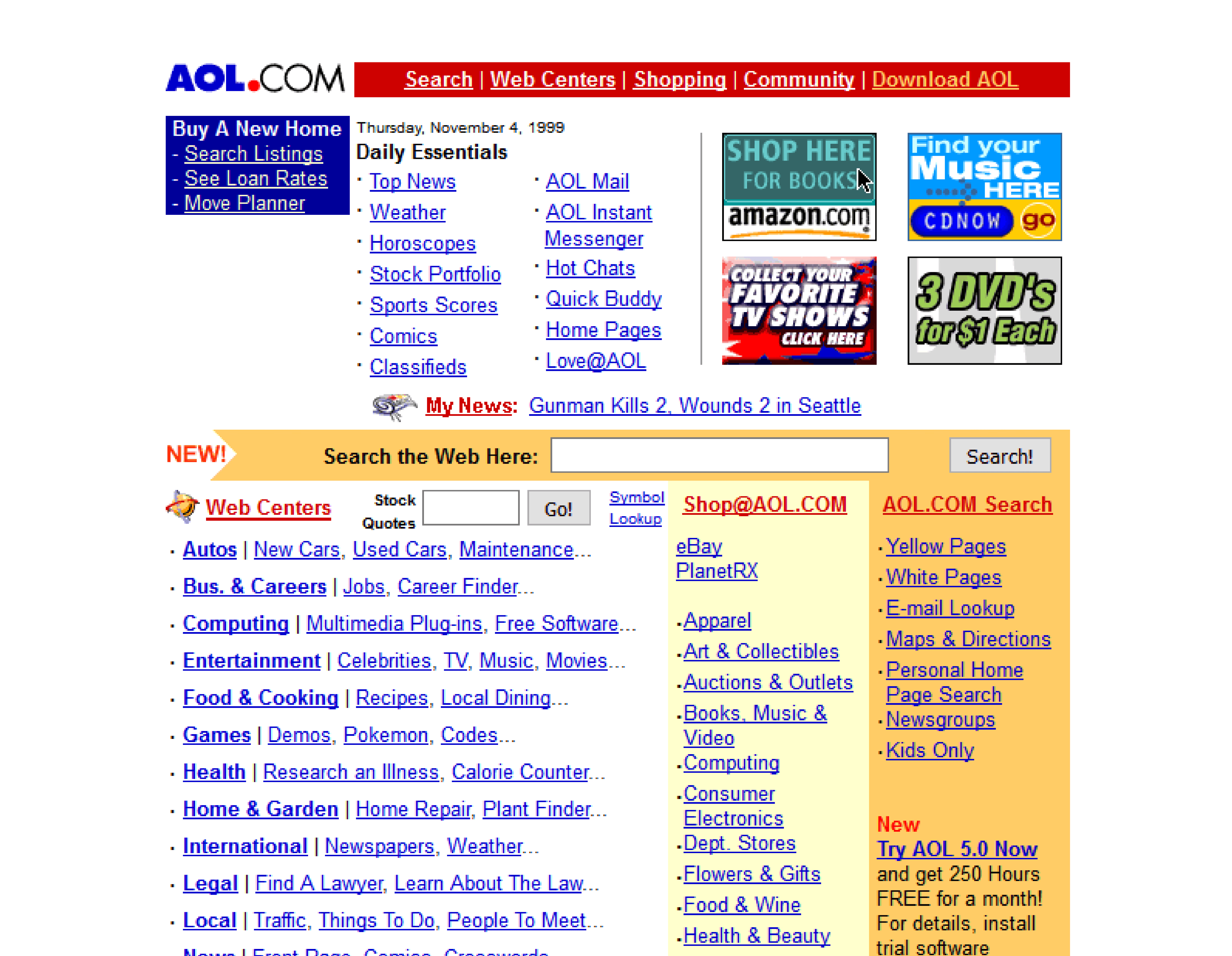
As a major internet portal, AOL’s site used bold, colorful banners and inline promotional blocks to guide users. Its information architecture relied heavily on HTML framesets, a technique that loaded different parts of a page independently. The site is still live but has been completely redesigned.
7. Amazon
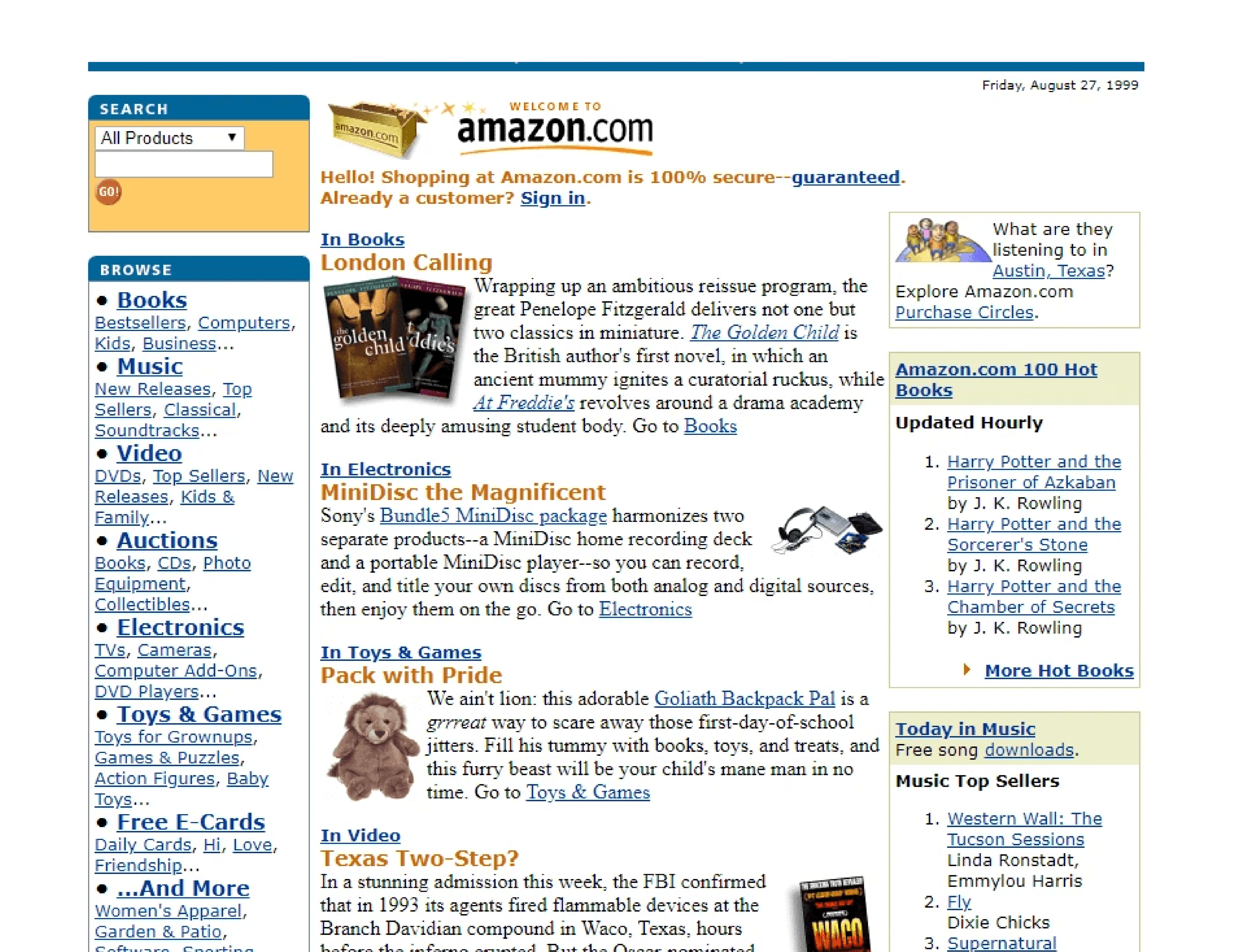
The very first version of Amazon launched in 1995 as a text-heavy, books-only e-commerce experience. The design prioritized book information, using standard blue hyperlinks, small and often pixelated cover images, and dense metadata to create a functional online bookstore. The current site is a modern e-commerce behemoth, but early versions available in web archives are a portal into the past.

Sign up for Framer for free and get 500 free Agent credits every month
8. CNN
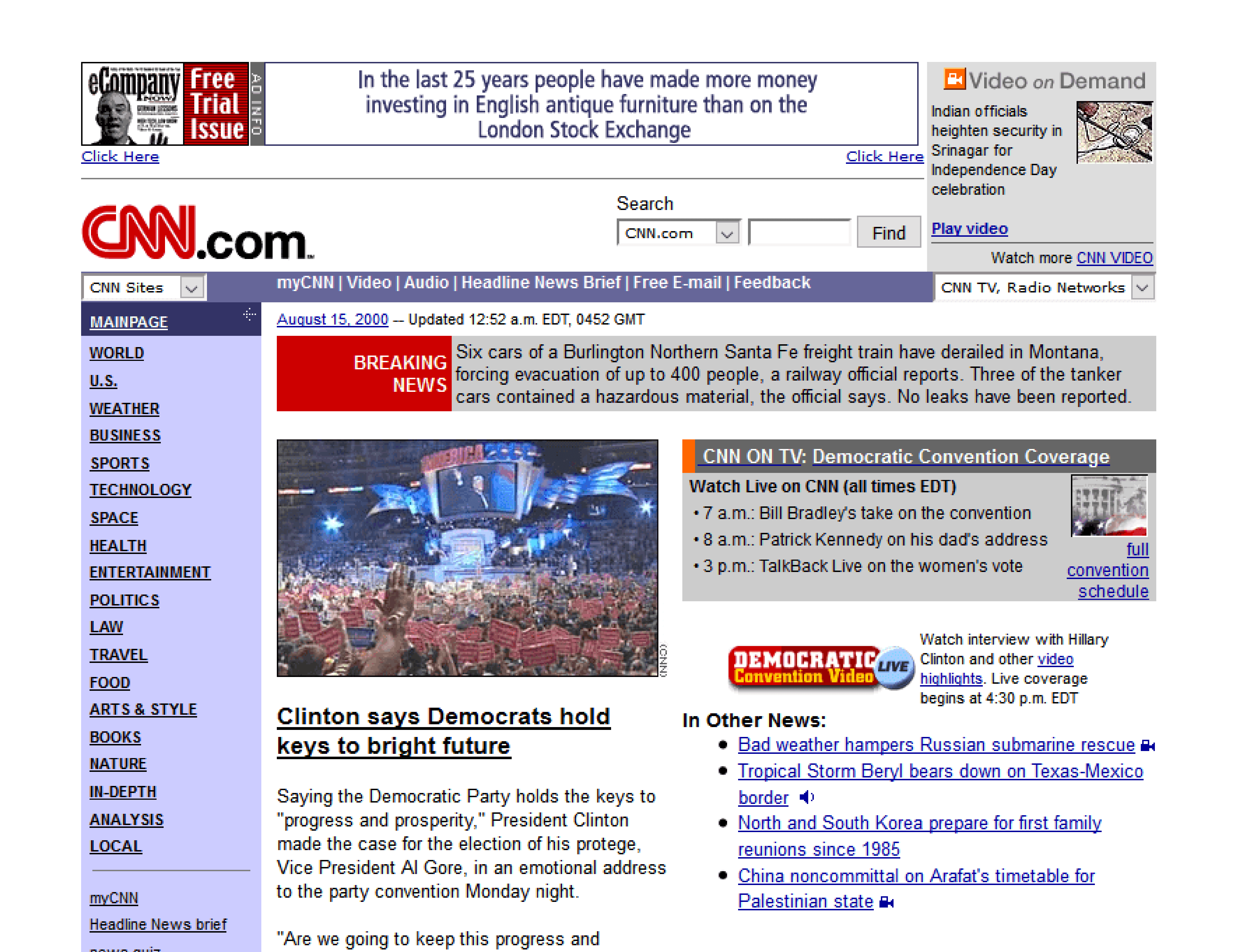
CNN’s early site organized breaking news into multi-column table layouts, mimicking a newspaper. It used marquee-style scrolling headlines and small image thumbnails to deliver a high density of information quickly. The site is still live, with its 90s versions found in web archives.
9. Apple
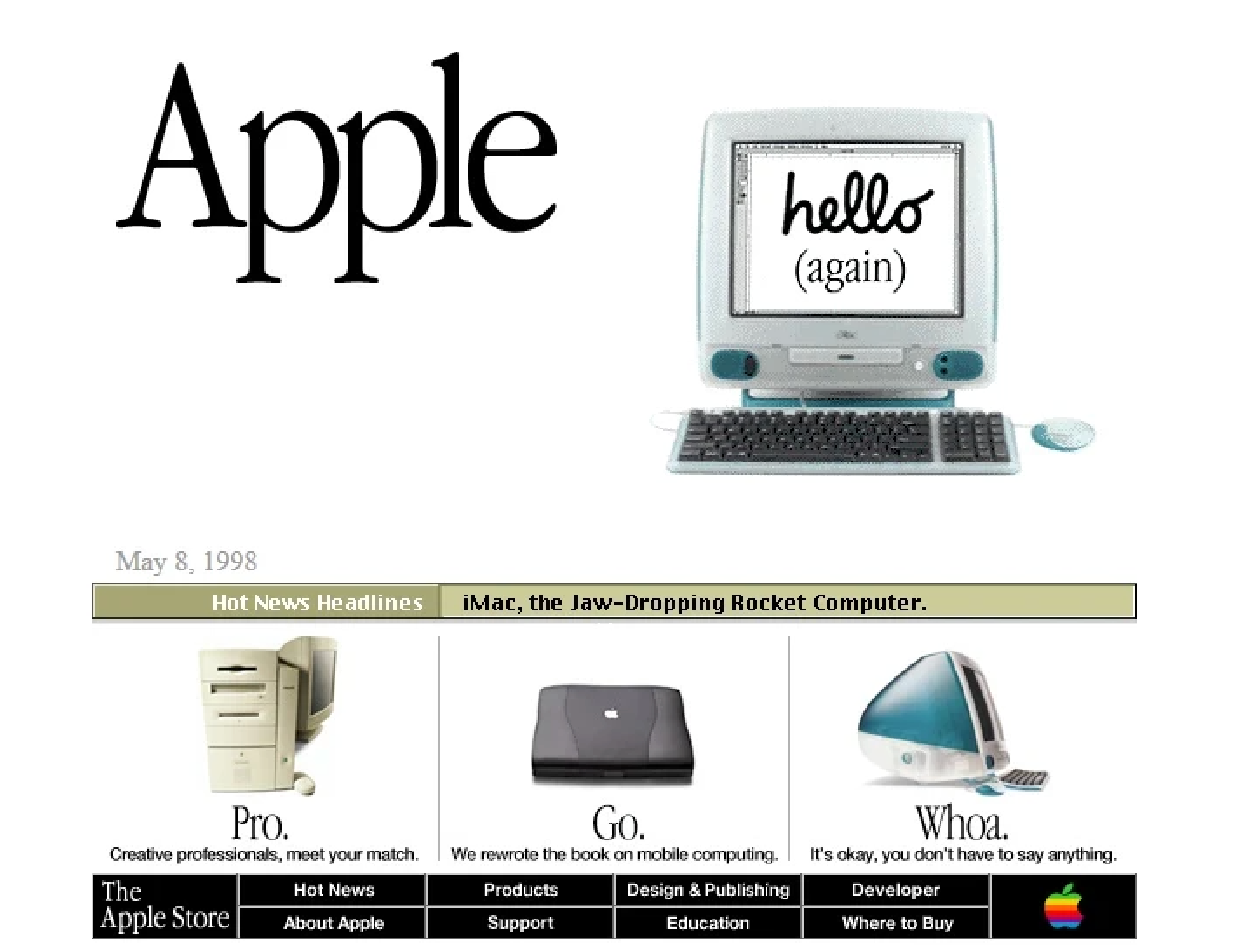
In the late 90s, Apple’s site heavily featured product hero graphics and UI elements with beveled, three-dimensional cues. It used sliced images to construct more complex visual layouts for the era, and maintained clunkier navigation and sidebars. The modern site is live and ultra-sleek, with its past designs archived for review.
10. Netscape
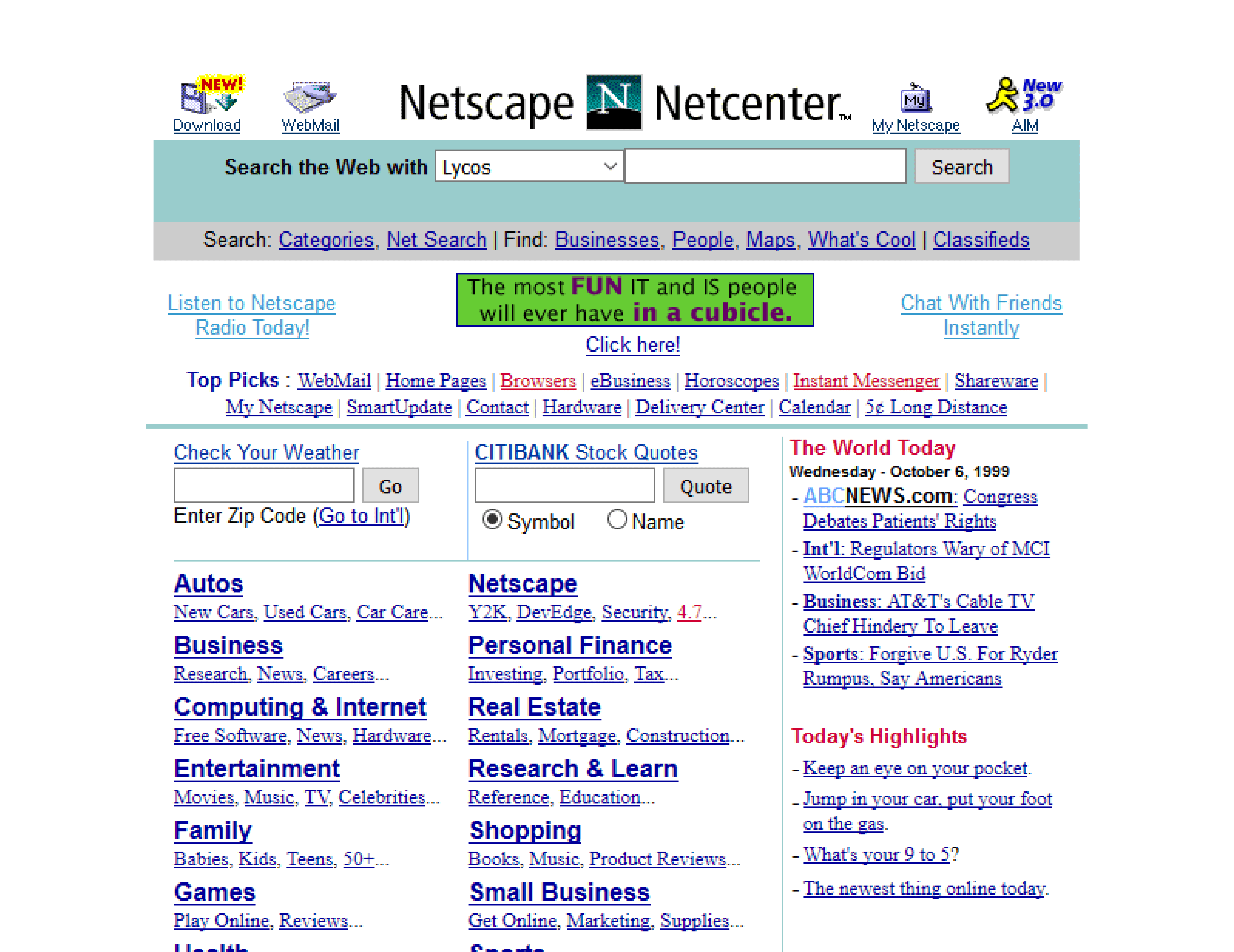
Netscape’s site was built to encourage downloads of its browser, featuring prominent CTAs and some of the earliest examples of on-page, trust-building badges. It used simple gradients, saved as tiled background images, for visual depth. The original site often serves as a relic reminding all of the very first browser popularity wars.
11. AltaVista
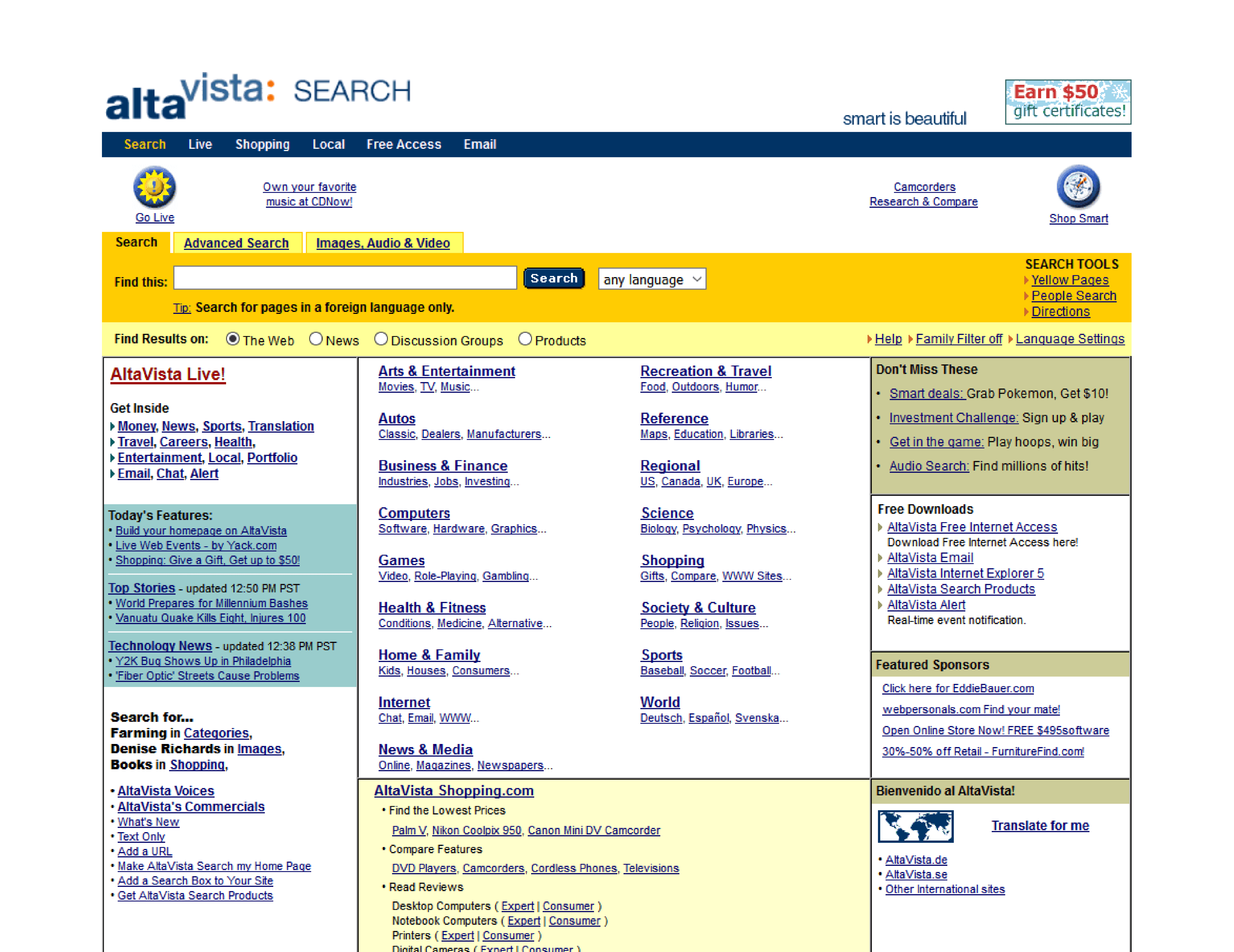
AltaVista is often compared to Google before Google. As an early search engine, it featured a minimalist interface focused almost entirely on the search bar. Below that main function, it offered dense directories of links, a common feature for old-school websites of the 90s that doesn’t visually stand the test of time, but certainly captures the UI of the era.
12. Lycos
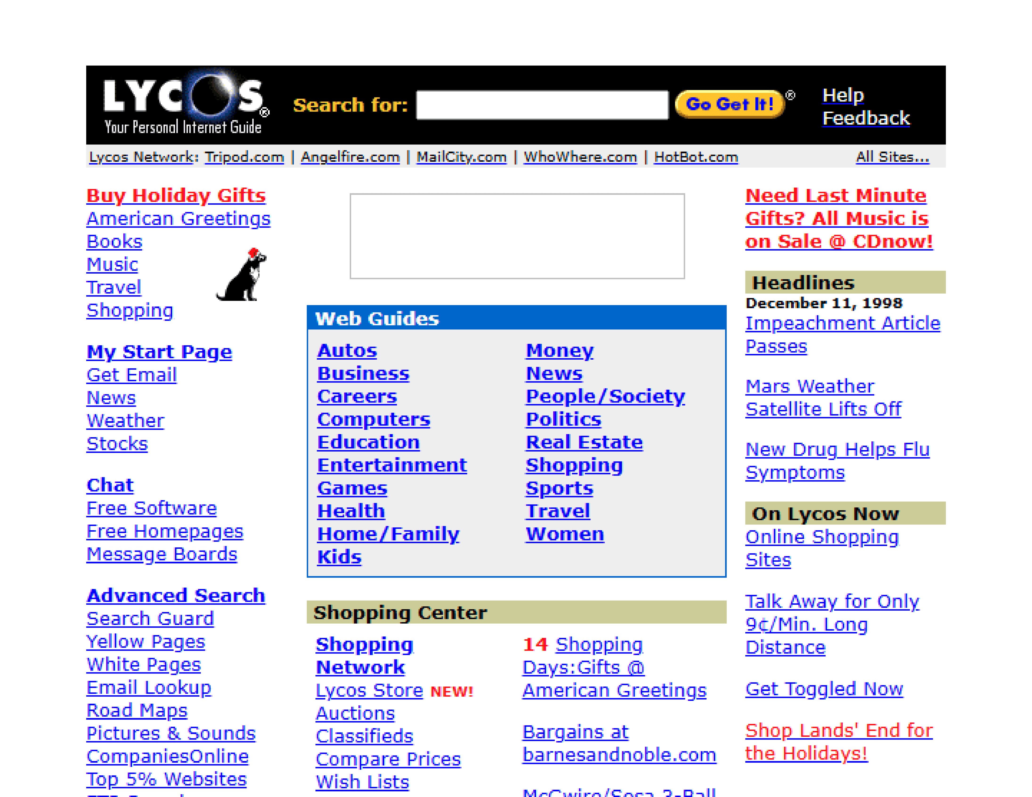
Lycos was a classic 90s informational portal, packing its homepage with modules for news, weather, and finance headlines. The layout was crowded, with a footer full of anchor links, designed to be a user’s primary doorway for the wider web. The site remains and has since been redesigned, with its original form viewable in archives.
13. Hotmail
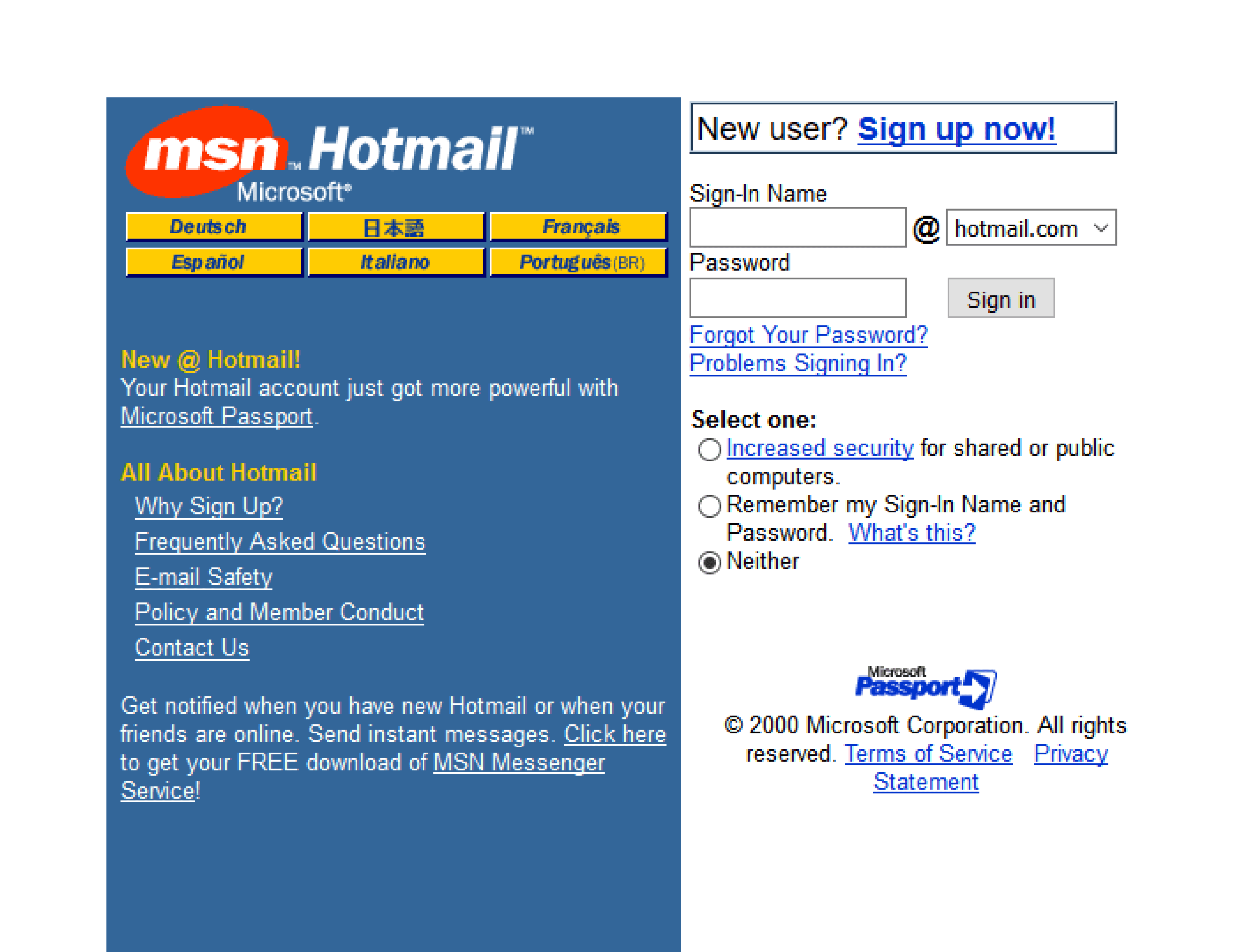
Hotmail’s website design was as 90s functional as you could get, with a utility-focused user interface. It contained simple HTML-based web forms, standard system fonts, and a framed layout guiding users through its login and email-checking process. While now part of Outlook, Hotmail’s original design still serves as a reference point even for contemporary login sequences.
14. Angelfire
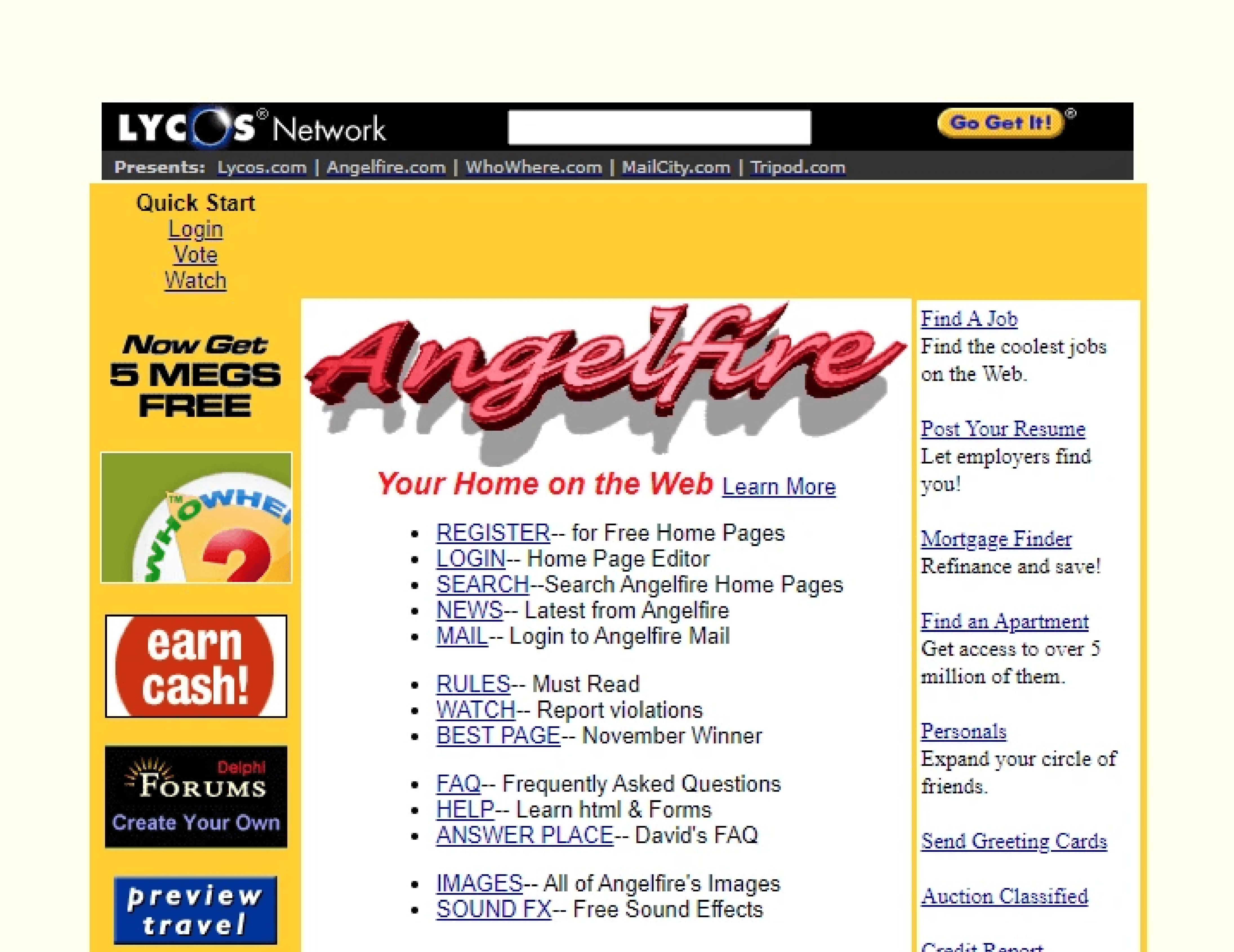
Similar to GeoCities, Angelfire hosted personal pages that showcased the best vibes of 90s internet aesthetic. Animated GIF-like dividers, static memes, visitor counters, and custom-patterned wallpapers were staples of these user-created sites. The service is still live, but the classic community pages are mostly found in WayBack Machine archives.
15. ICQ
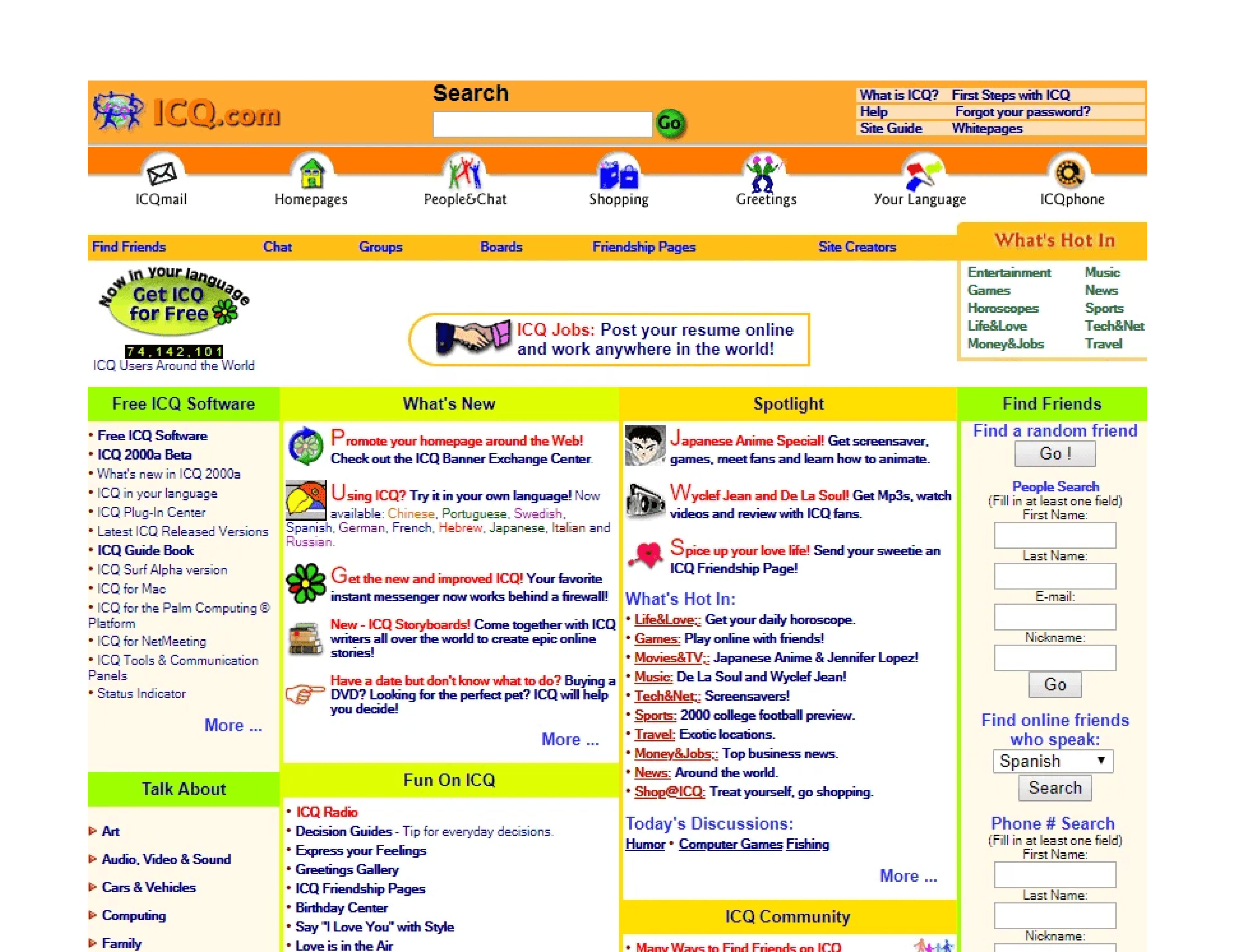
The website for the ICQ messaging service was built around its brand and product, featuring badge-like logos and chunky iconography. The primary goal was to get users to download the software, so large download buttons were a key design feature — and became a modern web development staple.
5 modern websites bringing 90s style back
The spirit of these old school 90s websites lives on, but today’s tools allow creators to adopt the best of its aesthetic without the technical limitations.
Modern sites can capture the expressive freedom of 90s website design while delivering the performance and usability now expected. Here are a few examples and resources selected by web design and dev experts, and available in Framer’s Marketplace and Gallery.
1. Retro’98 (by Nick404)
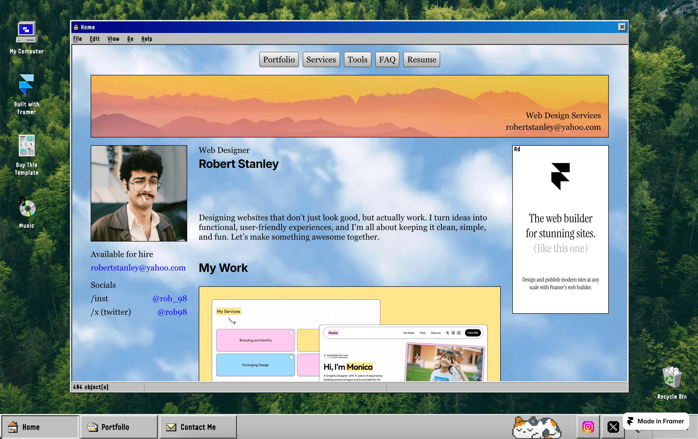
This retro-immersive portfolio template recreates the classic Windows 98 user interface, complete with familiar window chrome, icons, and status bars. However, it has a modern technology backbone, meaning a responsive layout that adapts to all devices, plus a CMS for easy site updates. It provides pixel-precise nostalgia without the slow performance of legacy websites.
2. DeskTales (by Mani)
DeskTales offers a vintage desktop experience, using quirky, draggable windows and nostalgic navigation-bar icons to emulate a 90s workstation. While the feel is retro, the site is fully responsive, features smooth navigation, and includes simple SEO and content management elements. It’s a template that channels the light, playful nature of early personal homepages.
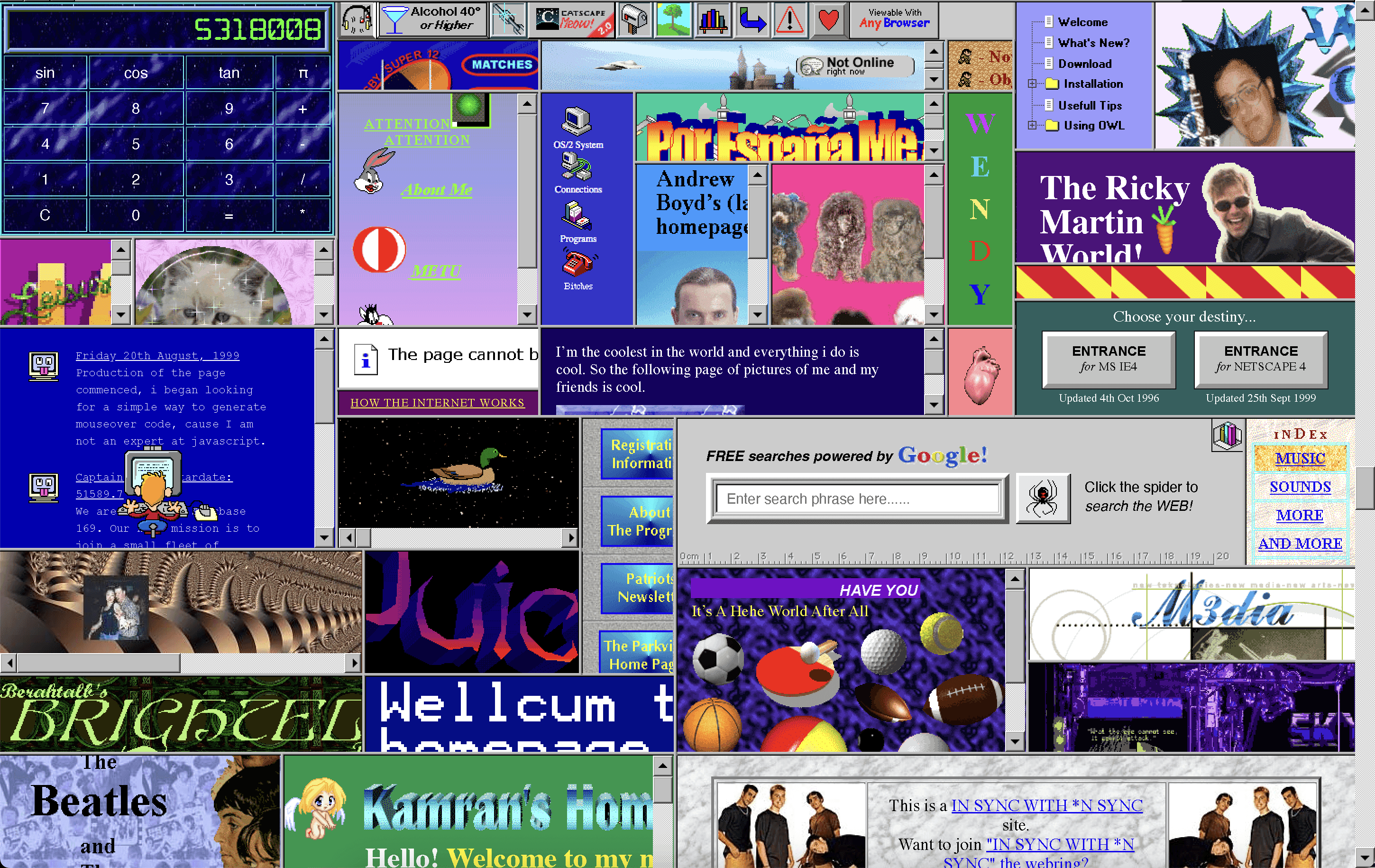
Both GeoCities and 1996 Space Jam website walked so Cameron’s World could run. You can immediately see the reference points, with the Cameron’s World project a sprawling digital homage built entirely from archived GeoCities page fragments. It celebrates the uncurated creativity of the early web with a loud, chaotic, collage-like arrangement of animated GIFs in tiled background patterns, and wonderfully eclectic typography.
4. Shader Pack Retro Plugin
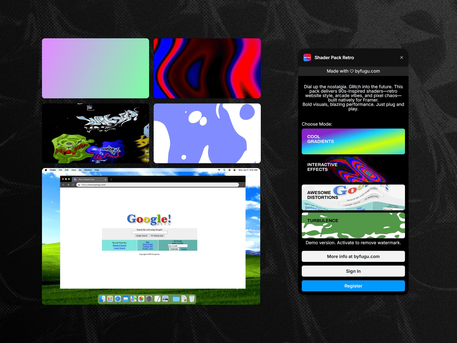
This time-capsule plugin allows designers to apply 90s-style animated effects to any element on a Framer site. Think VHS, arcade, and glitch shaders that bring a bold, pixel-era flair to modern layouts. These effects are powered by WebGL for high performance and run natively in Framer, offering tasteful 90s motion without any external dependencies.
5. Windows93
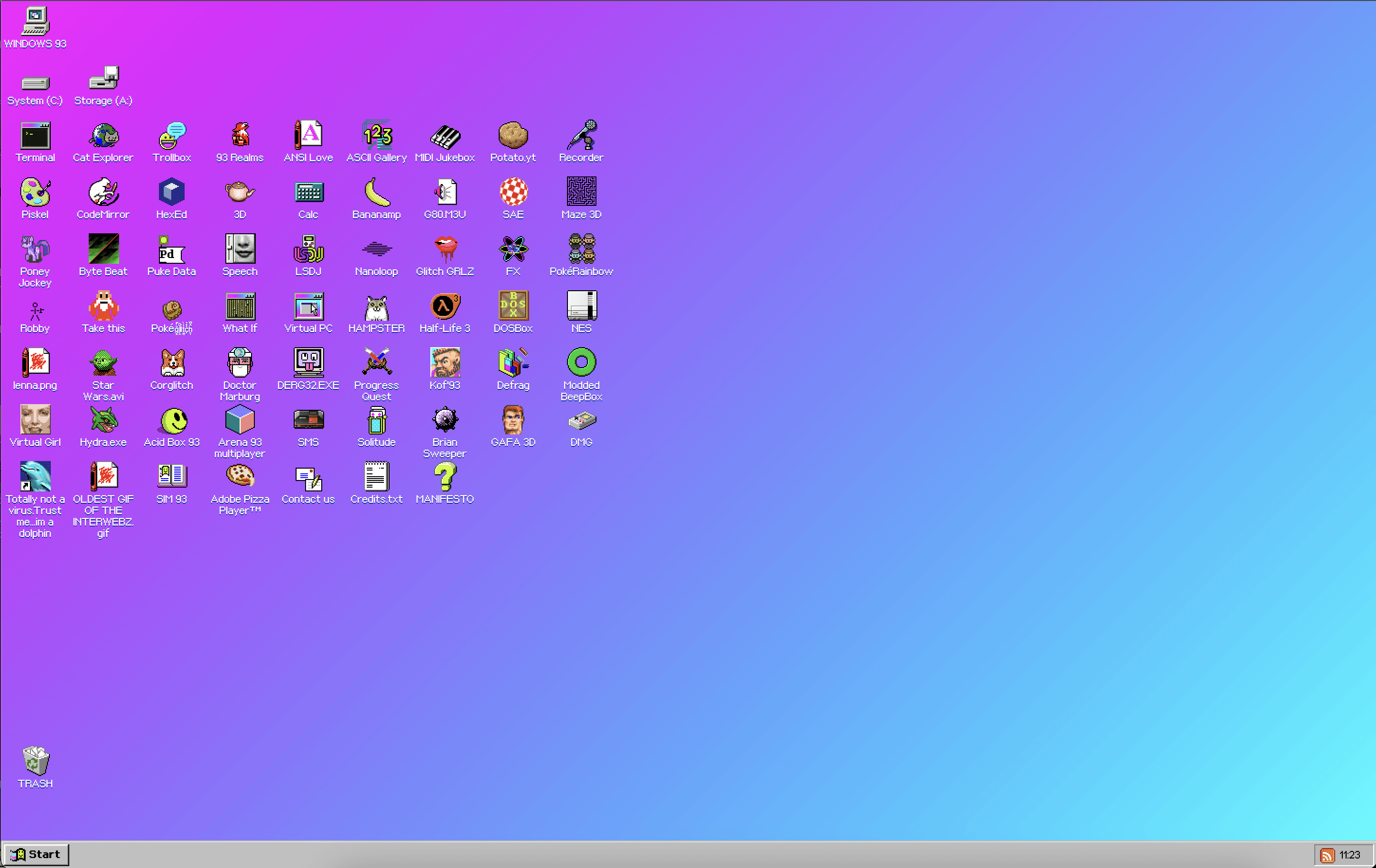
Windows93 is nothing short of a trip down memory lane. It’s a deeply interactive homage to 90s computer interfaces, presented as a complete operating system within the browser, and powered by retro JavaScript, CSS, and HTML elements. The experience features a pixel art environment, skeuomorphic buttons, and draggable pop-up windows that perfectly mimic early desktop computing. It’s a masterclass in nostalgic interaction design.
Recreate the 90s-inspired website of your dreams with Framer
Creating a website that captures the 90s internet aesthetic is more than achievable, thanks to Framer’s full-site templates.
With Framer, you can blend vintage visuals with modern performance standards, making sure your site is both expressive and fast.
For example, GPU-accelerated effects, available through plugins like the Framer Shader Pack Retro, can replicate the animated GIF motion of the early world wide web without its performance issues.
Framer’s 2,000 plug-and-play templates bring modern responsiveness. While websites from the 90s were built for a single, fixed-width desktop view, Framer sites are built to adapt to any device with responsive breakpoints. Your users get the charm of retro web design, without the slow load times and glitching displays.
Finally, templates have professional infrastructure built-in. Features like global hosting, integrated settings for traffic-vital SEO, and one-click publishing are standard. This ensures your sites are not just visually high-quality, but high-performing, discoverable, and accessible worldwide – a far cry from the dial-up days.
To create a 90s-style website in Framer, you can start with pre-built templates like Retro’98 or DeskTales. Get started with these, and other vintage designs, available in the Framer Marketplace. Then, when you’re ready, sign up for Framer to create your own site.