

The Evolution of Responsive Design
With responsive web design, your website automatically adjusts to any device or browser. Your audience has a consistent experience regardless of whether they’re using a smartphone or working from a desktop computer. See Why choose Framer over other no-code website builders?.
In the early days of responsive design, web designers started with a desktop version, then adapted the design for mobile and tablet. Using breakpoints for desktop, mobile, and tablet is still a core part of responsive design, but these days there are so many device types that designing for every possible resolution is impractical.
In 2018, the most common resolution (360x640) was used by 23% of users. Now, no single resolution has more than an 8% market share.
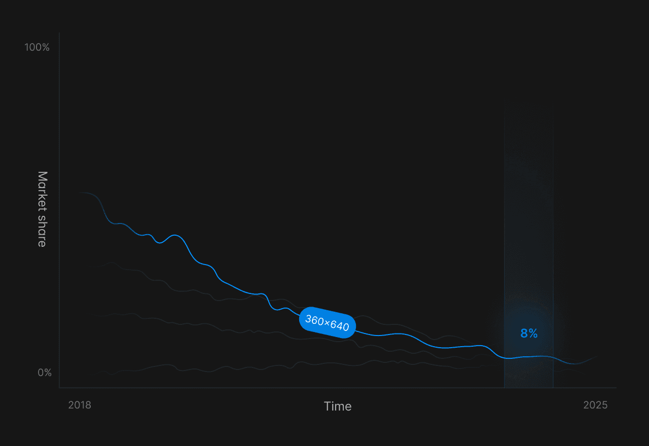
Source: Statcounter
Auto-sizing using stacks is one alternative. (We’ll explore stacks more in the next section.) By transforming your design into a stack, the layout self-adjusts to changes without requiring manual breakpoint adjustments. You can also use tools like fluid grid layouts, relative positioning, and responsive images and typography.
How to Build Responsive Websites with Framer
Mastering responsive design techniques allows you to build websites that delight users by displaying beautifully on every device.
1. Start with Wireframes
Wireframing in Framer is different from traditional design tools. Instead of creating static mockups that’ll need to be rebuilt later for different screen sizes, Framer’s components are responsive from the start.
The platform’s component library has pre-built elements that automatically adapt to different screen sizes.
Navigation menus transform themselves for mobile views.
Hero sections resize intelligently.
Content blocks reflow based on available space.
This frees you up to focus on your design’s structure and hierarchy instead of getting bogged down in technical details.
When building your wireframes:
Keep navigation simple and intuitive.
Focus on content hierarchy—what do users need to see first?
Consider how elements will stack and reflow on smaller screens.
Use Framer’s pre-built components to speed up the process.
Start with basic content blocks and gradually add complexity. Pay attention to navigation elements, as these often require significant adaptation between mobile and desktop views.
Framer makes it easy to create different navigation versions for different screen sizes.

Sign up for Framer for free and get 500 free Agent credits every month
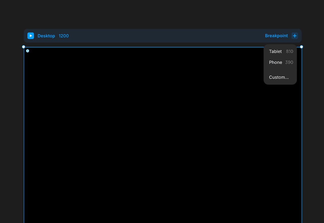
2. Define Breakpoints for Responsive Design
Breakpoints are the foundation of responsive design. But as anyone who’s wrestled with CSS media queries knows, they can also be tricky to deal with: What looks good at exactly 768px might break at 767px or 769px.
Framer transforms this traditionally technical process into an intuitive, visual experience. For example, Framer’s visual breakpoint editor lets you drag handles to set breakpoints, while watching your design adapt in real-time. You can also use Framer’s responsive preview mode to instantly see how your design looks at different screen sizes.
One of Framer’s most powerful features is breakpoint inheritance. Here’s how it works: When you make changes to your primary layout, those changes automatically cascade to other screen sizes, saving hours of repetitive work.
You can also make specific adjustments for certain screen sizes (like mobile) that override your inherited settings without affecting other screen sizes.
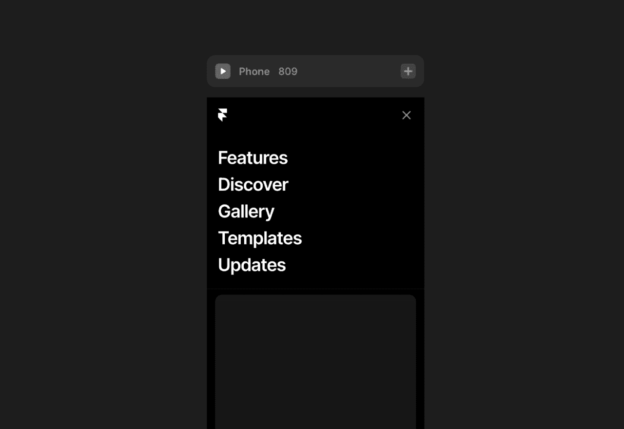
3. Take a Mobile-First Approach
Mobile traffic now dominates the web, making up 61% of all traffic. As a result, the old approach of designing for desktop first doesn’t make sense anymore. Instead, design for mobile first, then adapt your design for desktop later. There’s a side benefit to this reversal: Since you have less space when designing for smaller screens, you have to make strategic decisions about what to include from the beginning of your design process.
Framer makes it simple to set mobile as your default layout, then progressively enhance your designs for larger screens.
This might look like:
Expanding single-column layouts into multiple columns.
Revealing additional content on larger screens.
Adding more sophisticated interactions for desktop users.
Transforming mobile navigation patterns into desktop-friendly versions.
Adjusting typography scales for improved readability.
Optimizing image layouts and cropping for different screen sizes.
Navigation is one of the most challenging aspects of mobile responsive design, but Framer makes it manageable. You can easily implement mobile patterns like hamburger menus and bottom navigation bars, then have them transform into full menu bars on desktop—all while maintaining brand consistency and user experience.
4. Create a Fluid Grid Layout
Framer’s grid layouts take the complexity out of responsive grids, replacing it with an intuitive visual system. Auto-layout capabilities automatically handle many of the common challenges in responsive design, like maintaining consistent spacing between elements and ensuring proper alignment as layouts resize.
Framer’s grid system lets you:
Specify column counts at different breakpoints.
Control how elements span across columns.
Manage element flow and resizing.
Adjust spacing automatically.
One of the most powerful features of Framer’s grid system is its ability to handle dynamic content like CMS collections, user-generated content, or dynamic images. As you upload new items, Framer’s grid system makes sure your layout stays as attractive as when you first designed it.
5. Use Stacks and Relative Positioning
While grids handle overall page structure, Framer’s stacks manage how elements within that structure relate to each other—all without manual positioning or complex code.
Stacks are intelligent containers that automatically handle spacing and alignment between elements. You can arrange elements horizontally (in a row) or vertically (in a column), and your stack will maintain proper spacing as screen sizes change.
The key is relative positioning: Instead of fixing elements to specific coordinates, stacks allow elements to adapt their position based on their container and neighboring elements.
Common uses for stacks include:
Navigation menus that transform seamlessly between desktop and mobile.
Card layouts that maintain consistent spacing regardless of content.
Form interfaces that keep inputs and labels perfectly aligned.
Content sections that adapt cleanly to any screen size.
The real power of stacks is when you nest them within each other. You can create sophisticated layouts by combining horizontal and vertical stacks, each with their own auto-layout properties like “Fill Container” and “Hug Contents.”
Tip: You can learn more about the difference between stacks and grids in Framer’s academy.
6. Optimize Images and Typography
Framer’s approach to responsive images goes beyond simple scaling. You can optimize image delivery with lazy loading for improved performance, automatically generate responsive image source sets, and dynamically crop tools that maintain focus on the important parts of images as they resize.
Framer’s tools ensure your images look great at any size by:
Serving appropriate image sizes for different devices.
Using SVGs when possible, for crisp scaling.
Offering adjustable positioning and sizing.
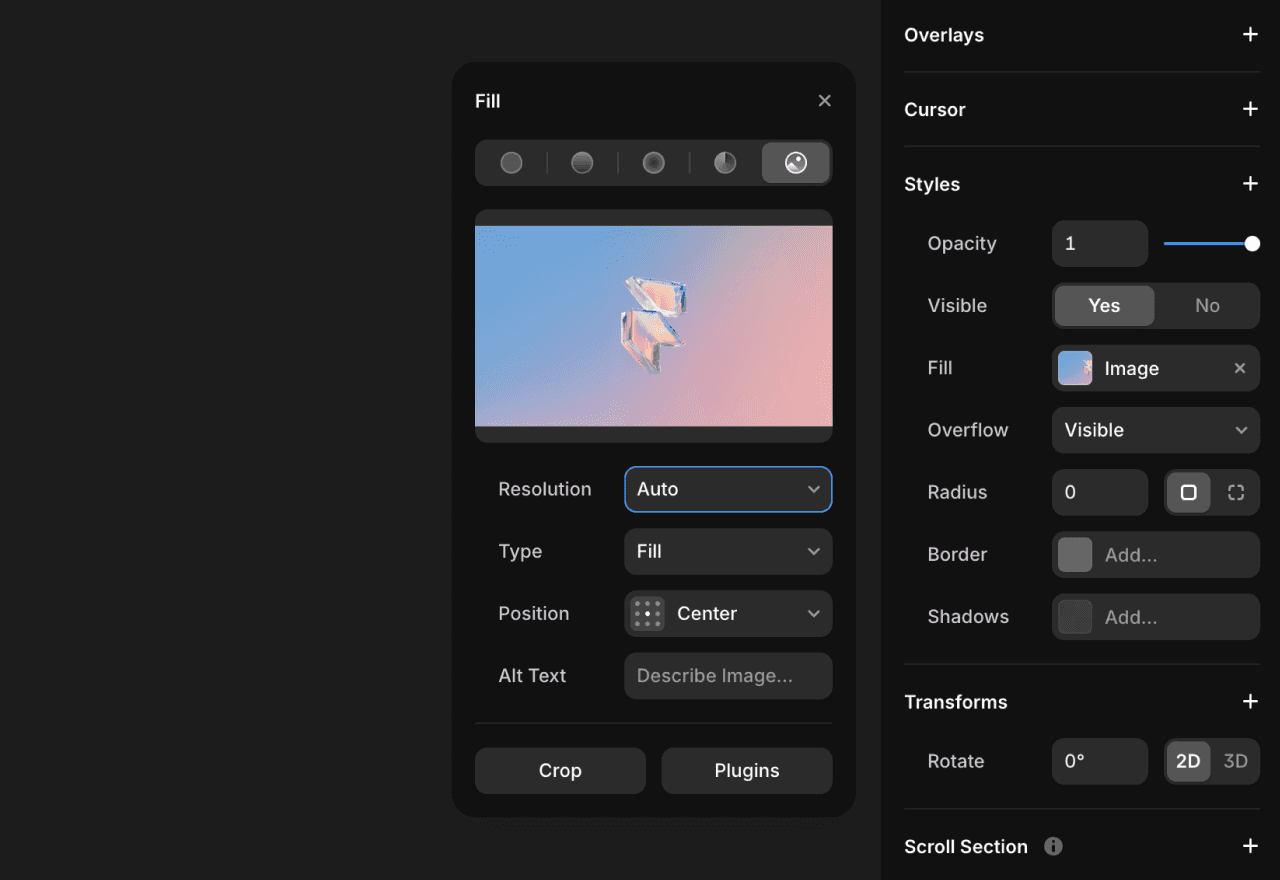
Framer”s typography system allows you to manage font sizes, line heights, and spacing across different breakpoints. It also optimizes font loading to prevent layout shifts and keeps text readable even while custom fonts are loading.
To prevent issues with responsive designs, you can set fluid font sizes that scale smoothly. You can also enable minimum and maximum sizes, so text never becomes too small or large.
And with Framer’s Fit Text feature, you can design eye-catching headers and paragraphs that resize along with your browser or section.
Test Your Site’s Responsiveness Before Launch
Framer gives you two powerful ways to test your site’s responsiveness before launching.
Using Framer’s built-in preview mode, you can check your design across different devices without leaving the editor. You can quickly catch and fix responsive issues, test interactions, and verify how your layout handles variable content like different text lengths and image sizes.
While the preview mode is great for quick iteration, nothing beats testing on actual devices before launch. With Framer, you can share preview links that open on any device. Interacting with your design on a range of smartphones, tablets, and monitors helps you make sure that everything works as expected—and catch bugs before you send your new website out into the world.
Make Your Website Work Beautifully Everywhere
Responsive design isn’t going anywhere. In fact, it’s only becoming more essential as screen sizes evolve and new devices emerge. Framer puts you ahead of the curve with a future-proof approach to web design that adapts to whatever comes next. Instead of being constrained by rigid layouts, you’ll have the flexibility to create fluid, responsive experiences that delight users and work flawlessly everywhere.
Ready to create a responsive website without coding? Explore Framer’s templates to kick-start your responsive design, visit our gallery to see responsive websites created by other users, and sign up for a free Framer account to start building responsive websites today.


