

Good website navigation is equal parts strategy and design. A beautifully designed menu is useless if it buries your highest-converting pages under generic labels like “Solutions.” A carefully planned content hierarchy goes to waste if clunky menus and tiny mobile fonts make it impossible to use.
In this guide, you’ll learn how to make navigation design decisions that improve your user experience and drive better outcomes. You’ll also get specific tips for improving your content structure, designing for mobile, and choosing the right navigation elements for your site, along with nine real-world examples of navigation done right.
How to design your website navigation
Here’s how to approach your website navigation in a systematic way that takes both user needs and modern web design best practices into account.
1. Figure out your content structure first
As a designer, you’d probably rather experiment with hover effects instead of nerding out on information architecture. But before you drag your first navigation elements onto the canvas, you have to answer at least a few questions.
At a minimum, identify which content is most important:
Consider what specific tasks users come to your site to accomplish
Map each of those user tasks to a web page
Feature those pages prominently in any menu design
If you’re dealing with high-visibility projects or extensive sitemaps, you might need to put on your UX researcher hat and go in-depth.
One simple way to add context to your navigation decisions is to look at your analytics, find an attribution report, and figure out which pages drive the most conversions. In most cases, your best-performing pages should be accessible. The Interaction Design Foundation also recommends running a card sorting exercise to validate your website navigation structure before designing.
Even if you just want to “check the box” on information architecture, never start designing without knowing what you’re designing—and why. Decide which links are important enough to include in your top-level navigation, which to elevate to the most visible positions, and which to bury in the footer.
2. Choose your navigation type and placement
A UX website design principle known as Jakob’s Law makes a common sense observation: users spend most of their time on other sites, and they expect your site to work more or less like the ones they’ve used in the past.
Most website navigation designs should stick with these standard conventions:
Top horizontal navigation
Hamburger menus on mobile
Clickable logo in the top left that takes users to the homepage
Call to action embedded as a button in the top right
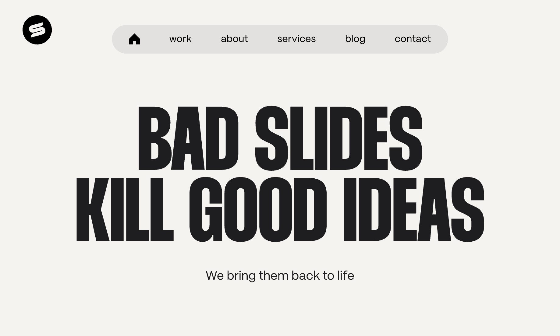
You won’t surprise anyone with these choices—and that’s exactly the point. These norms have been around for decades and are deeply ingrained in user behavior. The benefit, as with this example below from Slides Agency, is a user interface that visitors understand in milliseconds.
Want to get experimental? You can—but you probably shouldn’t. Sticking to what users know is your fastest path to getting them where they want to go. One exception to this rule are sidebars, which can work well as a secondary navigation menu for content-heavy situations like navigating ecommerce sites, blog posts, or support articles.
3. Keep your menu focused and scannable
At a certain point in internet history, businesses got bored with the name of their “About” pages. Some switched to “Our Story,” which these days is more or less understood by users. But trying to be clever can backfire: rather than making navigation effortless, eccentric menu item names (like “Come Aboard” instead of “Careers”) adds cognitive load for users.
Keep your menu straightforward:
Limit menu item names to one or two words and use familiar terminology
Stick to 5-7 options on your top nav bar to prevent decision paralysis
Show your most important pages prominently
Use dropdowns or mega menus for secondary content
With just three primary menu items, a dropdown menu, and a nav bar call to action, Packaly is a great example of the benefits of navigation minimalism. Users understand what to do immediately—and if they want to dive deeper, they know where to go.

If you’re using larger mega menus, you have a little more leeway. Your menu item names should still be short, scannable, and familiar—but since you have more space to work with, you can afford to add more information than just the bare necessities.
4. Create a separate mobile navigation experience
Mobile menus are often a carbon copy of the desktop navigation experience. But that’s not always the best path: if you’ve ever visited a site with dozens of links stuffed into mobile accordion menus, you’ve seen firsthand how this can go wrong.
Given the limited space you’re working with, the touch-based interactions used on mobile, and the different goals users have when using smaller screens, there’s a strong argument for taking a more calculated approach.
Design minimalist mobile menus that:
Show the most critical 5-7 menu items visibly
Put less important links in a collapsed menu (or remove them entirely)
Make touch targets large enough and add adequate spacing
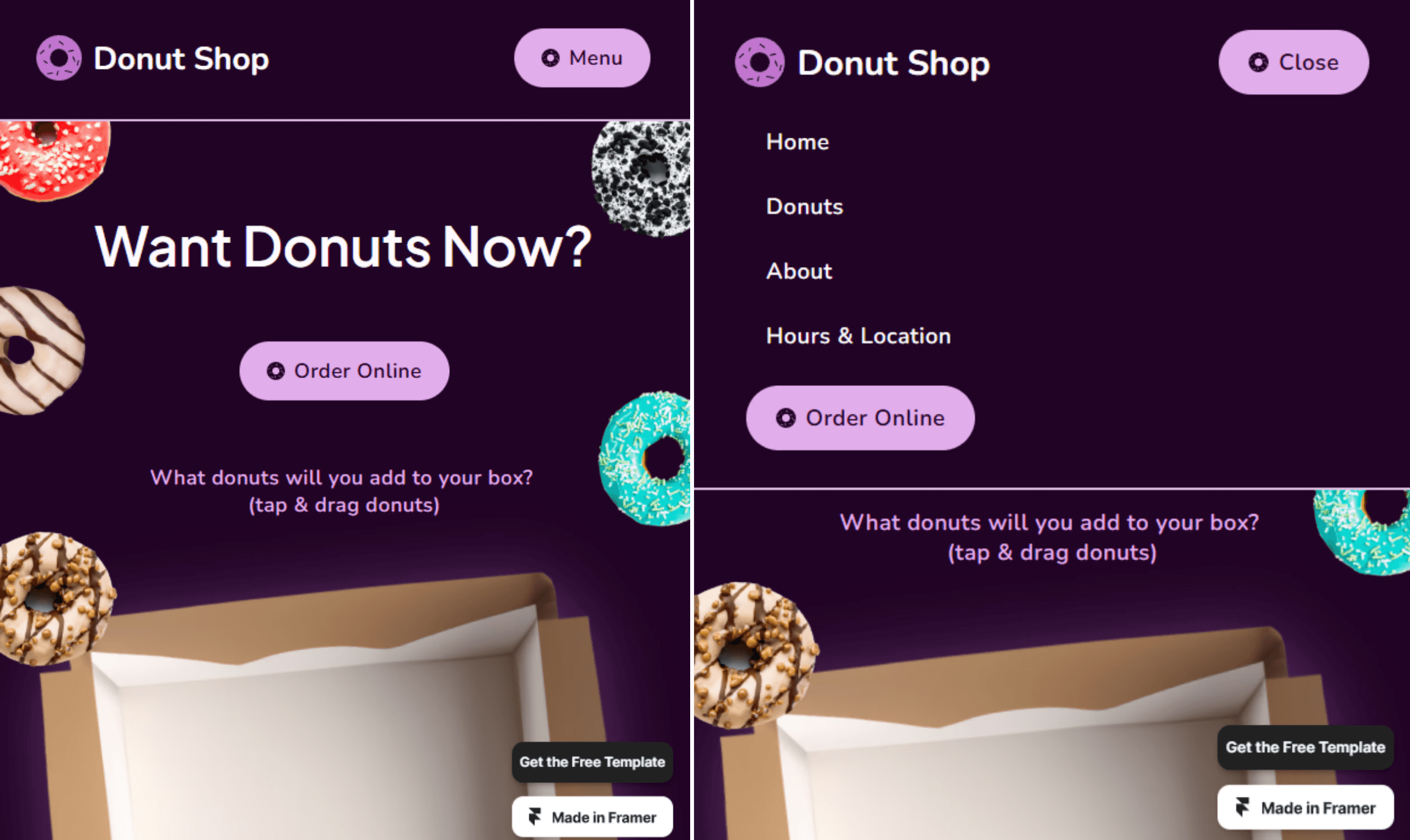
Hamburger menus are a tried-and-true approach for mobile navigation. After nearly two decades, they’re widely understood by users. If you want to improve on the classic hamburger icon formula, you can add the word “Menu” for clarity—it performed better in a series of A/B tests run by CXL, a UX training group.
Donut Shop, a Framer template, shows this in action. It also features another user-friendly touch: after opening the menu, “Menu” changes to “Close” so users know how to make it go away.
Putting links in a hamburger menu makes them less discoverable than if they were out in the open, so you might also consider displaying your most important call to action button separately on the mobile nav bar. Or, if you only have a few links, consider using a bottom navigation bar, listing each link directly, and skipping the hamburger menu entirely.
5. Design for usability and accessibility
While you should always keep your website navigation on brand, it’s not the best place to make big creative statements. Instead, stick to usability best practices that subtly show users how to interact and find what they need.
Follow these website navigation best practices:
Make sure your navigation links look clickable and change visibly upon hover
Add icons in dropdown menus to help users navigate quickly
Maintain the same navigation structure across your entire site
Use breadcrumbs for sites with deep hierarchies
Consider embedding an expandable search bar
Design your menu hover states to trigger immediately
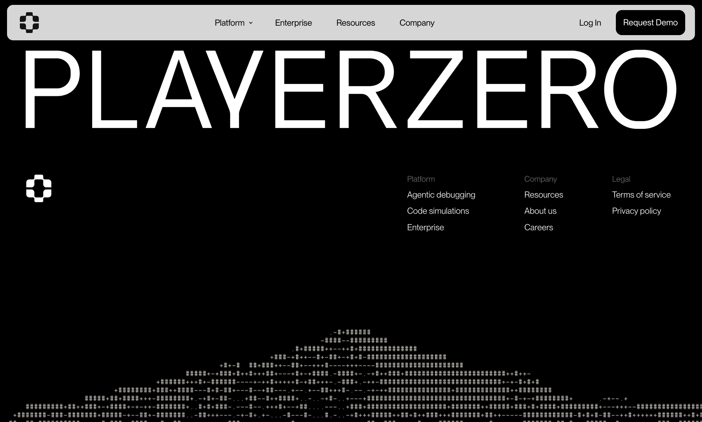
Sticky menus are an easy way to boost usability and keep users on your site longer. A study by Smashing Magazine found that sticky menus are 22% faster to navigate—and 100% of users in the study preferred them over static menus. Sticky menus are especially critical on mobile, since without them users have to do an unreasonable amount of scrolling.
Here, you can see how PlayerZero’s sticky nav bar follows users all the way to the footer, giving them an easy way to take next steps without tiring out their scroll finger.
Make sure your website navigation menus are accessible. Use proper focus states and ARIA labels, pick text colors with high contrast against your menu’s background color, and make sure your menus support keyboard navigation and screen readers. In addition to improving readability for all users, these steps also support your site’s SEO.
9 examples of effective website navigation design
Let’s look at nine sites that get navigation right, from familiar approaches like horizontal nav bars and hamburger menus to underused gems like bottom navigation bars.
1. Horizontal navigation bar — Tapdaa
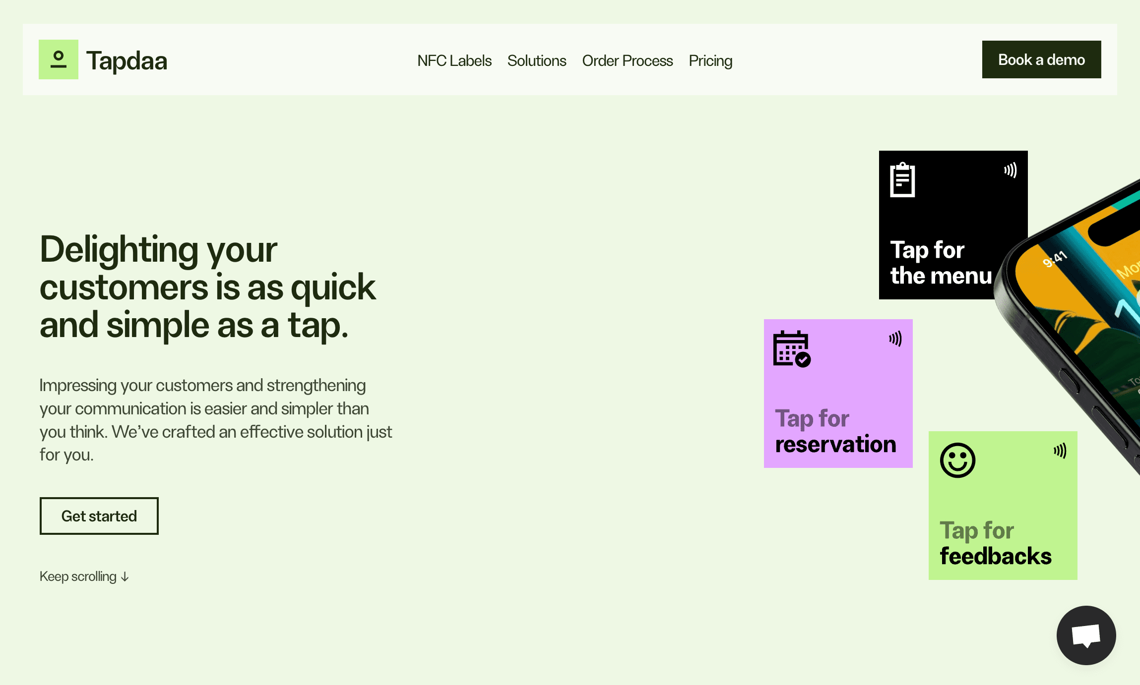
Tapdaa’s horizontal navigation bar checks all the right boxes: it’s sticky, it changes color upon hover, and it has an eye-catching call to action button. And because it’s a one-pager, all the links are actually anchor links—meaning it’s easy to zoom back and forth between sections using the sticky nav bar.
Some designers prefer not to use sticky horizontal nav bars to avoid crowding the screen. If that’s a concern for you, set your nav bar to disappear when users scroll down and reappear as soon as they start scrolling up again.
2. Dropdown menu — Delphi

Delphi’s dropdown menu is ultra-responsive, with menu items appearing in just milliseconds via a smooth fade in animation. Arrows indicate the presence of dropdown menu items. The nav bar breaks convention by putting the logo in the center instead of to the left, but the trade-off is worth it—there’s a clear organizational logic at play, with action-oriented links on the right and informational links on the left.
3. Mega menu — Gitbook
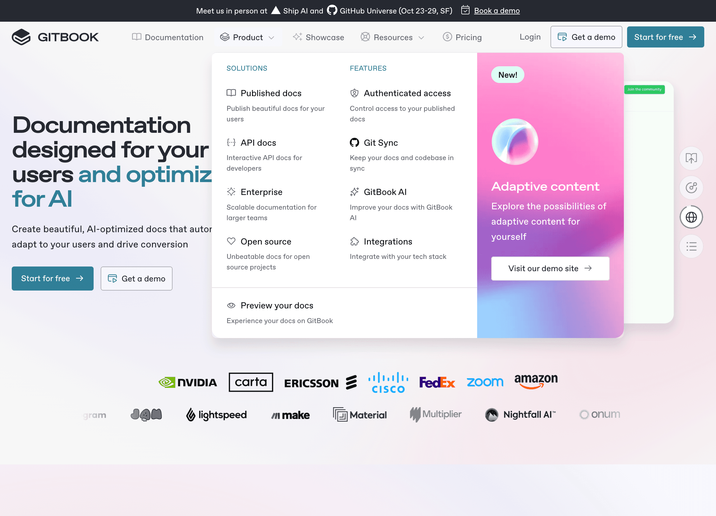
If you find yourself adding multiple nested dropdown menus to accommodate your content, consider a mega menu instead. It offers a more elegant way to organize lots of navigation items. Mega menus also reduce the space constraints inherent in nav bars, giving you the option to include short descriptions and additional calls to action.
Gitbook makes good use of its mega menu. Each of the menu’s columns works as an instantly-visible submenu, reducing the number of links that need to go in the nav bar. Gitbook also makes it easy to navigate the content by including icons and short descriptions, and turns an entire mega menu column into an eye-catching CTA that drives users toward new features.
4. Sidebar navigation — Novara
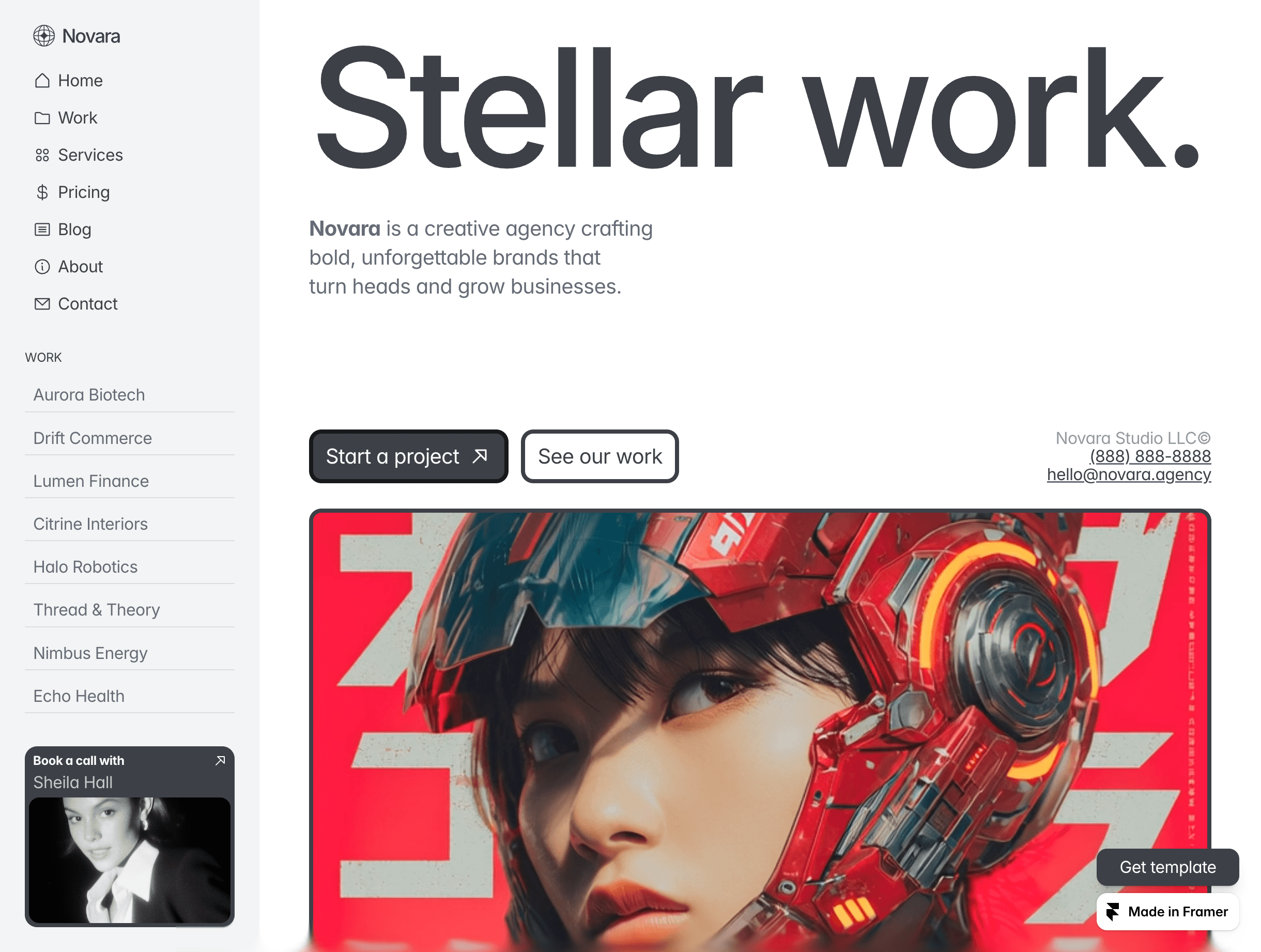
Sidebar navigation menus are useful for navigating deep content hierarchies like ecommerce product pages. But using them as your primary navigation breaks UX conventions, which means users will inevitably be surprised at the way you’ve chosen to organize your content. That’s not always a dealbreaker, though, especially for marketing agencies and designers.
Portfolio websites sometimes opt for sidebar navigation because it opens up the body of the website while adding more space for menu items. Novara, a Framer template, is a good example of how this works: it allows one-click navigation between different projects, includes a visual “Book a Call” CTA, and still has room for standard menu items like About and Pricing.
If you use sidebar menus, put them on the left side of the screen. Right-aligned menus make it much harder for users to scan your list of links, according to eye-tracking studies run by Nielsen Norman Group, a user experience training consultancy.
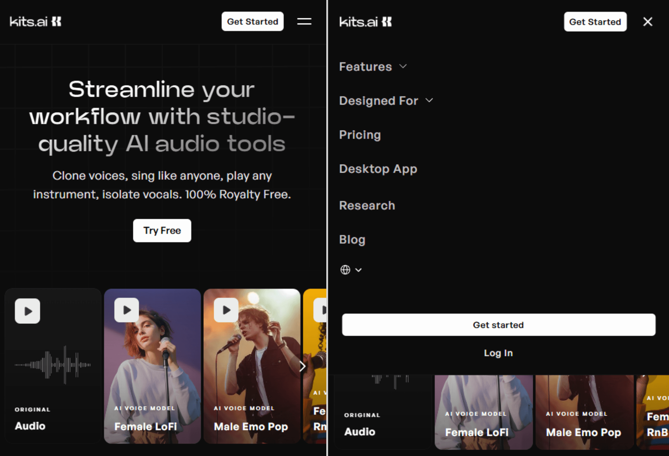
5. Hamburger menu — Kits AI
Hamburger menus have long been controversial in UX circles. They have two main failings:
Visitors have to click before seeing your menu, which can result in less engagement.
Less tech-savvy users may not realize that clicking on the hamburger icon opens up a menu.
Should you still use them? Probably. Hamburger menus are now nearly universal for mobile navigation, and they’re probably never going away. The Atlantic and TechCrunch both ran articles in 2015 calling for their abolishment—and both of those sites are still using the hamburger menu today. (All that being said, never use the hamburger menu on desktop since it buries your navigation and offers no clear space-saving benefit in return.)
Kits AI has a clean hamburger menu design with smooth animations, a sticky nav bar, and a font size that’s big enough to read on small devices. It leaves its primary CTA (“Get Started”) outside of the hamburger menu at all times, which is a smart move for conversion rates. Its 16 features are probably a little too much to list out on a mobile menu, but since they’re hidden under an accordion menu, navigating the site on mobile doesn’t get too unwieldy.
6. Bottom nav bar — Assemble
Bottom nav bars offer an elegant alternative to hamburger menus: they free up space at the top of the screen, keep every menu option visible, and do a more faithful job of recreating the full desktop experience on mobile. Unfortunately, you can’t make good use of them if your site has more than a handful of links. While bottom nav bars aren’t especially common on websites, users are accustomed to them because they’re conventional on mobile apps.
Assemble’s mobile site starts without a top nav bar and without a bottom nav bar, which keeps the focus on just a couple of CTAs and gives it more of a squeeze page vibe at first. As you scroll down from the top of the page, a bottom navigation bar comes into view, making it easy to navigate anywhere at any time.
7. Accordion menu — Crayo
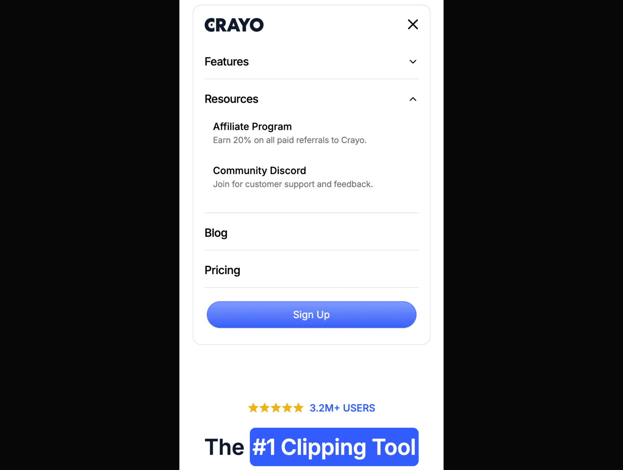
Accordion menus (or collapsible menus, which allow multiple sections to stay open at once) are the default solution for dealing with lots of menu items on mobile.
Crayo uses accordion menus to organize about a dozen links that are normally accessible via dropdown navigation on the site’s desktop version. Navigating lots of links on mobile gets overwhelming fast, so the key is to offer context. Crayo does a good job of this by showing short descriptions under each menu item and organizing larger lists with headers.
8. Mobile overlay menu — Penny
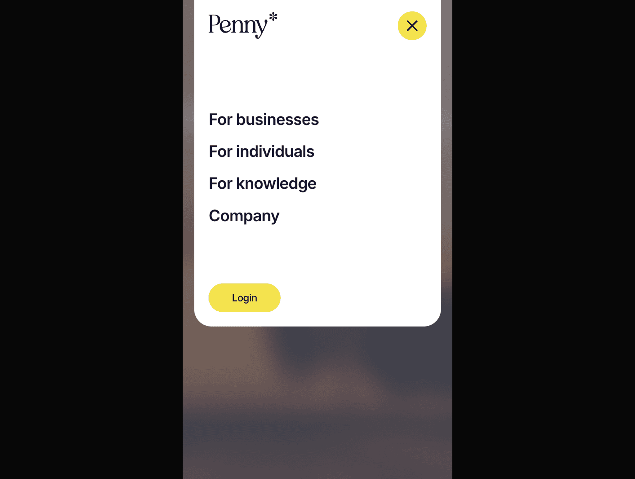
When it comes to mobile menus, simpler is better. Penny, a fintech company, has an advantage here: its site has just four pages plus a CTA. Penny does an admirable job of adapting its menu for mobile devices by increasing the font size, adding whitespace, and animating its hamburger icon into an “X” so users understand how to close the menu.
It’s funny to think of something as small as a mobile menu as contributing to the brand experience, but Penny’s does—the menu’s rounded edges, smooth animations, and blurred background all feel intentional and on-brand. (If you want to create scrollable mobile menus with slick fade-in animations, Framer makes it easy.)
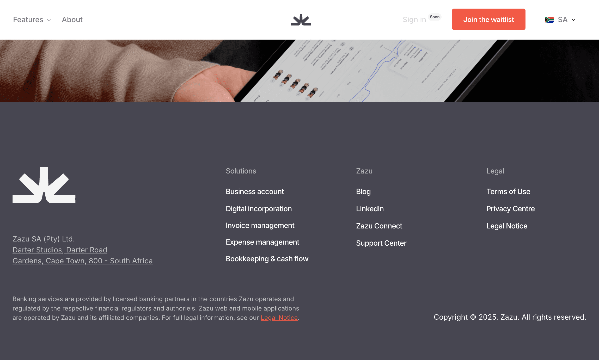
9. Footer menu — Zazu
Many designers use the footer as a point-by-point rehashing of their main menu. Theoretically this could reduce your bounce rate, but it isn’t necessary anymore. It’s a holdover from the days before sticky navigation, when the footer navigation was a lifeline to website visitors who reached the bottom of the page and didn’t want to scroll back to the top.
Your website footer menu is better used to highlight important content that deserves to be seen, but doesn’t justify inclusion in your main menus.
Footer menus are the place for:
Legal disclaimers
Privacy/terms of use/copyright information
Address and contact information
Bottom-of-funnel content like comparison articles
Social media links
Zazu, a banking app, strikes this balance well. Its footer is nicely branded, easy to read, and covers all the privacy, legal, and social media information that isn’t accessible from the main menu. Zazu manages to direct attention to the primary sections of the site without overwhelming users by listing every page.
Use Framer to build navigation that actually works
The best navigation is invisible. Users should reach their destination so seamlessly that they never think twice about how they got there. But when navigation fails—when users can’t find your pricing page or get lost in messy dropdown menus—suddenly it’s all they can think about. Getting it right requires experimentation, and for many design teams, that requires waiting for a developer.
With Framer, designers can use a no-code builder to test navigation hypotheses in days instead of months. Want to see if a bottom nav bar performs better than a hamburger menu for your mobile users? Build both versions and find out. Curious whether your mega menu is actually helping users find what they need? Test a simplified dropdown instead.
If you’re ready to design more effective navigation, start by taking a quick look through the navigation lessons in Framer Academy. From there, you can find ready-to-use navigation elements in Framer’s component library and sign up for Framer to start building today.


