

What are breakpoints in responsive design?
Breakpoints are screen-width checks in a CSS document that apply layout rules so content can adjust fluidly to different screen sizes. This prevents complex or multi-column desktop designs from being crammed onto small phone screens, keeping layouts clear and usable.
If you’ve ever used a non-responsive design on your phone, you’ve seen how text and images from a site designed for a desktop screen shrink to fit on your phone’s screen, and how much awkward zooming and scrolling is required to get around. With breakpoints, you can make sure all your text stays readable, buttons are still usable, and images don’t take over your whole page.
Types of breakpoints
There are different types of breakpoints: some change the entire page, some tweak a single user interface (UI) element, and some activate when a visitor turns their phone on its side to a landscape layout. Here are the main types of breakpoints commonly used across websites:
Layout breakpoints
Layout breakpoints affect the entire page. For example, a three-column grid in a 1200-pixel window might collapse into two neat rows at 768 pixels. Or, on a larger screen, your blog might have a sidebar with a short list of related posts, but in a smaller window, though, a layout breakpoint could move those posts below the article or into a menu.
Here’s an example of what a layout breakpoint could look like in CSS:
Nothing fancy. This simple rule says that if the browser screen is narrower than 768 pixels, the sidebar is hidden. More complex CSS might replace it with a hamburger menu, keeping the same content accessible just an extra tap away.
Component breakpoints
Component breakpoints target individual elements that don’t scale well to smaller sizes. Navigation bars, for example, look great and work fine at the top of a big desktop window, but become cramped and hard to use on a smaller, much narrower phone screen. A component breakpoint might introduce a hamburger menu when the screen drops below 640 pixels.
This component breakpoint, for example, keeps the .card component at 400px when there is room, but it will scale with the width of the screen when smaller:
On The1’s website, component breakpoints direct the responsiveness of the headline and grid components. The desktop version displays a large headline with a grid of four space types in their office building. But on mobile, the page displays a much smaller headline at 640 pixels, and the grid options get stacked above each other.
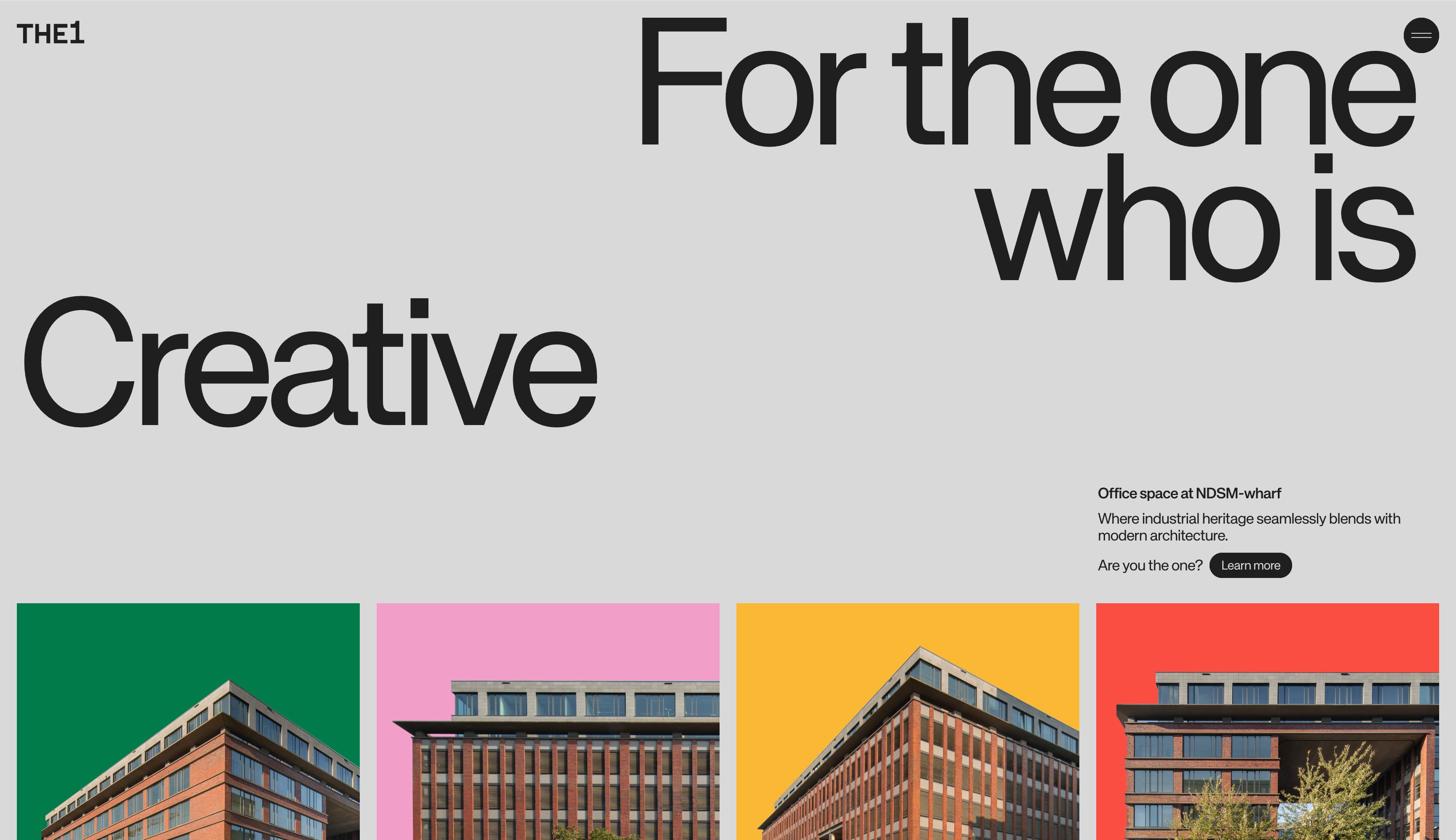
1440 pixels (L) 640 pixels (R)
Orientation breakpoints
Orientation breakpoints respond when your device changes layout orientation, like turning your phone sideways into landscape mode. If you don’t plan for it, your design can look off, with odd text wrapping or misaligned images.
For example, a recipe blog might show the ingredients list above the steps with large food photos in between. Flip to landscape mode and the ingredients can shift to a left sidebar, with the steps and smaller inline photos on the right, making better use of the wider screen width.
Here’s an example of an orientation breakpoint:
This makes the .hero component 60% of the visible area (viewport height) whenever the device is in portrait mode.
Content- and device-based breakpoints
Instead of relying on common width markers like 375 pixels for an iPhone, 768 for a tablet, or 1024 for a desktop browser, content- and device-based breakpoints are tailored to the actual design. Rather than targeting specific devices, a content-based breakpoint is set at the point where the layout begins to break down in real-world use.
They’re still width-based, but the breakpoints come from testing. The widths targeted might be odd values like 642px or 911px, where buttons, text, or images begin to misalign or lose usability. You might discover through testing that a three-column layout breaks at 860 pixels, so you set a content-based breakpoint at that width and shift to a two-column layout, reorganizing the content to maintain clarity and usability at smaller screen sizes.
This content-based breakpoint disables any animation when the user’s Accessibility settings are set to reduce motion.
Common breakpoints: XS, S, M, L, XL
Most responsive design falls into these common breakpoint sizes because popular devices use similar screen ratios and pixel sizes:
Extra small: 320px, 360px
320px to 360px is the size of most phones in portrait mode. The design usually has tight gutters (narrow margins around the content). Elements built for larger screens can start to break down as space shrinks. Navbars wrap onto multiple lines, rows of icons become cluttered, and multi-column layouts can make text feel scattered while images begin to overflow their containers.
To adapt, you typically hide non-essential content behind menus, switch to a single column layout, bump up the line height for better readability, and make buttons larger and easier to tap. Images are often set at 100% max-width so they don’t exceed their containers.
Small: 480px, 640px
These screen widths are common on landscape phones and smaller tablets, like an iPad mini or Samsung Tab A. At this size, some components like forms can feel oversized (input fields or elements in the form may appear too large or awkwardly spaced), hero images might crop awkwardly, and two-column grids may wrap unevenly. Even button text can start to break onto new lines. The content fits, but not comfortably.
To improve usability, you might use two cards (containers for information on a website) instead of three, reduce padding (the space around the content) to fit more cleanly, set banner images to scale without stretching, and shorten button labels so the text doesn’t split to a new line. Forms might adjust so that each input box spans the full width of a smaller screen, so users can scan vertically instead of having to scroll left to right.
Medium: 768px, 1024px
Tablets typically fall into these screen widths and can feel almost like using a desktop. However, when a user is on a tablet, the server will often load the mobile version of the site. This comes with trade-offs, including hidden navigation, images that are too small for a larger tablet screen, and layouts that do not translate well, such as sidebars and three-column grid systems that feel cramped or awkward.
You might reintroduce a full navbar at 1024px, while sticking to mobile nav and two-column layouts at 768px. Using CSS flexbox tells browsers to expand a card grid naturally without fixed pixel widths, and slightly increasing font sizes can make paragraphs feel more balanced on wider screens.
Large: 1200px, 1440px
This is where most desktop windows fall. Layouts that look great at 1024px start to feel narrow and restricted on larger screens, with too much white space and small text that looks like it’s a small bit of content afloat in a larger amount of negative space.
Designers often widen the content container to a pixel width of around 1200px to 1440px, increase font sizes, and aim for 65–75 characters per line for better readability. You might make it so the negative space is used more intentionally, like giving more breathing room around a headline, or spacing out content cards more evenly, and you might introduce three-column grids to make better use of the larger area.
Extra large: 1920px
These are the ultra-wide monitors for desktop monitor setups and laptops connected to larger screens. At this size, centered content can feel disconnected from the edges of the screen, which creates an empty, underutilized feel. In addition, images can stretch awkwardly, and CTA buttons might disappear in all the empty space.
You can cap the content container with a max-width rule to keep text readable without forcing users to scan edge to edge. Imagery can scale up, using larger versions of hero images, for example. You might also introduce supplemental background elements or color blocks to anchor the eye, while rebalancing spacing and heading sizes to better suit the larger canvas.
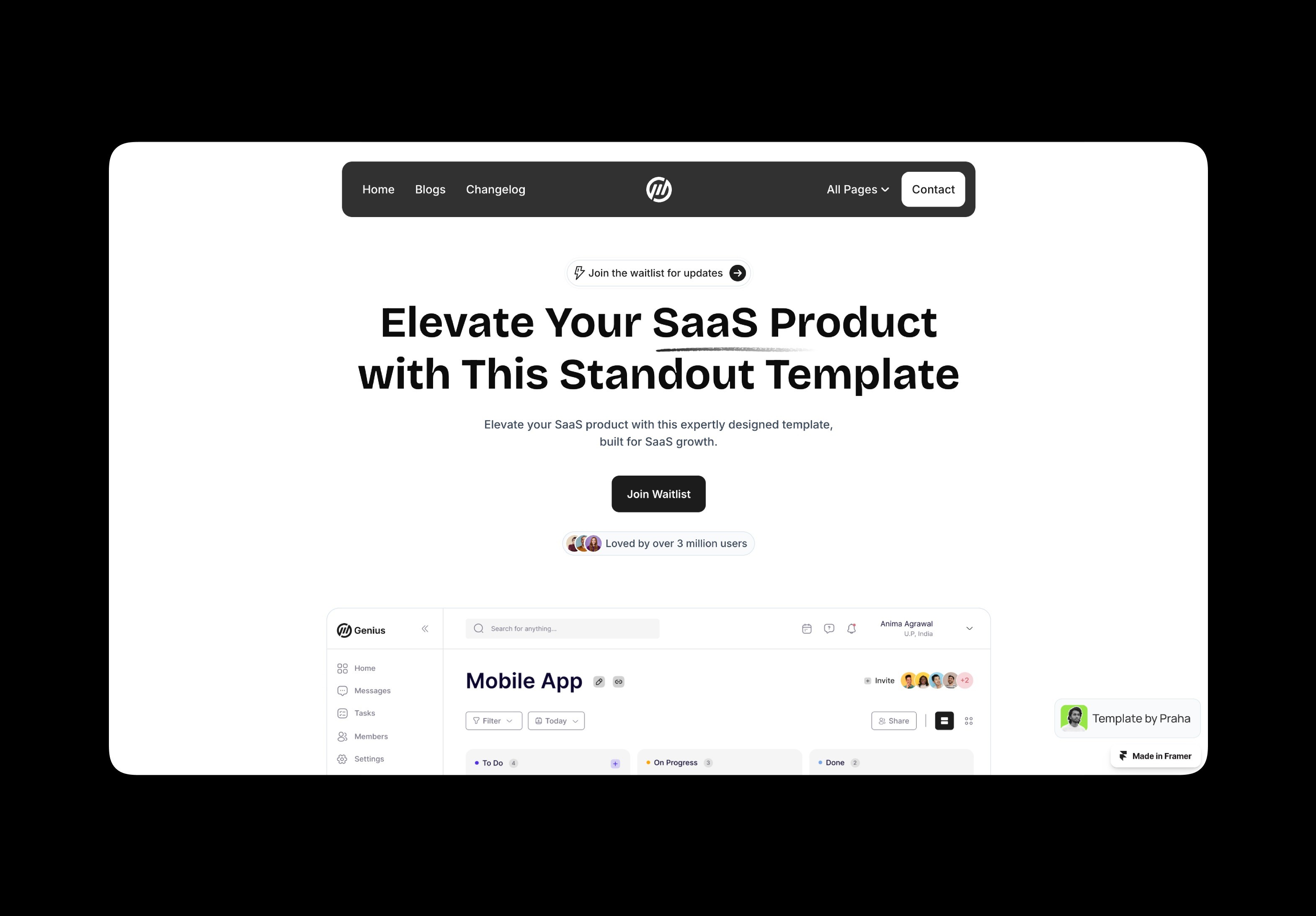
Example of breakpoints in responsive design
Take the Genius template from the Framer Marketplace. At 1440 pixels wide, the layout features a full-width hero image paired with a prominent headline and navigation spanning the top of the page, creating a clear and confident first impression on larger screens.
There’s a little breakpoint at around 1300px, where the menu items in the navbar are placed in the All Pages menu and the heading shrinks. The hero image gets a little smaller to fit, as well.
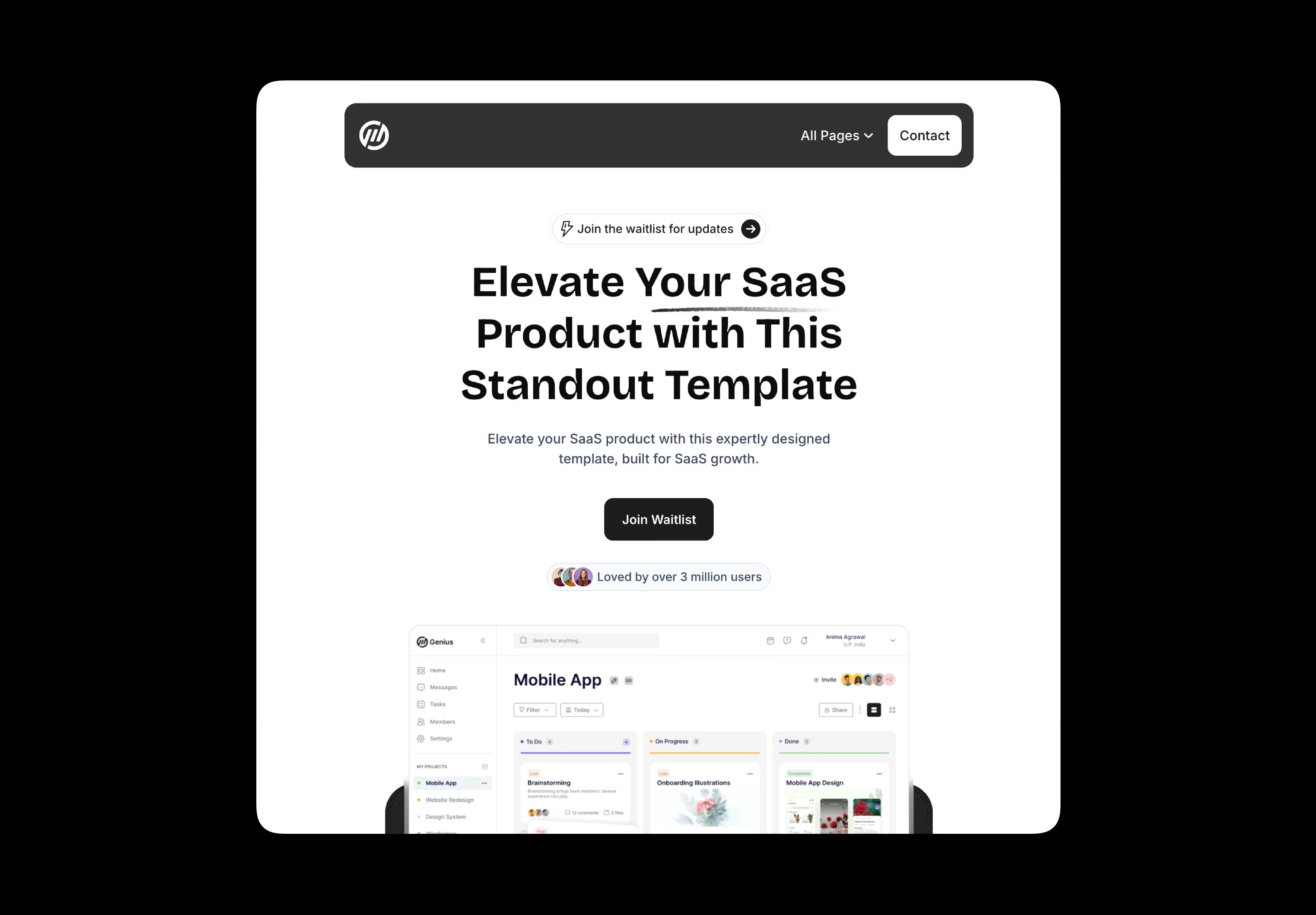
The headline scales down slightly around 1100px, but the more noticeable change hits at around 768px, where the headline shrinks further, the main menu becomes a hamburger, and the hero image stacks above the text container below, appearing much smaller. The whole design looks phone-ready and scales down easily from here.
How to implement responsive breakpoints correctly
Knowing what screen sizes your users are working with is just the start. Testing for issues at different breakpoints ensures you don’t alienate and lose visitors to awkward or broken layouts:
Use responsive typography
Set your fonts to em (relative to the current parent font) or rem (relative to the base font size). These scale text responsively, unlike fixed pixels. Your body copy will adjust automatically across screen sizes, so you don’t have to worry about the specific pixels. This ensures, for example, that text remains readable on a 320-pixel phone screen, while also scaling appropriately so it still feels well balanced on a 1920-pixel desktop.
Prioritize mobile-first design
Mobile traffic makes up more than 62% of global internet traffic, so if you can make your layout look great for mobile users, you’re golden when you want to amp it up for larger screens. To design for mobile, you have no wiggle room and have to make sure everything important fits. On a larger layout, you can add breathing room, columns, richer visuals, and the like. That can make it a little easier to grow your mobile design into something larger as you’re adding space, not smashing content into smaller areas. If you design at 320–260px, you’re capturing the screen size of many older devices that people still use today (older and low-cost Android phones, for example), making your site more device-inclusive overall.
Test across screen sizes
When designing in Framer, you can also use the responsive preview mode to instantly see how your design looks at different screen sizes. Otherwise, use DevTools presets in your web browser. Chrome, Firefox, and Safari let you simulate screen sizes without ever having to leave your desktop or big design monitor. You can choose various sizes like iPhone SE (375px), iPad (768px), laptop (1200px), and widescreen (1920px). This is great when you start your design, but also be sure to test it on real hardware when possible, since there are still some things, like pixel density, performance, and input feel, that simulated screen sizes don’t quite get.
Lean on flexbox and CSS grid
CSS has a layout system called Flexbox that makes it easier to lay out content in rows and columns. It lets your boxes spread out evenly across large screens and stack neatly on smaller ones. It’s a much easier, more flexible way to manage responsive design than floats, tables, or a bunch of complex math.
CSS Grid is a two-dimensional layout system, ideal for things like creating a photo gallery with clean, resizable rows and columns that resize gracefully as the screen size changes. Designers tend to use Grid to control the overall skeleton of a page, putting elements around the page. Flexbox then lets the stuff inside those elements move around easily across varying screens.
Build responsively with Framer
Breakpoints are easy enough to implement, but Framer makes them even easier as they’re built right in the web builder. The Marketplace templates already shift at common widths like 320px, 768px, 1024px, 1200px, and 1920px. You can add more breakpoints as needed by dragging the preview window or typing in your content-specific breakpoints to simulate screen changes. Framer takes care of the underlying CSS so you don’t have to.
If you want to learn more about what’s going on under the hood, check out Framer’s Academy lesson on breakpoints to walk through the setup.


