

Design is your website’s most powerful conversion tool. But many designers still inhabit a role that’s separate from marketing outcomes, creating beautiful work that gets handed off to developers and marketers for optimization. Conversion-driven design—together with no-code design tools—bridges this gap by giving designers complete control over the entire process, from initial concept to launch.
1. Build layouts that encourage users to take action
As a designer, it’s natural to get excited about new UX possibilities. But sometimes trendy visual features come at the expense of conversions. Just look at the rise and demise of sliders, which try to squeeze more information above the fold but fail to actually engage users.
That’s why the first rule of conversion-centered design (CCD) is to include only what’s helpful for the user’s path to conversion. And to do that, you need to talk to users.
Start by mapping the user's journey through your page
Whether you actually interview users or simply study heat maps and click paths, the goal is the same: to understand what your target audience needs. What are their pain points? What information do they need first? What objections might they have? What action do you want them to take?
Once you’ve answered those questions, address them in a logical sequence:
Begin with a clear value proposition
Offer social proof like case studies
Address potential objections proactively
Create a logical path to your call-to-action (CTA)
Eliminate distractions that pull focus from conversion goals
Each section should build on the last, moving users closer to conversion with every scroll.
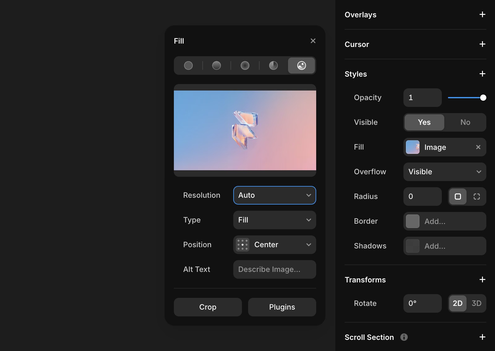
Nudge users to take action with color and contrast
While color and contrast can help emphasize your CTAs, there are a few myths to dispel first.
Here’s the reality:
There’s no “best” button color. Some studies say to go with red buttons, and others say blue. You can safely ignore all of them. Contrast matters much more.
Color consistency matters more than color psychology. Unless you’re prepared to do a full rebrand, don’t spend too much time wondering what your website’s colors say about your business. Just grab your brand palette and reserve the boldest, most contrasting colors for your CTAs—and be consistent about using it everywhere so users know what to expect.
Whitespace matters too. Creating contrast doesn’t always mean using bright colors. Sometimes, it’s about creating breathing room around important elements. Whitespace can be just as effective at drawing the eye as a bold color, especially when used strategically to isolate calls-to-action.
Run a visual audit on your landing page to make sure your call-to-action buttons stand out. If they don’t, switch to a higher-contrast color and emphasize your CTAs with whitespace to ensure users don’t miss them.
Finally, consider doing a quick accessibility check to confirm that your color scheme is easily seen by the widest range of users possible.
Don’t get distracted by conversion hacks
If your conversion rate is suffering, you might assume there’s a secret “hack” you’re missing. In reality, the most likely culprit is a lack of design purpose (users don’t understand what you want them to do) or a lack of persuasion (they haven’t been convinced to take action).
As UX designer David Kadavy says, “all of the winning landing pages I’ve seen have one thing in common: It is very visually clear what they want the user to do next.”
2. Use interactive elements strategically to boost user engagement
Interactive elements are everywhere. But while modern interactive elements look impressive in web design showcases, they don’t always deliver real business results. The most effective interactions aren't just beautiful—they serve a specific purpose on the user’s journey.
So before you add that fancy animation or widget, ask yourself: will it actually help users convert, or is it just visual noise?
Focus on micro-animations that serve a purpose
Good interaction design is invisible: it helps users accomplish their goals without calling attention to itself. Each micro-interaction should have a clear purpose that moves users closer to your desired action.
Focus on creating interactions that:
Highlight important calls-to-action
Reduce perceived wait times during loading
Provide immediate feedback based on user behavior
Guide visitors’ attention to critical conversion elements
Confirm that user inputs have been received
Turn passive visitors into active participants
What metric is most indicative of conversion? There are a few good answers here, but one broadly correlated indicator is time on site. A user who stays on your site longer has more time to build trust, work through their pre-sale objections, and understand how your product or service solves their problem.
Interactive components can not only increase time on site, they can also improve the quality of that time—especially if users can actually experience the benefits of your product rather than just read about them.
Look for ways to engage users by:
Replacing static pricing tables with interactive ROI calculators
Converting generic recommendations into personalized quizzes
Creating interactive demos that allow users to experience your product
Turning feature lists into interactive showcases
3. Make responsive design work for conversions, not against them
Most “responsive” websites still treat mobile devices as an afterthought. They shrink everything down, hide a few elements, and call it a day. But that design approach ignores a fundamental truth: users on different devices have different goals and behaviors.
True conversion-focused responsive design adapts to user context, not just screen size. To make this work, you need to rethink your assumptions about how people actually use your site across devices.
Start with mobile, but optimize for each context
The mobile-first approach has been standard practice for years, but many designers still get it wrong. They design for mobile by subtracting from the desktop experience rather than building for the needs of smaller devices from the ground up.
For mobile users, focus on three critical elements:
Prioritize content that increases conversions
Create tap targets large enough for easy one-handed interaction
Eliminate non-essential steps in the conversion process
Each decision should consider the mobile context. Remember that users are often distracted and browsing with one hand. They may also be dealing with variable connection speeds, so avoid design choices that noticeably impact your loading time.
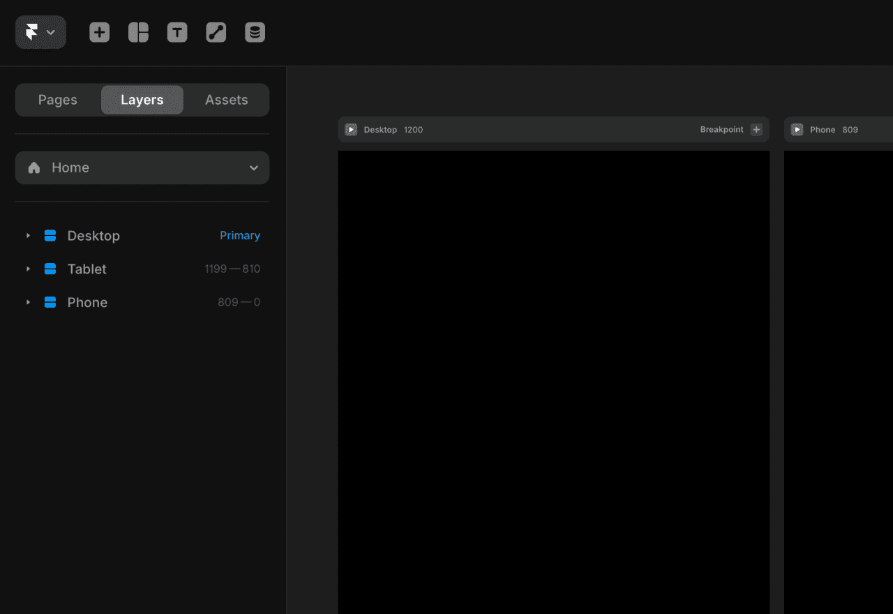
No-code designers like Framer make it easy to design for different screen sizes with responsive type scales and stack-based designs that fluidly respond to the available space. You can see all of your breakpoint-adapted designs in a single editing window, making it easy to add and remove elements to improve each experience. And with breakpoint inheritance, any changes you make to your primary breakpoint will “cascade” automatically to the others.
Use desktop space strategically
When users switch to desktop, you have more screen real estate—but resist the urge to fill it with content just because you can. Instead, use that space to reduce friction in the conversion process.
On desktop, you can:
Create multi-column layouts that show more options at once
Display additional information without requiring extra clicks
Implement sophisticated hover states to guide users
The goal isn’t to create a completely different experience; instead, use the additional space to make conversion even easier.
Avoid responsive mistakes that kill conversions
When reviewing your website design at different breakpoints, watch for these common conversion killers:
Hidden CTAs on mobile: If your call-to-action disappears below the fold on mobile, your conversion rate will suffer.
Complex forms: The same forms that work fine on desktop can become conversion nightmares on mobile. Each field you add increases abandonment risk exponentially on smaller screens.
Tiny fonts and microscopic tap targets: Nothing kills conversions faster than forcing users to pinch-zoom just to read text or click checkout buttons.
The biggest mistake is treating responsive design as a technical exercise rather than a user experience challenge. Don’t just make your site “work” on different screens—make it convert on every device.
4. Treat performance as a design decision, not just a technical one
Most designers leave performance optimization to developers. That’s a mistake that costs conversions. When pages load slowly, users leave. And no amount of conversion design can save a site that users never have the chance to see.
As a designer, you have significant influence over performance through the choices you make early in the design process. Here’s how to make those choices count.
Optimize images without sacrificing quality
Images account for over half of a typical website’s weight. They’re also where many designers are most reluctant to compromise. Fortunately, you can significantly improve performance without visible quality loss:
Use SVGs for icons, logos, and simple illustrations
Choose JPEG for photographs and complex images without transparency
Select PNG only when transparency is needed in complex images
Implement WebP with fallbacks for better compression in modern browsers
Framer makes all this easier by handling image optimization automatically. To maximize performance, most images are converted to AVIF, which makes them about 20% smaller; each image is then automatically resized and served to browsers dynamically depending on the screen size. You can also adjust specific image resolutions manually in Framer’s settings.
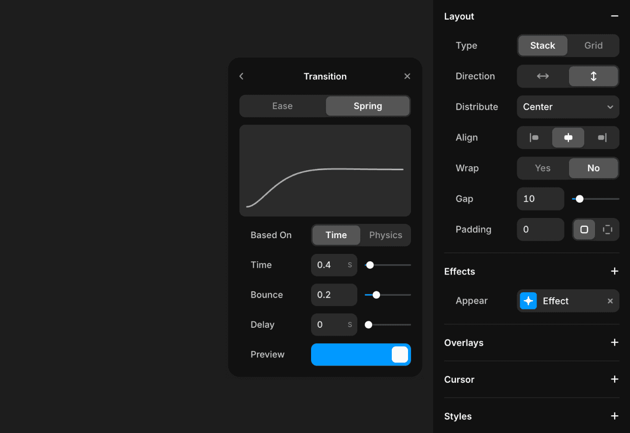
Use lightweight animations
Adding fancy animations might seem like a way to boost engagement, but if they slow down your site, they’ll hurt your conversion rate. Research consistently shows that even a 100-millisecond delay in page load time can reduce conversions by up to 7%.
Run performance tests before and after adding interactive elements to ensure you’re not sacrificing speed for style. If an animation adds more than 100ms to your load time, it’s probably not worth it—no matter how cool it looks.
Keep your animations lightweight, make sure there’s a conversion rationale to justify them, and experiment with loading animations that help reduce your users’ perceived loading time.
Build systems of reusable components
Component-based design creates both consistency and performance benefits. When components are reused, browsers cache them effectively, dramatically improving load times for returning visitors.
Think systematically: develop a library of optimized components rather than creating custom designs for every page. This approach reduces code bloat, creates a more cohesive user experience, and speeds up the entire experience.
5. Evolve your designs based on real data, not assumptions
Most teams design a site, launch it, then move on to the next project. Others adjust their sites from time to time, but do so based on gut feeling, subjective opinions—or whatever the loudest voice in the room says. Both approaches leave serious money on the table.
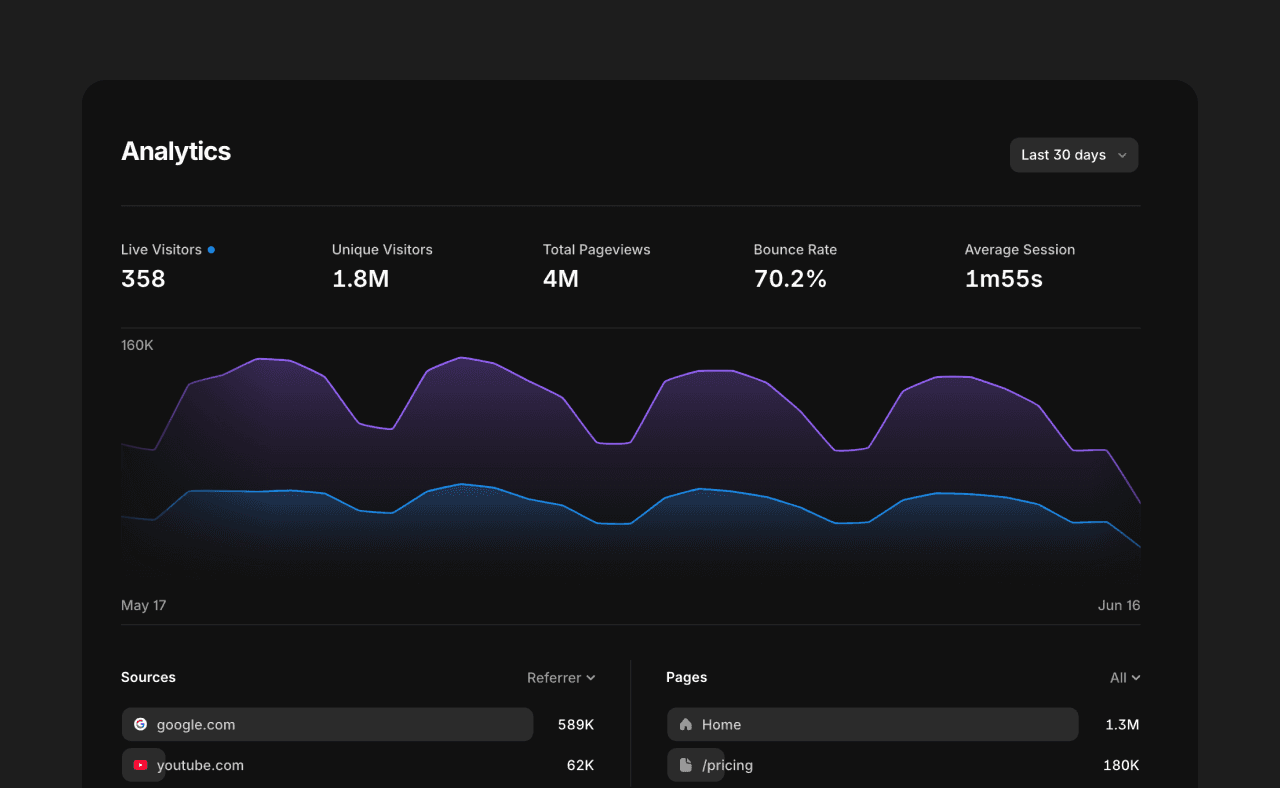
Instead, create a data-informed design strategy that creates a feedback loop of continuous improvement. Focus on signals that uncover friction in your conversion process:
Path analysis: Shows exact routes users take before converting or abandoning
Conversion rate by device: Reveals if your responsive design fails on specific screens
Form field completion rates: Identifies which fields cause users to give up
Click-through rates on CTAs: Measures if your primary CTA buttons work
Scroll depth: Shows whether critical content is seen at all
Exit page analysis: Reveals which web pages cause users to leave
Time to first interaction: Indicates if users understand what to do
By using a no-code design platform, you can avoid waiting on developers for A/B testing and iterate even faster. Instead of occasional conversion optimization sprints, you can constantly improve based on real user data, creating a compounding effect on conversion rates over time.
Just remember that not all changes are created equally—so prioritize those that are likely to have the biggest impact.
Turn design into your conversion superpower
These principles of conversion-centered design put you in control of both creative and business outcomes. Instead of watching your carefully crafted designs lose their effectiveness during implementation, you’ll maintain ownership of the entire process—creating experiences that not only delight users but convert them into customers.
As a designer, this approach gives you a significant competitive advantage. While others focus solely on creating pretty websites, you’ll position yourself as a strategic contributor by delivering designs that drive measurable business growth.
Ready to transform your design impact? Join thousands using Framer to build high-performing websites fast. Sign up for a free Framer account to start creating conversion-driven designs today.


