
These components are starting points, not substitutes for clear hierarchy: keep essential information readable, respect reduced motion, and tune each effect to the moment it serves.
What to look for in a Typography component
Choose a component that gives you the right level of control, works at your intended breakpoint sizes, and has a clear fallback when motion is reduced or unavailable.
1. Text Reveal
Reveal text as it enters the page. Use it for a hero headline or section title when the motion should guide attention without changing the copy.
2. Morphing Text
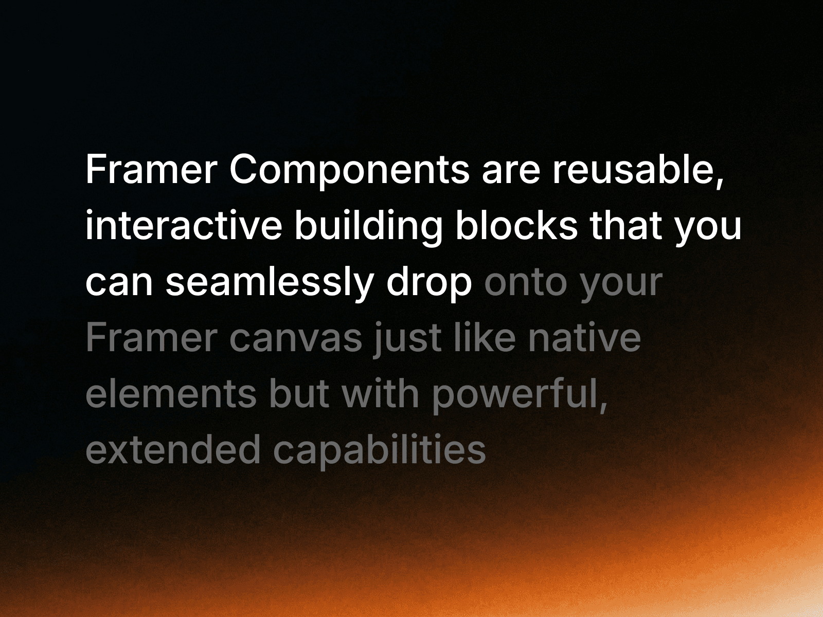
Transform one word or phrase into another. Use it for a headline that needs to show changing ideas, states, or product benefits.

3. Editorial Marquee
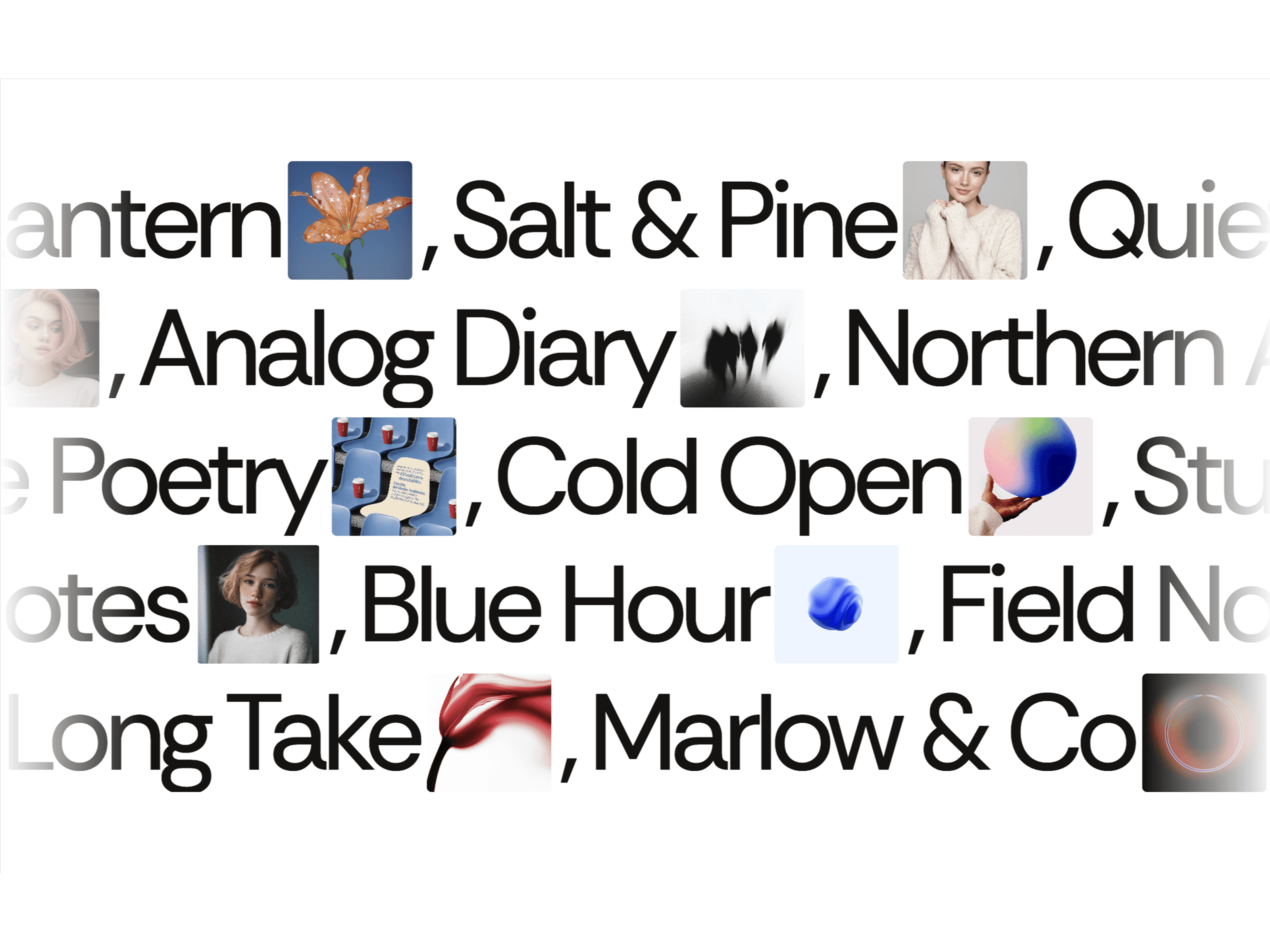
Create a continuously moving line of type. Use it for a compact announcement, a set of keywords, or a visual divider between sections.
4. Handwritten Text FX
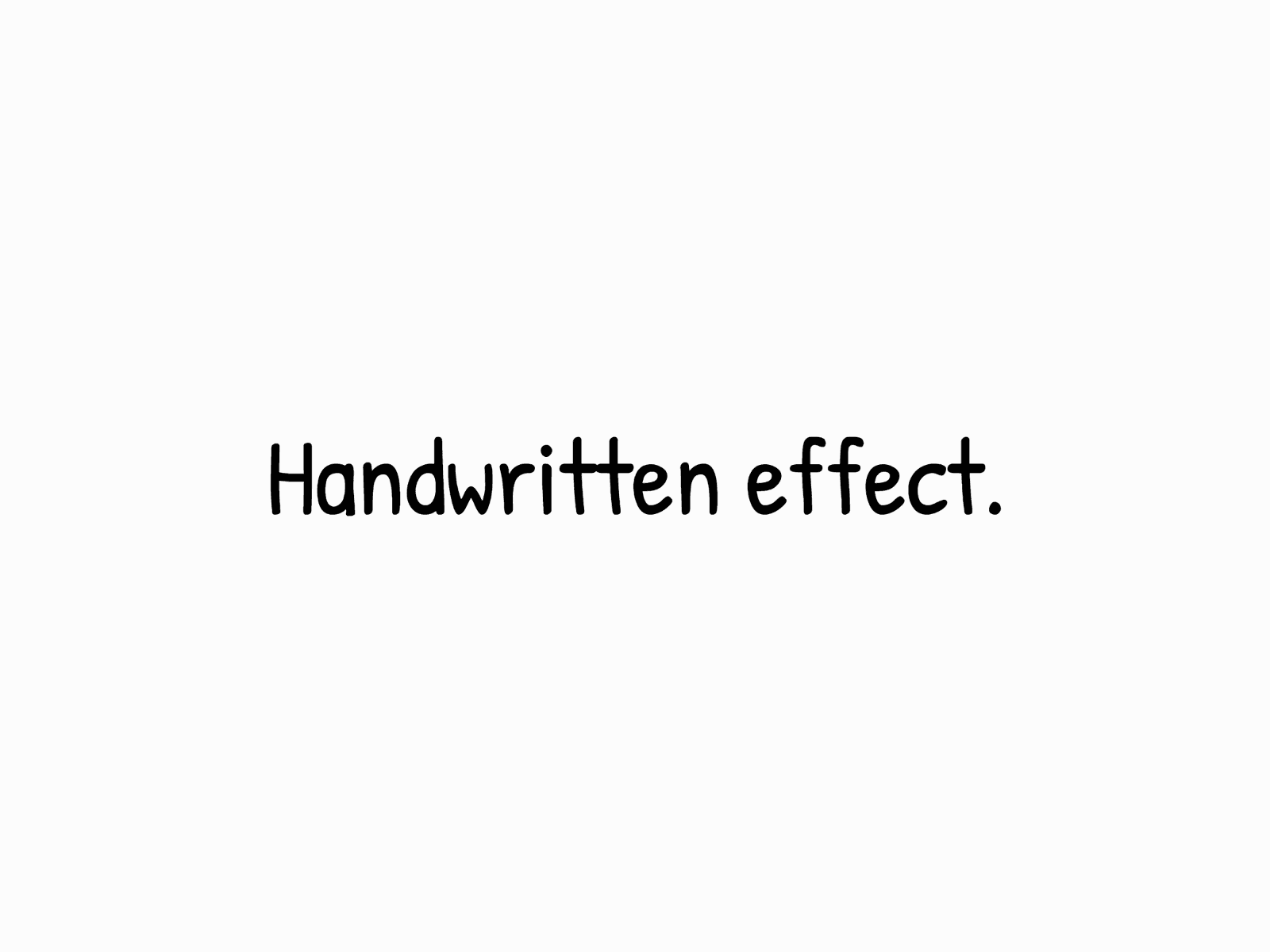
Add a handwritten treatment to typed content. Use it for notes, signatures, or a human counterpoint to a more structured interface.
5. Text Flow
Give text a more fluid, expressive movement. Use it when a short headline or statement needs to feel active while remaining readable.
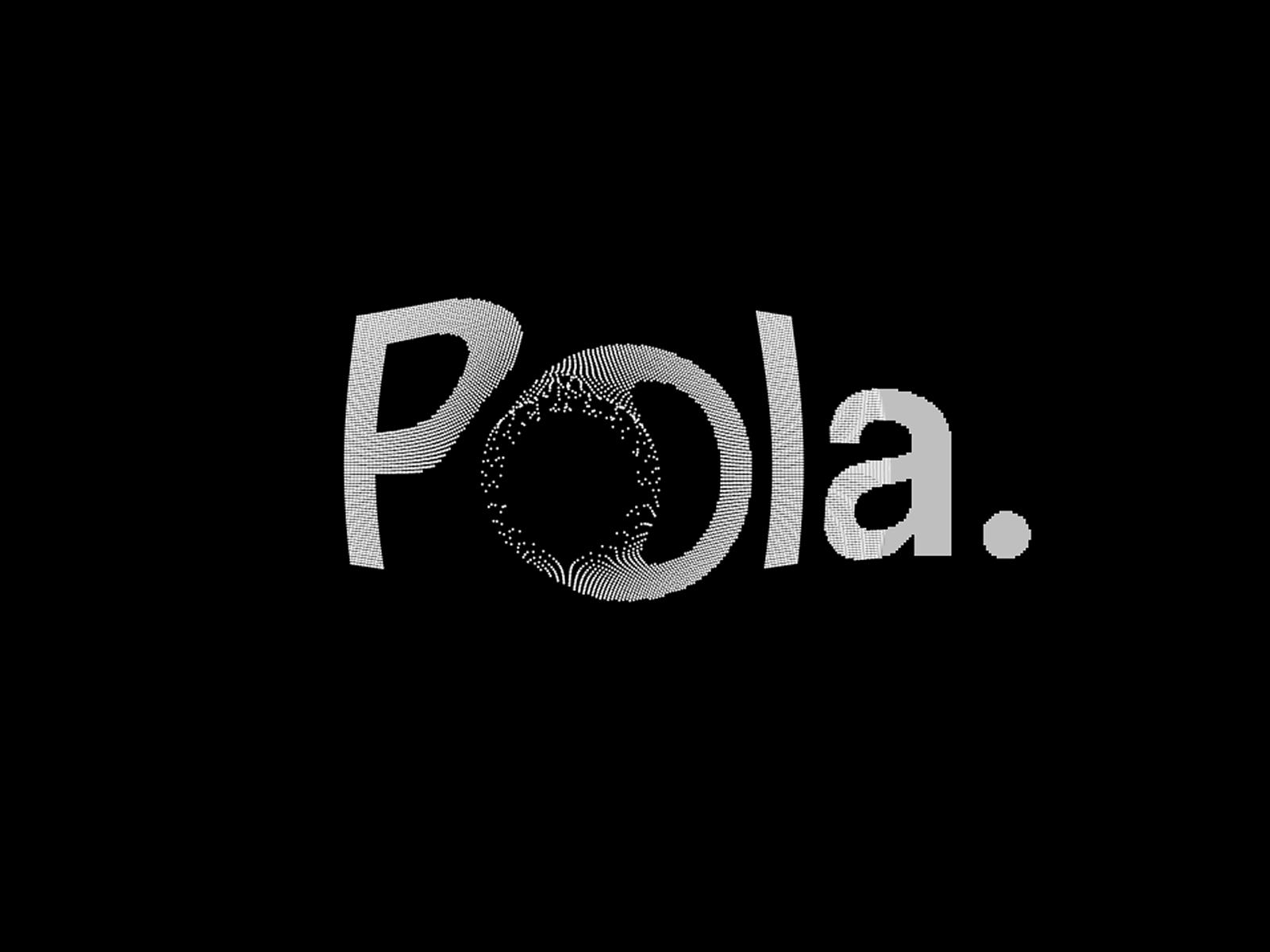
6. ScrollSyncedText
Tie text motion to the user’s scroll position. Use it to pace a story section or reveal supporting copy as the visitor moves through the page.

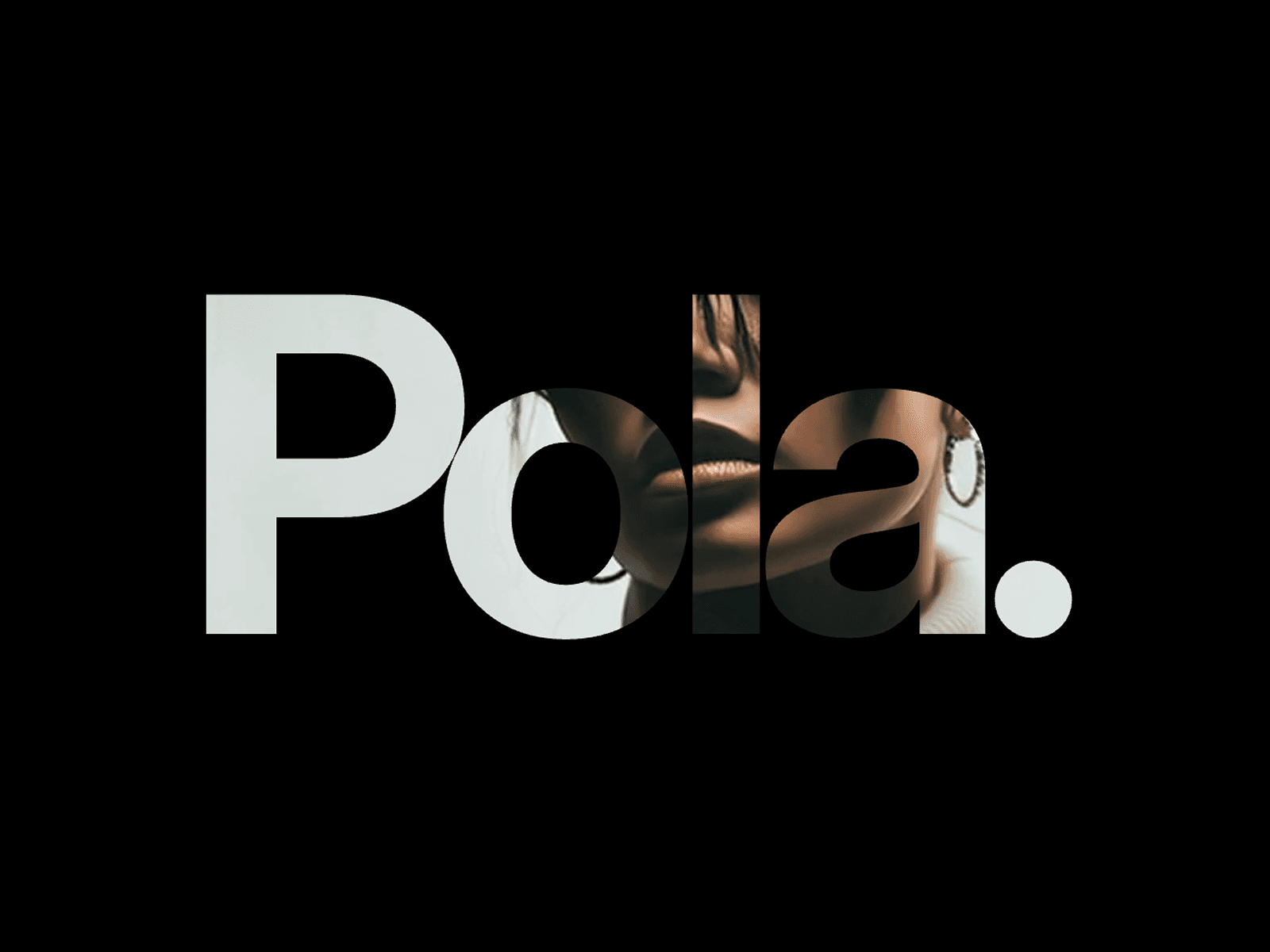
7. Text Video Mask
Show moving imagery through letterforms. Use it for a high-impact hero treatment, while keeping the surrounding copy short and accessible.
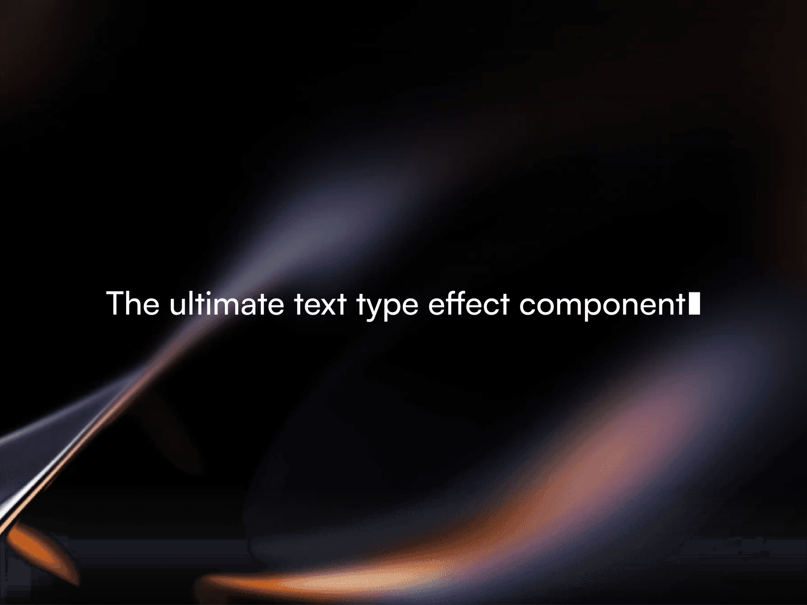
8. Pro Text Type Effect
Recreate a type-on text effect. Use it for sequential messages, product states, or a compact sequence of words in a hero.
9. Dithered Text Effect
Render type with a dithered visual texture. Use it for experimental or technical visual systems where the text effect supports the brand language.

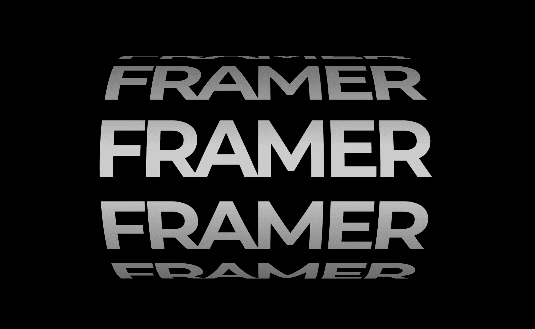
10. Text Cylinder
Arrange text around a cylindrical form. Use it as a display element or focal interaction rather than for essential instructions.
11. Animated Colour Typo
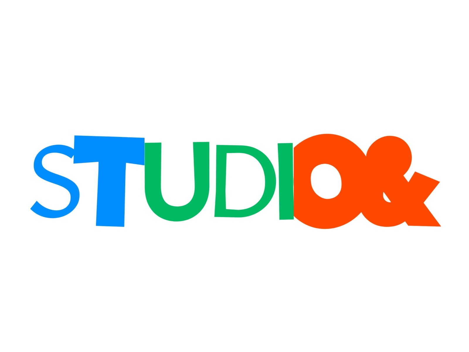
Animate colour across typography. Use it to add movement to a key phrase while preserving a strong static fallback for readability.
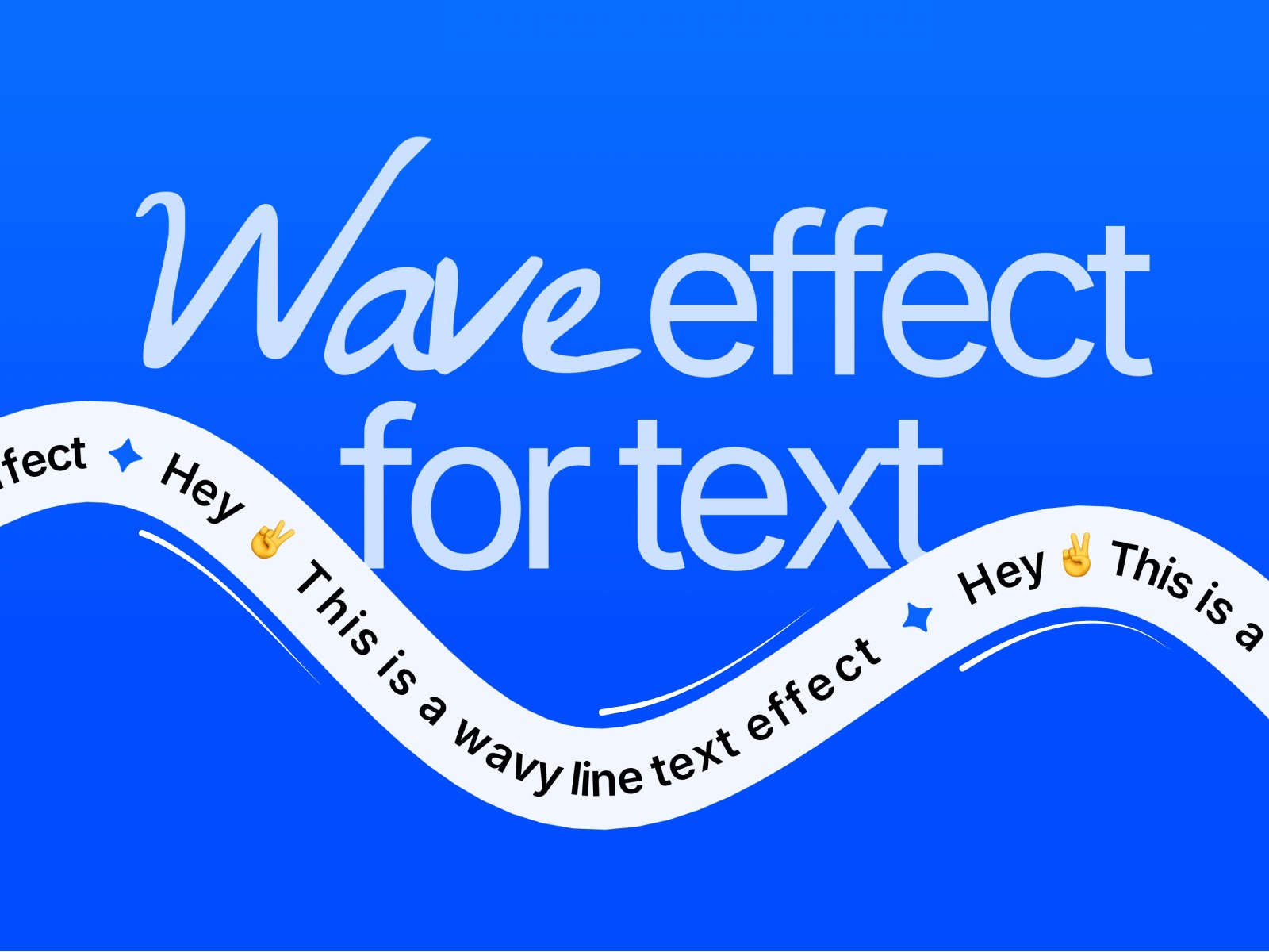
12. Wave effect for text
Bend or move text with a wave-like treatment. Use it sparingly for expressive headlines, labels, or transitions between sections.
Start with the component that matches the job your text needs to do, then adjust its controls, spacing, and motion to fit the rest of the page.
